Understand the theories behind effective visualizations and start to generate plots of our own with matplotlib and seaborn.
Analyze histograms and identify the skewness, potential outliers, and the mode.
Use boxplot and violinplot to compare two distributions.
In our journey of the data science lifecycle, we have begun to explore the vast world of exploratory data analysis. More recently, we learned how to pre-process data using various data manipulation techniques. As we work towards understanding our data, there is one key component missing in our arsenal — the ability to visualize and discern relationships in existing data.
These next two lectures will introduce you to various examples of data visualizations and their underlying theory. In doing so, we’ll motivate their importance in real-world examples with the use of plotting libraries.
7.1 Visualizations in Data 8 and Data 100 (so far)
You’ve likely encountered several forms of data visualizations in your studies. You may remember two such examples from Data 8: line plots, scatter plots, and histograms. Each of these served a unique purpose. For example, line plots displayed how numerical quantities changed over time, while histograms were useful in understanding a variable’s distribution.
Line Chart
Scatter Plot
Histogram
7.2 Goals of Visualization
Visualizations are useful for a number of reasons. In Data 100, we consider two areas in particular:
To broaden your understanding of the data. Summarizing trends visually before in-depth analysis is a key part of exploratory data analysis. Creating these graphs is a lightweight, iterative and flexible process that helps us investigate relationships between variables.
To communicate results/conclusions to others. These visualizations are highly editorial, selective, and fine-tuned to achieve a communications goal, so be thoughtful and careful about its clarity, accessibility, and necessary context.
Altogether, these goals emphasize the fact that visualizations aren’t a matter of making “pretty” pictures; we need to do a lot of thinking about what stylistic choices communicate ideas most effectively.
This course note will focus on the first half of visualization topics in Data 100. The goal here is to understand how to choose the “right” plot depending on different variable types and, secondly, how to generate these plots using code.
7.3 An Overview of Distributions
A distribution describes both the set of values that a single variable can take and the frequency of unique values in a single variable. For example, if we’re interested in the distribution of students across Data 100 discussion sections, the set of possible values is a list of discussion sections (10-11am, 11-12pm, etc.), and the frequency that each of those values occur is the number of students enrolled in each section. In other words, we’re interested in how a variable is distributed across it’s possible values. Therefore, distributions must satisfy two properties:
The total frequency of all categories must sum to 100%
Total count should sum to the total number of datapoints if we’re using raw counts.
Not a Valid Distribution
Valid Distribution
This is not a valid distribution since individuals can be associated with more than one category and the bar values demonstrate values in minutes and not probability.
This example satisfies the two properties of distributions, so it is a valid distribution.
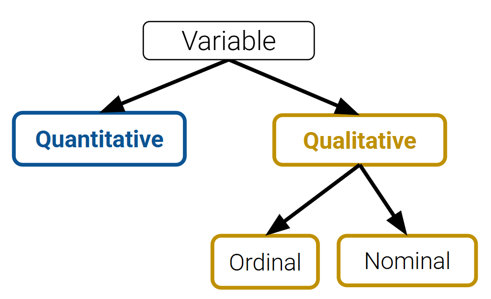
7.4 Variable Types Should Inform Plot Choice
Different plots are more or less suited for displaying particular types of variables, laid out in the diagram below:
The first step of any visualization is to identify the type(s) of variables we’re working with. From here, we can select an appropriate plot type:
7.5 Qualitative Variables: Bar Plots
A bar plot is one of the most common ways of displaying the distribution of a qualitative (categorical) variable. The length of a bar plot encodes the frequency of a category; the width encodes no useful information. The color could indicate a sub-category, but this is not necessarily the case.
Let’s contextualize this in an example. We will use the World Bank dataset (wb) in our analysis.
Code
import pandas as pdimport numpy as npimport warnings warnings.filterwarnings("ignore", "use_inf_as_na") # Supresses distracting deprecation warningswb = pd.read_csv("data/world_bank.csv", index_col=0)wb.head()
Continent
Country
Primary completion rate: Male: % of relevant age group: 2015
Primary completion rate: Female: % of relevant age group: 2015
Lower secondary completion rate: Male: % of relevant age group: 2015
Lower secondary completion rate: Female: % of relevant age group: 2015
Youth literacy rate: Male: % of ages 15-24: 2005-14
Youth literacy rate: Female: % of ages 15-24: 2005-14
Adult literacy rate: Male: % ages 15 and older: 2005-14
Adult literacy rate: Female: % ages 15 and older: 2005-14
...
Access to improved sanitation facilities: % of population: 1990
Access to improved sanitation facilities: % of population: 2015
Child immunization rate: Measles: % of children ages 12-23 months: 2015
Child immunization rate: DTP3: % of children ages 12-23 months: 2015
Children with acute respiratory infection taken to health provider: % of children under age 5 with ARI: 2009-2016
Children with diarrhea who received oral rehydration and continuous feeding: % of children under age 5 with diarrhea: 2009-2016
Children sleeping under treated bed nets: % of children under age 5: 2009-2016
Children with fever receiving antimalarial drugs: % of children under age 5 with fever: 2009-2016
Tuberculosis: Treatment success rate: % of new cases: 2014
Tuberculosis: Cases detection rate: % of new estimated cases: 2015
0
Africa
Algeria
106.0
105.0
68.0
85.0
96.0
92.0
83.0
68.0
...
80.0
88.0
95.0
95.0
66.0
42.0
NaN
NaN
88.0
80.0
1
Africa
Angola
NaN
NaN
NaN
NaN
79.0
67.0
82.0
60.0
...
22.0
52.0
55.0
64.0
NaN
NaN
25.9
28.3
34.0
64.0
2
Africa
Benin
83.0
73.0
50.0
37.0
55.0
31.0
41.0
18.0
...
7.0
20.0
75.0
79.0
23.0
33.0
72.7
25.9
89.0
61.0
3
Africa
Botswana
98.0
101.0
86.0
87.0
96.0
99.0
87.0
89.0
...
39.0
63.0
97.0
95.0
NaN
NaN
NaN
NaN
77.0
62.0
5
Africa
Burundi
58.0
66.0
35.0
30.0
90.0
88.0
89.0
85.0
...
42.0
48.0
93.0
94.0
55.0
43.0
53.8
25.4
91.0
51.0
5 rows × 47 columns
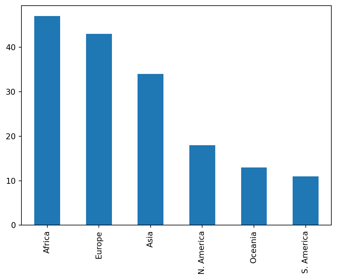
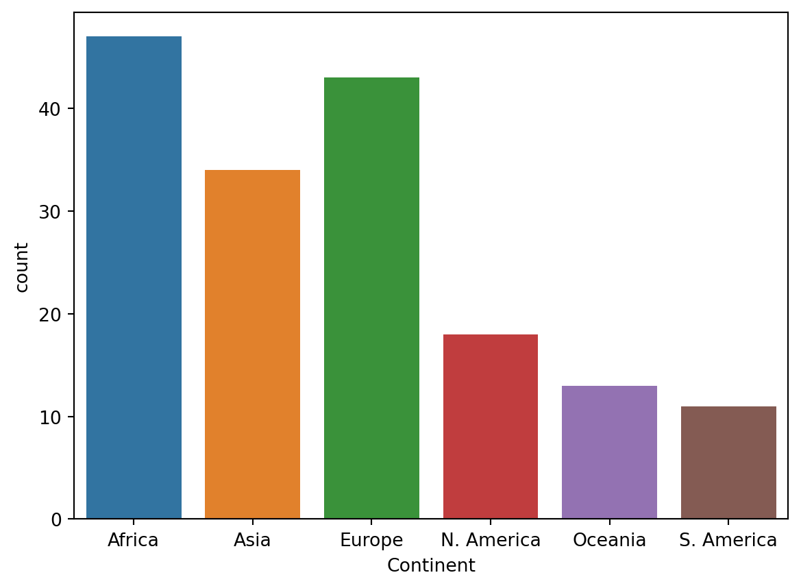
We can visualize the distribution of the Continent column using a bar plot. There are a few ways to do this.
7.5.1 Plotting in Pandas
wb['Continent'].value_counts().plot(kind='bar');
Recall that .value_counts() returns a Series with the total count of each unique value. We call .plot(kind='bar') on this result to visualize these counts as a bar plot.
Plotting methods in pandas are the least preferred and not supported in Data 100, as their functionality is limited. Instead, future examples will focus on other libraries built specifically for visualizing data. The most well-known library here is matplotlib.
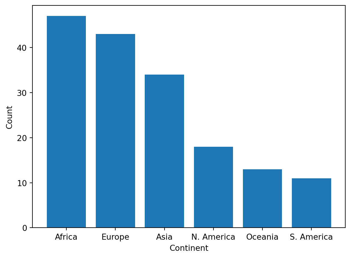
7.5.2 Plotting in Matplotlib
import matplotlib.pyplot as plt # matplotlib is typically given the alias pltcontinent = wb['Continent'].value_counts()plt.bar(continent.index, continent)plt.xlabel('Continent')plt.ylabel('Count');
While more code is required to achieve the same result, matplotlib is often used over pandas for its ability to plot more complex visualizations, some of which are discussed shortly.
However, note how we needed to label the axes with plt.xlabel and plt.ylabel, as matplotlib does not support automatic axis labeling. To get around these inconveniences, we can use a more efficient plotting library: seaborn.
7.5.3 Plotting in Seaborn
import seaborn as sns # seaborn is typically given the alias snssns.countplot(data = wb, x ='Continent');
In contrast to matplotlib, the general structure of a seaborn call involves passing in an entire DataFrame, and then specifying what column(s) to plot. seaborn.countplot both counts and visualizes the number of unique values in a given column. This column is specified by the x argument to sns.countplot, while the DataFrame is specified by the data argument.
seaborn is built on matplotlib! When using seaborn, you’re actually using matplotlib under the hood, but with an easier-to-use interface for working with DataFrames and creating certain types of plots.
For the vast majority of visualizations, seaborn is far more concise and aesthetically pleasing than matplotlib. However, the color scheme of this particular bar plot is arbitrary - it encodes no additional information about the categories themselves. This is not always true; color may signify meaningful detail in other visualizations. We’ll explore this more in-depth during the next lecture.
By now, you’ll have noticed that each of these plotting libraries have a very different syntax. As with pandas, we’ll teach you the important methods in matplotlib and seaborn, but you’ll learn more through documentation.
Revisiting our example with the wb DataFrame, let’s plot the distribution of Gross national income per capita.
Code
wb.head(5)
Continent
Country
Primary completion rate: Male: % of relevant age group: 2015
Primary completion rate: Female: % of relevant age group: 2015
Lower secondary completion rate: Male: % of relevant age group: 2015
Lower secondary completion rate: Female: % of relevant age group: 2015
Youth literacy rate: Male: % of ages 15-24: 2005-14
Youth literacy rate: Female: % of ages 15-24: 2005-14
Adult literacy rate: Male: % ages 15 and older: 2005-14
Adult literacy rate: Female: % ages 15 and older: 2005-14
...
Access to improved sanitation facilities: % of population: 1990
Access to improved sanitation facilities: % of population: 2015
Child immunization rate: Measles: % of children ages 12-23 months: 2015
Child immunization rate: DTP3: % of children ages 12-23 months: 2015
Children with acute respiratory infection taken to health provider: % of children under age 5 with ARI: 2009-2016
Children with diarrhea who received oral rehydration and continuous feeding: % of children under age 5 with diarrhea: 2009-2016
Children sleeping under treated bed nets: % of children under age 5: 2009-2016
Children with fever receiving antimalarial drugs: % of children under age 5 with fever: 2009-2016
Tuberculosis: Treatment success rate: % of new cases: 2014
Tuberculosis: Cases detection rate: % of new estimated cases: 2015
0
Africa
Algeria
106.0
105.0
68.0
85.0
96.0
92.0
83.0
68.0
...
80.0
88.0
95.0
95.0
66.0
42.0
NaN
NaN
88.0
80.0
1
Africa
Angola
NaN
NaN
NaN
NaN
79.0
67.0
82.0
60.0
...
22.0
52.0
55.0
64.0
NaN
NaN
25.9
28.3
34.0
64.0
2
Africa
Benin
83.0
73.0
50.0
37.0
55.0
31.0
41.0
18.0
...
7.0
20.0
75.0
79.0
23.0
33.0
72.7
25.9
89.0
61.0
3
Africa
Botswana
98.0
101.0
86.0
87.0
96.0
99.0
87.0
89.0
...
39.0
63.0
97.0
95.0
NaN
NaN
NaN
NaN
77.0
62.0
5
Africa
Burundi
58.0
66.0
35.0
30.0
90.0
88.0
89.0
85.0
...
42.0
48.0
93.0
94.0
55.0
43.0
53.8
25.4
91.0
51.0
5 rows × 47 columns
How should we define our categories for this variable? In the previous example, these were a few unique values of the Continent column. If we use similar logic here, our categories are the different numerical values contained in the Gross national income per capita column.
Under this assumption, let’s plot this distribution using the seaborn.countplot function.
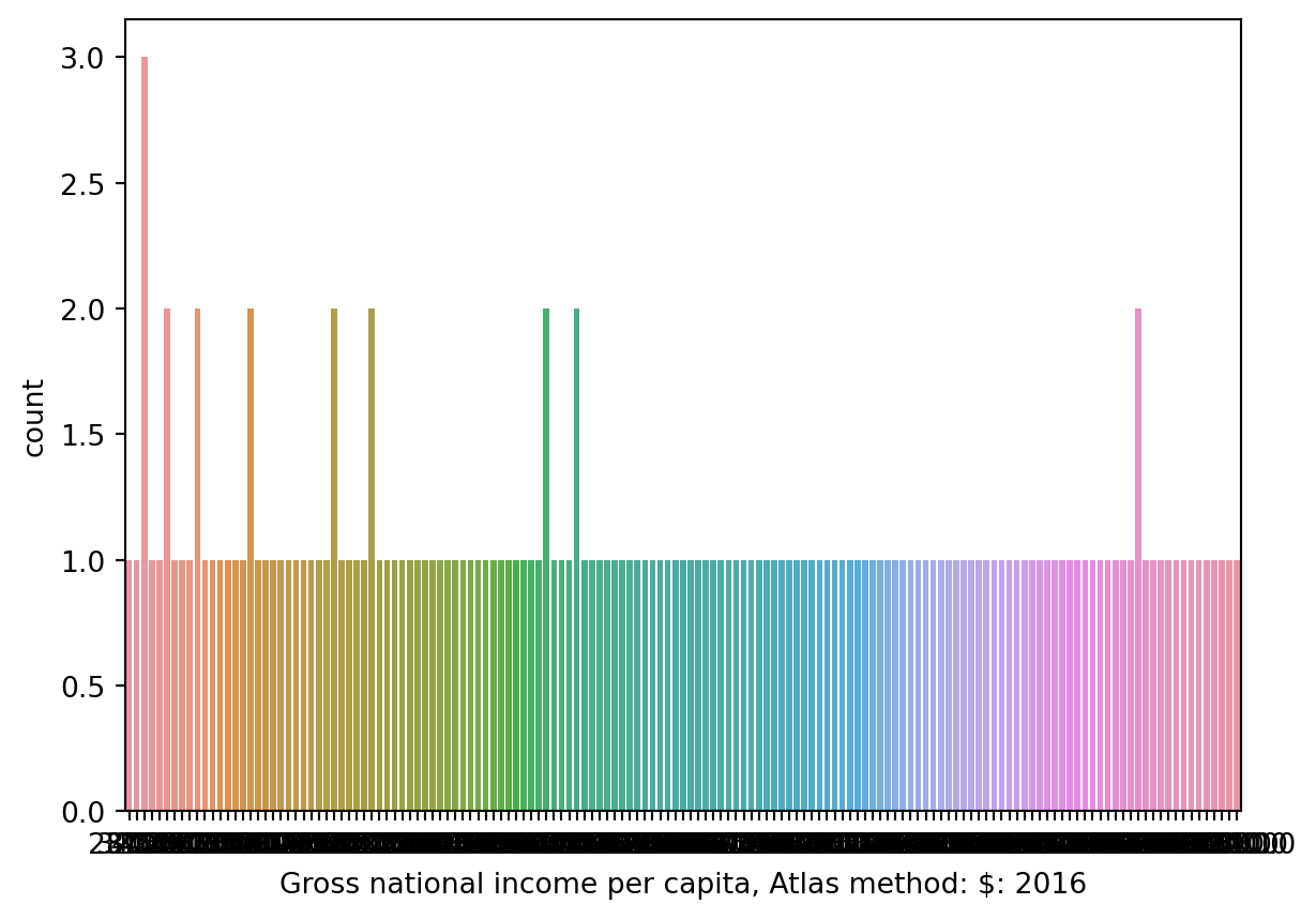
sns.countplot(data = wb, x ='Gross national income per capita, Atlas method: $: 2016');
What happened? A bar plot (either plt.bar or sns.countplot) will create a separate bar for each unique value of a variable. With a quantitative variable, we may not have a finite number of possible values, which can lead to situations like above where we would need many, many bars to display each unique value.
Specifically, we can say this histogram suffers from overplotting as we are unable to interpret the plot and gain any meaningful insight.
Rather than bar plots, to visualize the distribution of a quantitative variable, we use one of the following types of plots:
Histogram
Box plot
Violin plot
7.6.1 Histograms
You are likely familiar with histograms from Data 8. A histogram collects quantitative data into bins, then plots this binned data.
Each bin reflects the density of datapoints with values that lie between the left and right ends of the bin; in other words, the area (not height!) of each bin is proportional to the percentage of datapoints it contains.
7.6.1.1 Plotting Histograms
Below, we plot a histogram using matplotlib and seaborn. Which graph do you prefer?
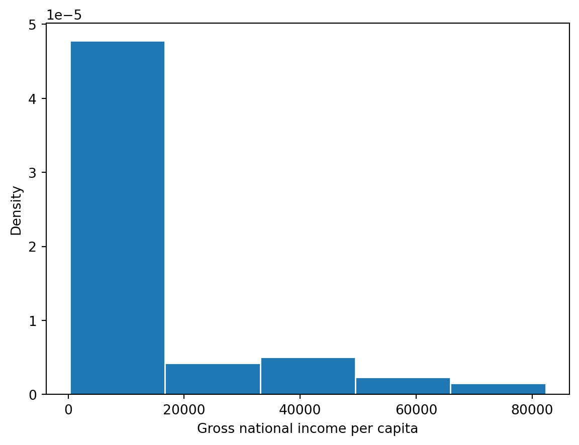
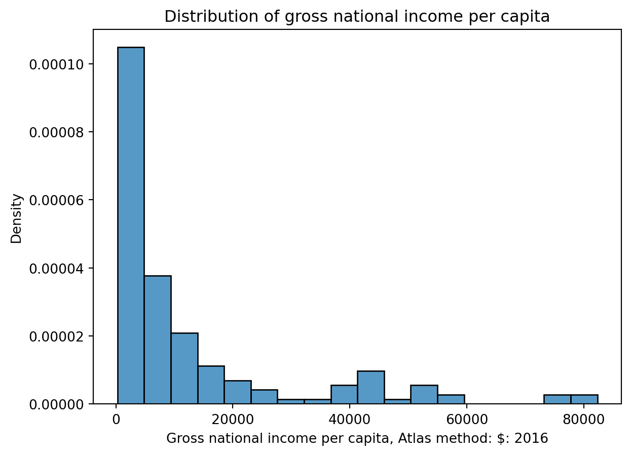
# The `edgecolor` argument controls the color of the bin edgesgni = wb["Gross national income per capita, Atlas method: $: 2016"]plt.hist(gni, density=True, edgecolor="white")# Add labelsplt.xlabel("Gross national income per capita")plt.ylabel("Density")plt.title("Distribution of gross national income per capita");
sns.histplot(data=wb, x="Gross national income per capita, Atlas method: $: 2016", stat="density")plt.title("Distribution of gross national income per capita");
7.6.1.2 Overlaid Histograms
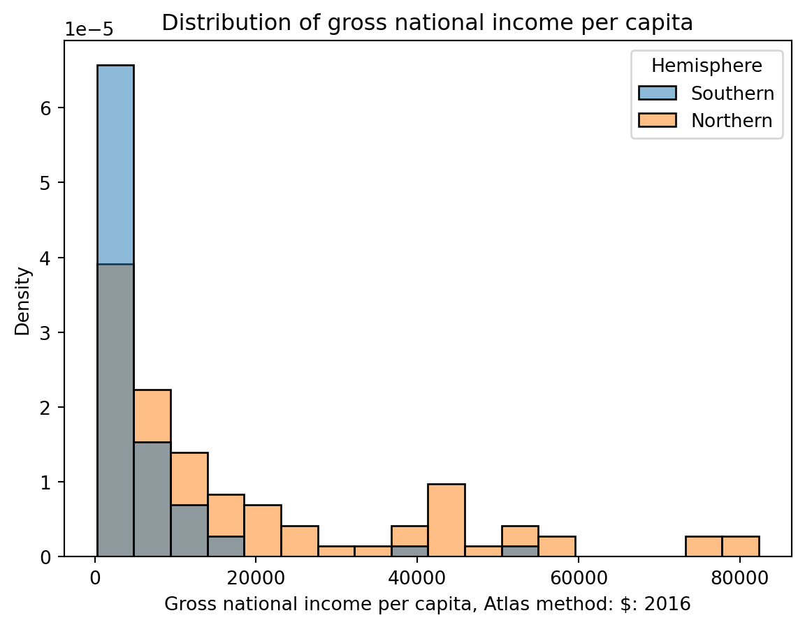
We can overlay histograms (or density curves) to compare quantitative distributions across qualitative categories.
The hue parameter of sns.histplot specifies the column that should be used to determine the color of each category. hue can be used in many seaborn plotting functions.
Notice that the resulting plot includes a legend describing which color corresponds to each hemisphere – a legend should always be included if color is used to encode information in a visualization!
# Create a new variable to store the hemisphere in which each country is locatednorth = ["Asia", "Europe", "N. America"]south = ["Africa", "Oceania", "S. America"]wb.loc[wb["Continent"].isin(north), "Hemisphere"] ="Northern"wb.loc[wb["Continent"].isin(south), "Hemisphere"] ="Southern"
sns.histplot(data=wb, x="Gross national income per capita, Atlas method: $: 2016", hue="Hemisphere", stat="density")plt.title("Distribution of gross national income per capita");
Again, each bin of a histogram is scaled such that its area is proportional to the percentage of all datapoints that it contains.
densities, bins, _ = plt.hist(gni, density=True, edgecolor="white", bins=5)plt.xlabel("Gross national income per capita")plt.ylabel("Density")print(f"First bin has width {bins[1]-bins[0]} and height {densities[0]}")print(f"This corresponds to {bins[1]-bins[0]} * {densities[0]} = {(bins[1]-bins[0])*densities[0]*100}% of the data")
First bin has width 16410.0 and height 4.7741589911386953e-05
This corresponds to 16410.0 * 4.7741589911386953e-05 = 78.343949044586% of the data
7.6.1.3 Interpreting Histograms
Histograms allow us to assess a distribution by their shape. There are a few properties of histograms we can analyze:
Skewness and Tails
Skewed left (negative skew) vs skewed right (positive skew)
Left tail vs right tail
Modes
Most commonly occuring data
Outliers
Using quartiles/percentiles
7.6.1.3.1 Skewness and Tails
The skew of a histogram describes the direction in which its “tail” extends.
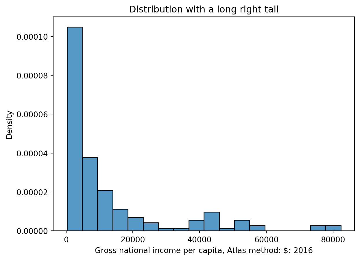
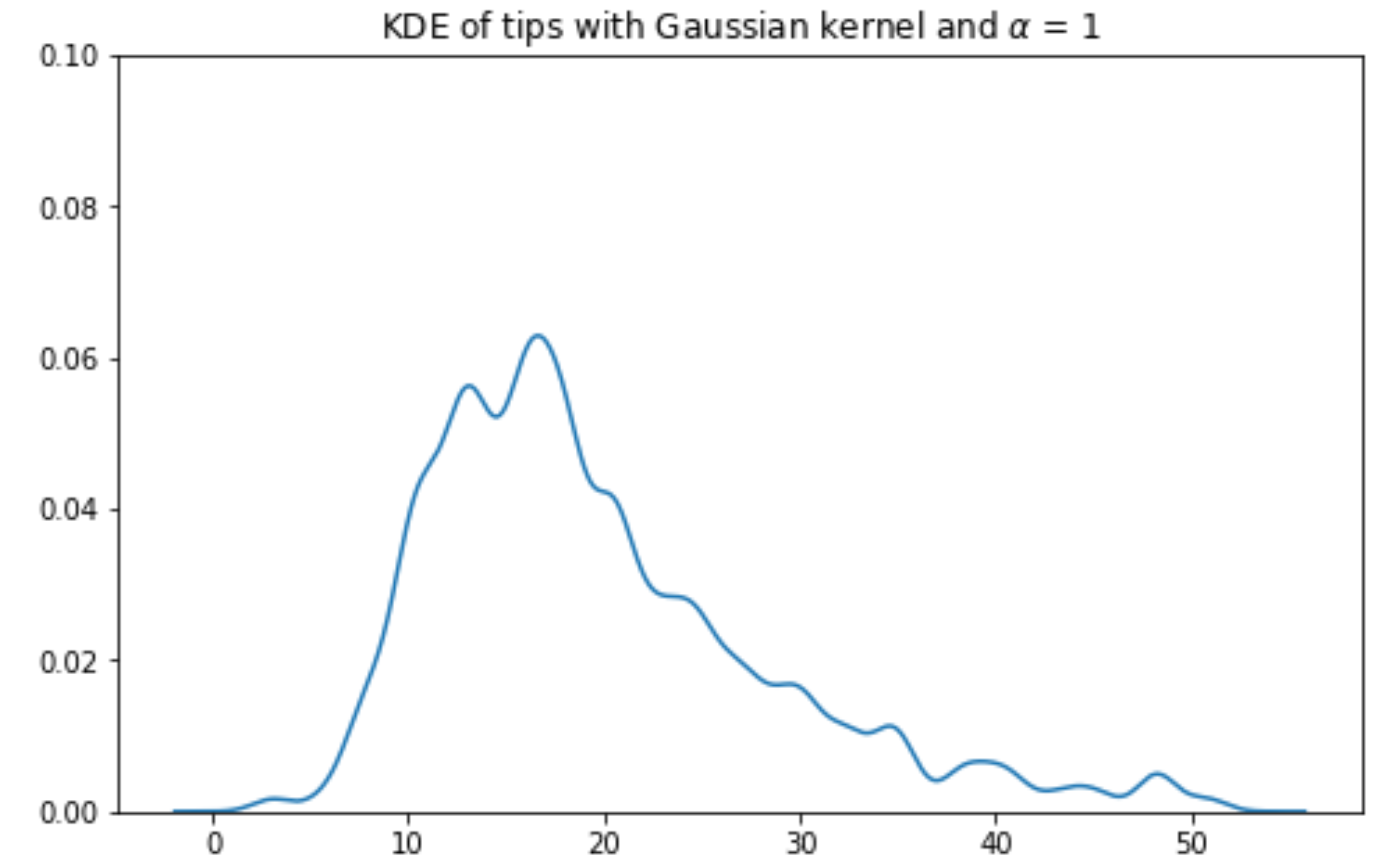
A distribution with a long right tail is skewed right, or has positive skew (such as Gross national income per capita). In a right-skewed distribution, the few large outliers “pull” the mean to the right of the median.
A good way to remember this is that it looks like a “P” on its side for Positive skew!
sns.histplot(data = wb, x ='Gross national income per capita, Atlas method: $: 2016', stat ='density');plt.title('Distribution with a long right tail')
Text(0.5, 1.0, 'Distribution with a long right tail')
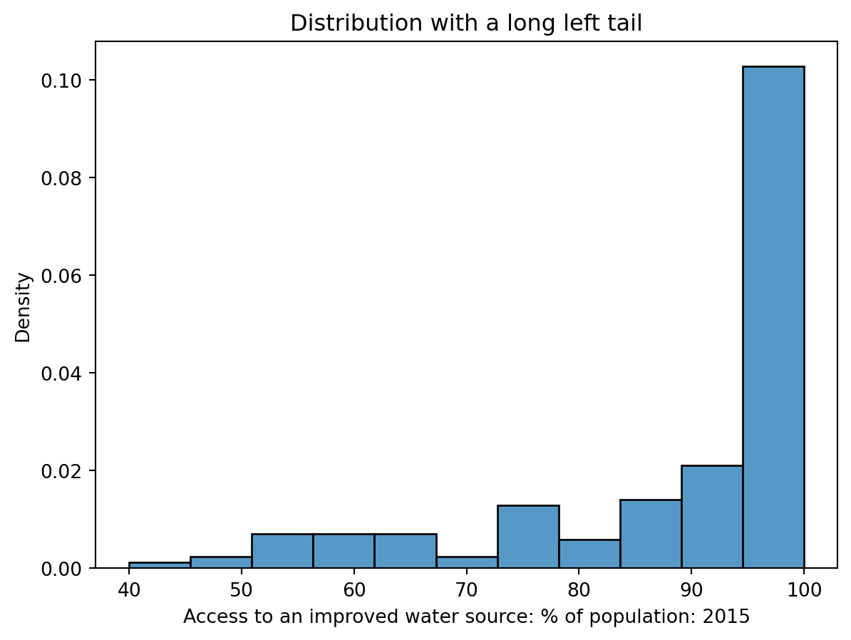
A distribution with a long left tail is skewed left (has negative skew) (such as Access to an improved water source). In a left-skewed distribution, the few small outliers “pull” the mean to the left of the median.
sns.histplot(data = wb, x ='Access to an improved water source: % of population: 2015', stat ='density');plt.title('Distribution with a long left tail')
Text(0.5, 1.0, 'Distribution with a long left tail')
In the case where a distribution has equal-sized right and left tails, it is symmetric. The mean is approximately equal to the median. Think of mean as the balancing point of the distribution.
7.6.1.3.2 Modes
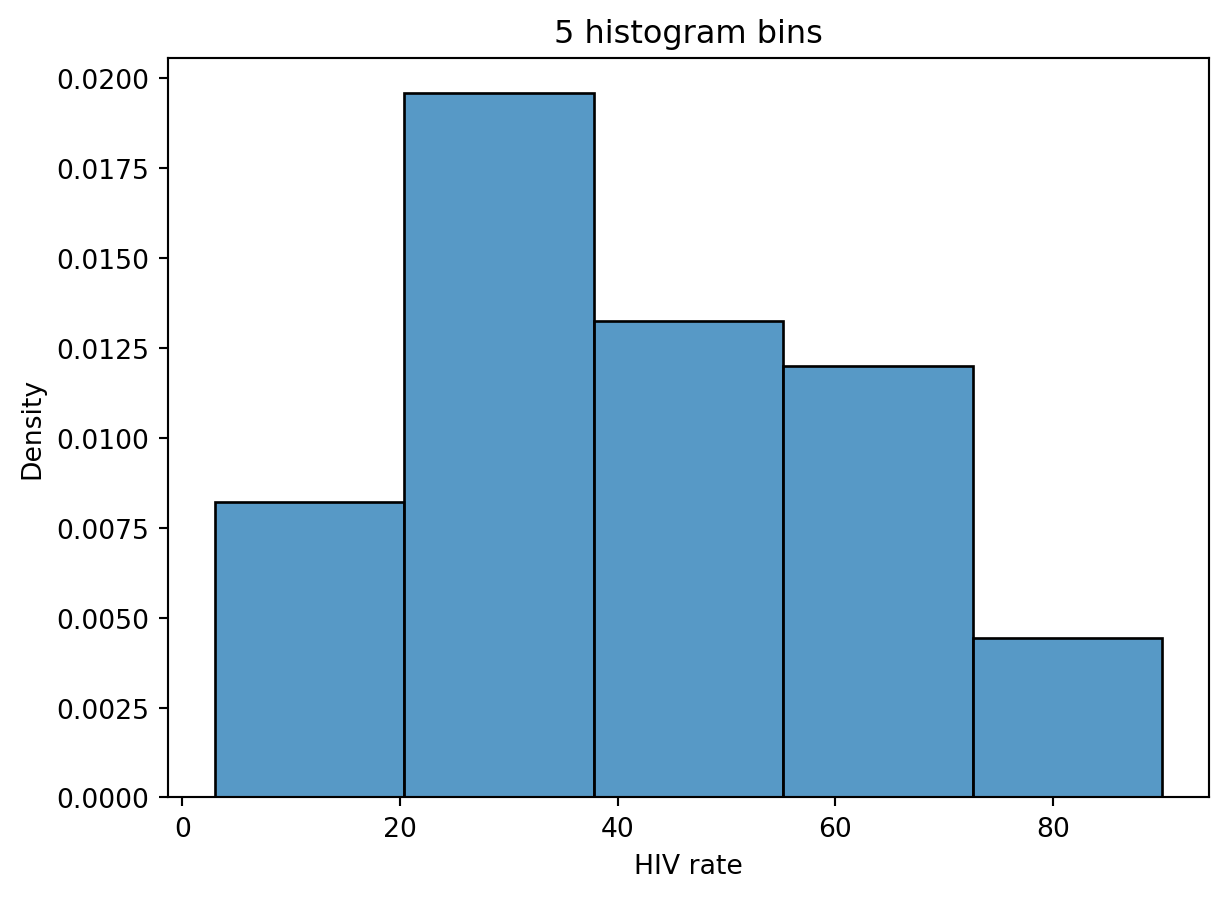
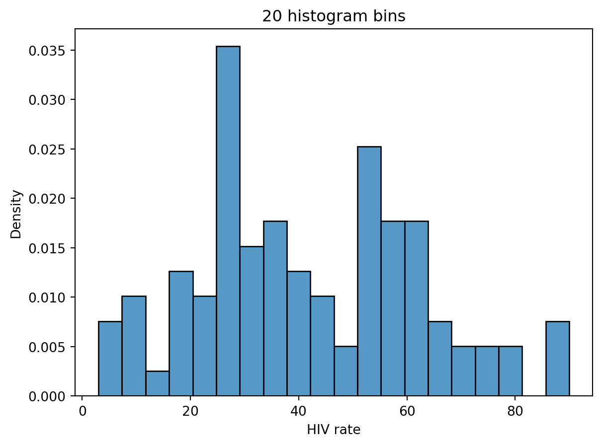
The mode is the most frequent value in a distribution. In Data 100, we describe a “mode” of a histogram as a peak in the distribution. As there may be multiple “peaks” in a distribution, we can talk about multiple modes. Often, however, it is difficult to determine what counts as its own “peak.” For example, the number of peaks in the distribution of HIV rates across different countries varies depending on the number of histogram bins we plot.
If we set the number of bins to 5, the distribution appears unimodal (has one clear peak/mode).
# Rename the very long column name for conveniencewb = wb.rename(columns={'Antiretroviral therapy coverage: % of people living with HIV: 2015':"HIV rate"})# With 5 bins, it seems that there is only one peaksns.histplot(data=wb, x="HIV rate", stat="density", bins=5)plt.title("5 histogram bins");
# With 10 bins, there seem to be two peakssns.histplot(data=wb, x="HIV rate", stat="density", bins=10)plt.title("10 histogram bins");
If a distribution has two peaks/modes, it is called bimodal. If a distribution has more peaks than that, we say it is multimodal.
# And with 20 bins, it becomes hard to say what counts as a "peak"!sns.histplot(data=wb, x ="HIV rate", stat="density", bins=20)plt.title("20 histogram bins");
In part, it is these ambiguities that motivate us to consider using Kernel Density Estimation (KDE), which we will explore more later in this note.
7.6.1.3.3 Outliers
In a loose sense, an outlier is a data point that lies an abnormally large distance away from other values. However, in order to make this more concrete, we define outliers using quartiles.
7.6.1.3.3.1 Quartiles
Quartiles are a way of dividing data points into four quarters of roughly equal size. Each of the four quartiles is defined by its percentile.
For a quantitative variable:
The 1st quartile (Q1) is the 25th percentile of the distribution; 25% of the data is smaller than or equal to Q1.
The 2nd quartile (Q2) is the 50th percentile of the distribution, or equivalently the median of the distribution. 50% of the data is smaller than or equal to Q2.
The 3rd quartile (Q3) is the 75th percentile of the distribution; 75% of the data is smaller than or equal to Q3.
The interval [Q1, Q3] contains the “middle 50% of the data.”
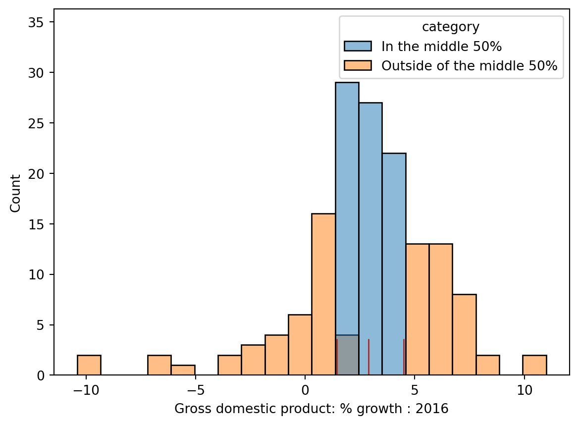
This concept is illustrated in the histogram below, where the three quartiles are marked with red vertical bars.R)
The Interquartile range (IQR) is a measure of spread of a distribution. You can calculate the IQR of a distribution with the formula below.
IQR = Q3 - Q1
We define outliers by the following formula:
Values > Q3 \(+\) (\(1.5\times\) IQR)
Values < Q1 \(-\) (\(1.5\times\) IQR)
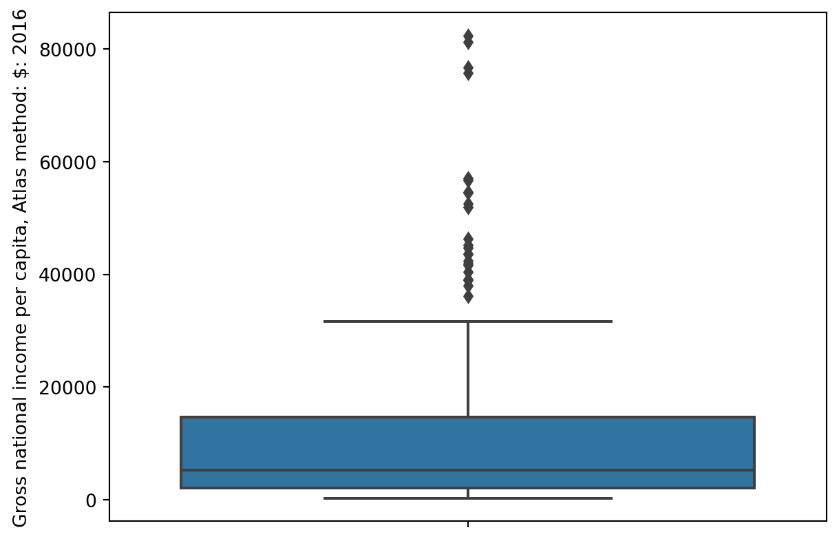
7.6.2 Box Plots
Box plots display the distribution of a variable using information about quartiles.
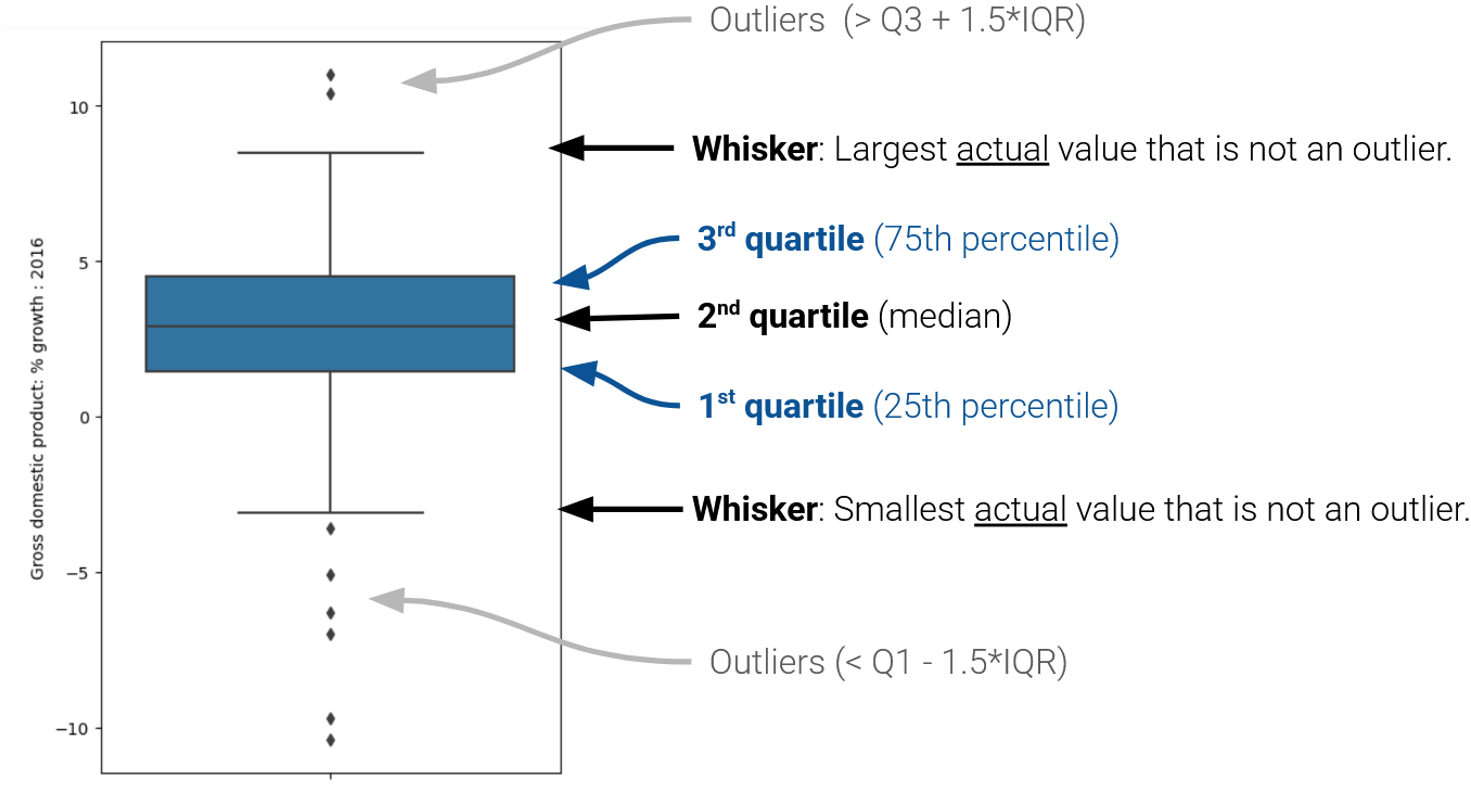
In a box plot, the lower extent of the box lies at Q1, while the upper extent of the box lies at Q3. The horizontal line in the middle of the box corresponds to Q2 (equivalently, the median). This can be seen in the box plot below.
The whiskers of a box-plot are the two points that lie at the [\(1^{st}\) Quartile \(-\) (\(1.5\times\) IQR)], and the [\(3^{rd}\) Quartile \(+\) (\(1.5\times\) IQR)]. They are the lower and upper ranges of “normal” data (the points excluding outliers).
The different forms of information contained in a box plot can be summarised as follows:
7.6.3 Side-by-Side Box plots
Plotting side-by-side box plots allows us to compare distributions across different categories. In other words, they enable us to plot both a qualitative variable and a quantitative variable in one visualization.
With seaborn, we can easily create side-by-side plots by specifying both an x and y column.
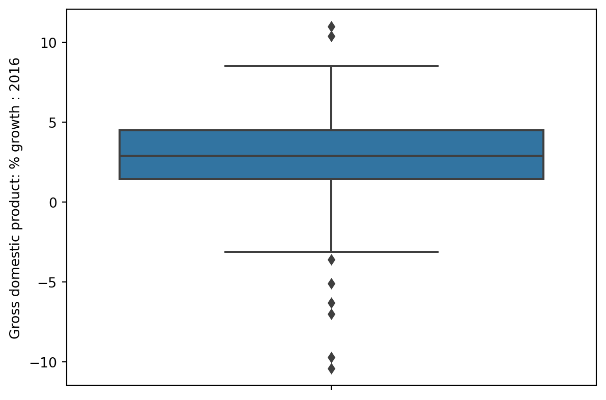
In the example below, we plot the distribution of a quantitative variable, GDP % growth, across different categories, which are different continents in this case
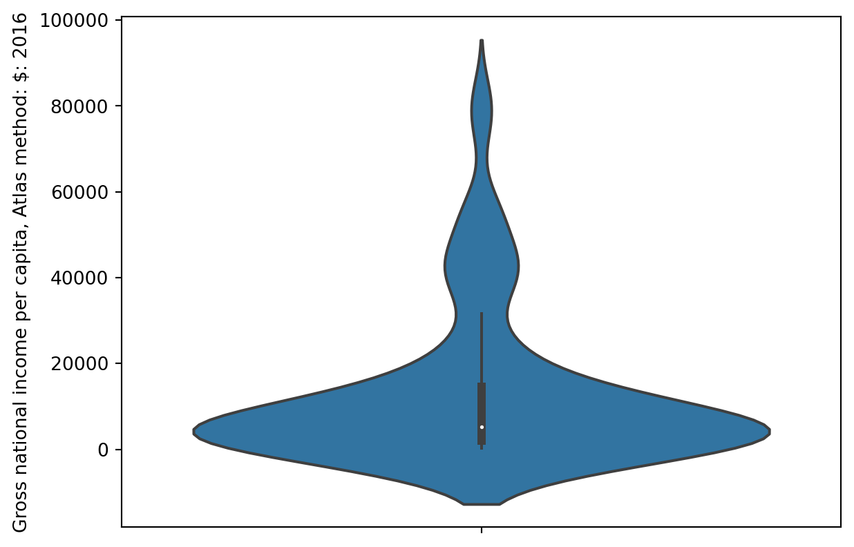
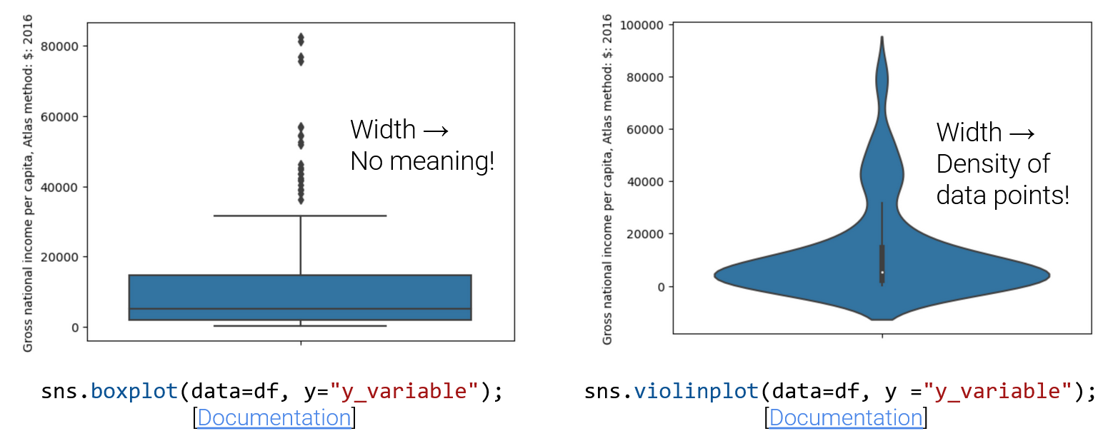
Violin plots are just box plots with smoothed density curves. The width indicates the density of points. Q1, the median, Q3, and whiskers are still present, just harder to see at first.
sns.violinplot(data=wb, y="Gross national income per capita, Atlas method: $: 2016");
Look closely at the center vertical bar of the violin plot above; the three quartiles and “whiskers” are still present!
Important note about Violin plots:
Can violin plots or box plots display modality?
Violin plots can display modality, and box plots cannot! The distribution in the violin plot above is (arguably) multimodal. We see one peak/mode around the median, and two others at higher values.You cannot tell this from a boxplot of the same information alone (We plotted this same distribution as a box plot earlier in these notes).
Observe that the width of a box in a box plot has no meaning, but the width in a violin plot is meaningful, and gives us information about the density of data points at a given range of values!
Since a violin plot contains all the information that a box plot, as well as information about modality/density of points, you may wonder why we still use box plots. The choice between a box plot and a violin plot will depend on if the density of points is useful information about the distribution you’re trying to visualize. If the density of points is not useful information, it can distract from information you are trying to highlight about the distribution.
7.7 Kernel Density Estimation
Often, we want to identify general trends across a distribution, rather than focus on detail. Smoothing a distribution helps generalize the structure of the data and eliminate noise.
7.7.1 KDE Theory
A kernel density estimate (KDE) is a smooth, continuous function that approximates a curve. It allows us to represent general trends in a distribution without focusing on the details, which is useful for analyzing the broad structure of a dataset.
More formally, a KDE attempts to approximate the underlying probability distribution from which our dataset was drawn. You may have encountered the idea of a probability distribution in your other classes; if not, we’ll discuss it at length in the next lecture. For now, you can think of a probability distribution as a description of how likely it is for us to sample a particular value in our dataset.
A KDE curve estimates the probability density function of a random variable. Consider the example below, where we have used sns.displot to plot both a histogram (containing the data points we actually collected) and a KDE curve (representing the approximated probability distribution from which this data was drawn) using data from the World Bank dataset (wb).
Code
import pandas as pdimport numpy as npimport matplotlib.pyplot as pltimport seaborn as snsimport warnings warnings.filterwarnings("ignore", "use_inf_as_na") # Supresses distracting deprecation warningswb = pd.read_csv("data/world_bank.csv", index_col=0)wb = wb.rename(columns={'Antiretroviral therapy coverage: % of people living with HIV: 2015':"HIV rate",'Gross national income per capita, Atlas method: $: 2016':'gni'})wb.head()
Continent
Country
Primary completion rate: Male: % of relevant age group: 2015
Primary completion rate: Female: % of relevant age group: 2015
Lower secondary completion rate: Male: % of relevant age group: 2015
Lower secondary completion rate: Female: % of relevant age group: 2015
Youth literacy rate: Male: % of ages 15-24: 2005-14
Youth literacy rate: Female: % of ages 15-24: 2005-14
Adult literacy rate: Male: % ages 15 and older: 2005-14
Adult literacy rate: Female: % ages 15 and older: 2005-14
...
Access to improved sanitation facilities: % of population: 1990
Access to improved sanitation facilities: % of population: 2015
Child immunization rate: Measles: % of children ages 12-23 months: 2015
Child immunization rate: DTP3: % of children ages 12-23 months: 2015
Children with acute respiratory infection taken to health provider: % of children under age 5 with ARI: 2009-2016
Children with diarrhea who received oral rehydration and continuous feeding: % of children under age 5 with diarrhea: 2009-2016
Children sleeping under treated bed nets: % of children under age 5: 2009-2016
Children with fever receiving antimalarial drugs: % of children under age 5 with fever: 2009-2016
Tuberculosis: Treatment success rate: % of new cases: 2014
Tuberculosis: Cases detection rate: % of new estimated cases: 2015
0
Africa
Algeria
106.0
105.0
68.0
85.0
96.0
92.0
83.0
68.0
...
80.0
88.0
95.0
95.0
66.0
42.0
NaN
NaN
88.0
80.0
1
Africa
Angola
NaN
NaN
NaN
NaN
79.0
67.0
82.0
60.0
...
22.0
52.0
55.0
64.0
NaN
NaN
25.9
28.3
34.0
64.0
2
Africa
Benin
83.0
73.0
50.0
37.0
55.0
31.0
41.0
18.0
...
7.0
20.0
75.0
79.0
23.0
33.0
72.7
25.9
89.0
61.0
3
Africa
Botswana
98.0
101.0
86.0
87.0
96.0
99.0
87.0
89.0
...
39.0
63.0
97.0
95.0
NaN
NaN
NaN
NaN
77.0
62.0
5
Africa
Burundi
58.0
66.0
35.0
30.0
90.0
88.0
89.0
85.0
...
42.0
48.0
93.0
94.0
55.0
43.0
53.8
25.4
91.0
51.0
5 rows × 47 columns
import seaborn as snsimport matplotlib.pyplot as pltsns.displot(data = wb, x ='HIV rate', \ kde =True, stat ="density")plt.title("Distribution of HIV rates");
Notice that the smooth KDE curve is higher when the histogram bins are taller. You can think of the height of the KDE curve as representing how “probable” it is that we randomly sample a datapoint with the corresponding value. This intuitively makes sense – if we have already collected more datapoints with a particular value (resulting in a tall histogram bin), it is more likely that, if we randomly sample another datapoint, we will sample one with a similar value (resulting in a high KDE curve).
The area under a probability density function should always integrate to 1, representing the fact that the total probability of a distribution should always sum to 100%. Hence, a KDE curve will always have an area under the curve of 1.
7.7.2 Constructing a KDE
We perform kernel density estimation using three steps.
Place a kernel at each datapoint.
Normalize the kernels to have a total area of 1 (across all kernels).
Sum the normalized kernels.
We’ll explain what a “kernel” is momentarily.
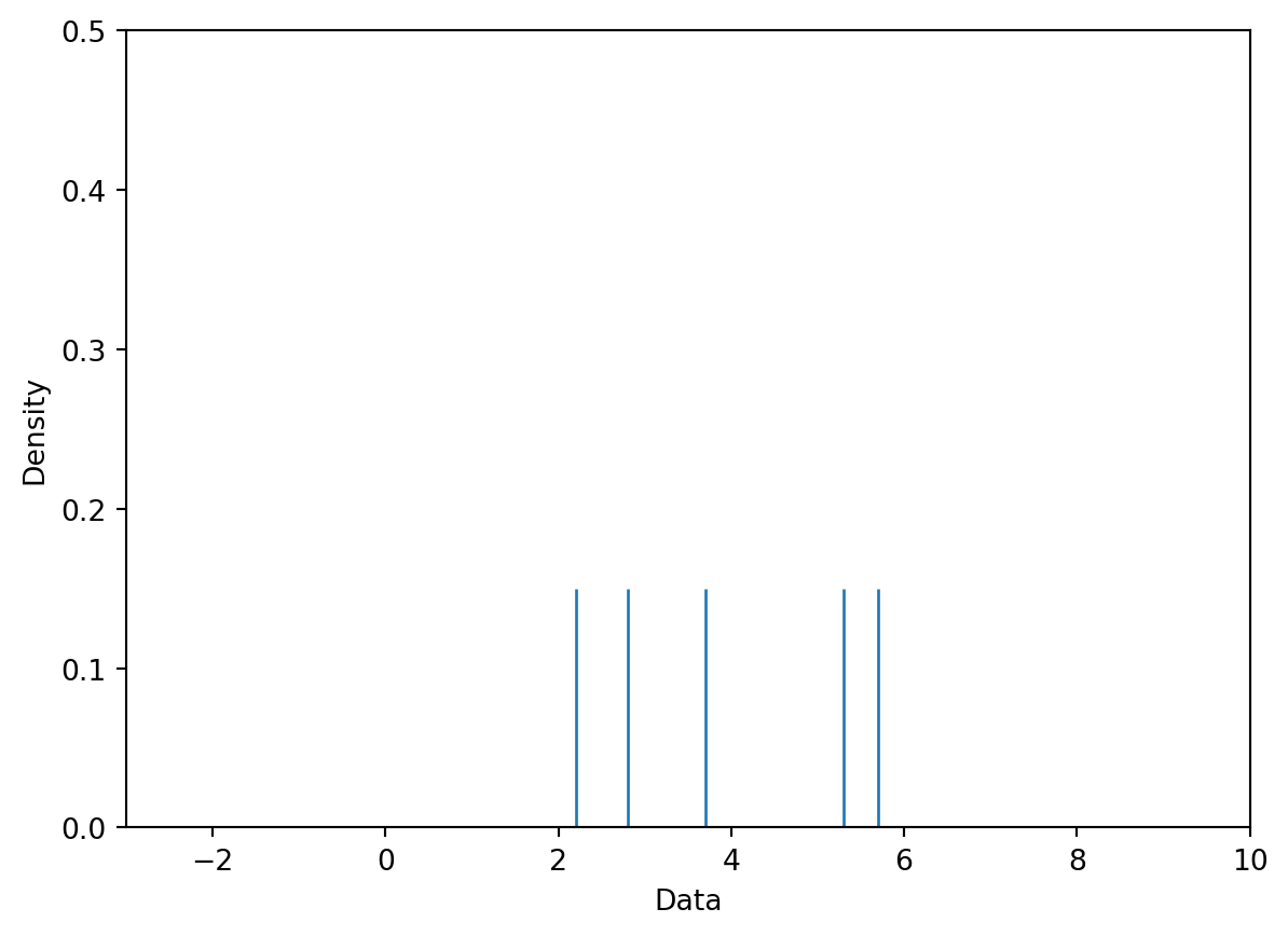
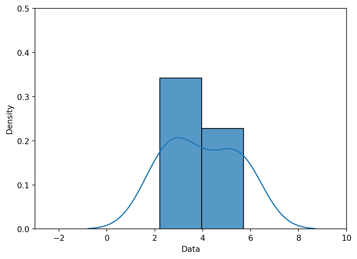
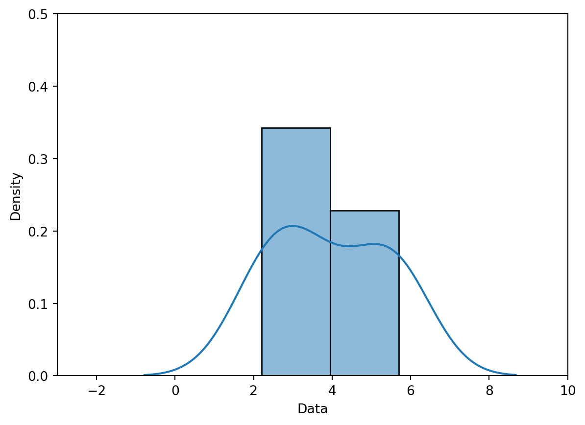
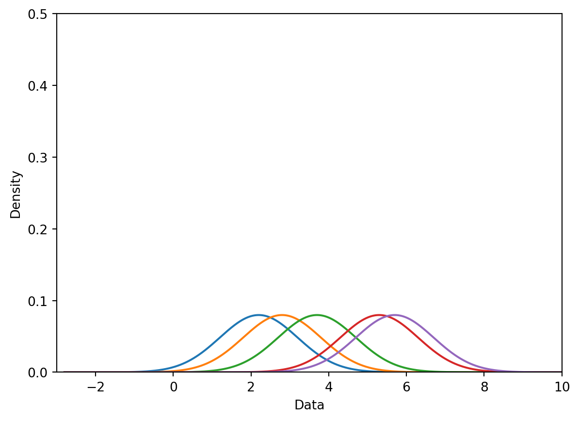
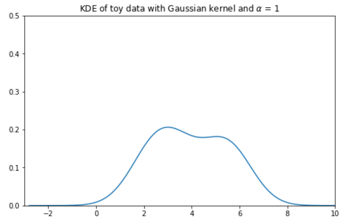
To make things simpler, let’s construct a KDE for a small, artificially generated dataset of 5 datapoints: \([2.2, 2.8, 3.7, 5.3, 5.7]\). In the plot below, each vertical bar represents one data point.
Code
data = [2.2, 2.8, 3.7, 5.3, 5.7]sns.rugplot(data, height=0.3)plt.xlabel("Data")plt.ylabel("Density")plt.xlim(-3, 10)plt.ylim(0, 0.5);
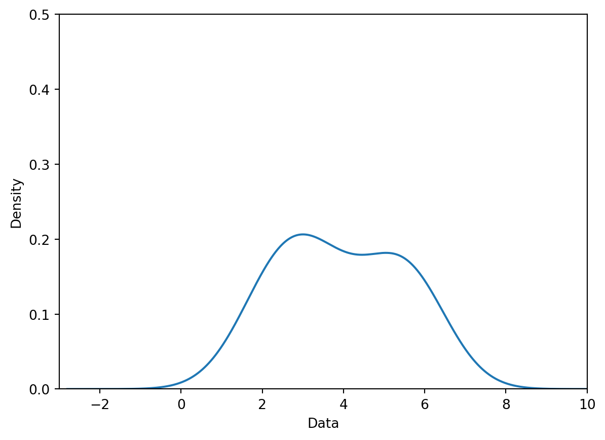
Our goal is to create the following KDE curve, which was generated automatically by sns.kdeplot.
Alternatively, we can use sns.histplot. You can also get a very similar result in a single call by requesting the KDE be added to the histogram, with kde=True and some extra keywords:
To begin generating a density curve, we need to choose a kernel and bandwidth value (\(\alpha\)). What are these exactly?
A kernel is a density curve. It is the mathematical function that attempts to capture the randomness of each data point in our sampled data. To explain what this means, consider just one of the datapoints in our dataset: \(2.2\). We obtained this datapoint by randomly sampling some information out in the real world (you can imagine \(2.2\) as representing a single measurement taken in an experiment, for example). If we were to sample a new datapoint, we may obtain a slightly different value. It could be higher than \(2.2\); it could also be lower than \(2.2\). We make the assumption that any future sampled datapoints will likely be similar in value to the data we’ve already drawn. This means that our kernel – our description of the probability of randomly sampling any new value – will be greatest at the datapoint we’ve already drawn but still have non-zero probability above and below it. The area under any kernel should integrate to 1, representing the total probability of drawing a new datapoint.
A bandwidth value, usually denoted by \(\alpha\), represents the width of the kernel. A large value of \(\alpha\) will result in a wide, short kernel function, while a small value with result in a narrow, tall kernel.
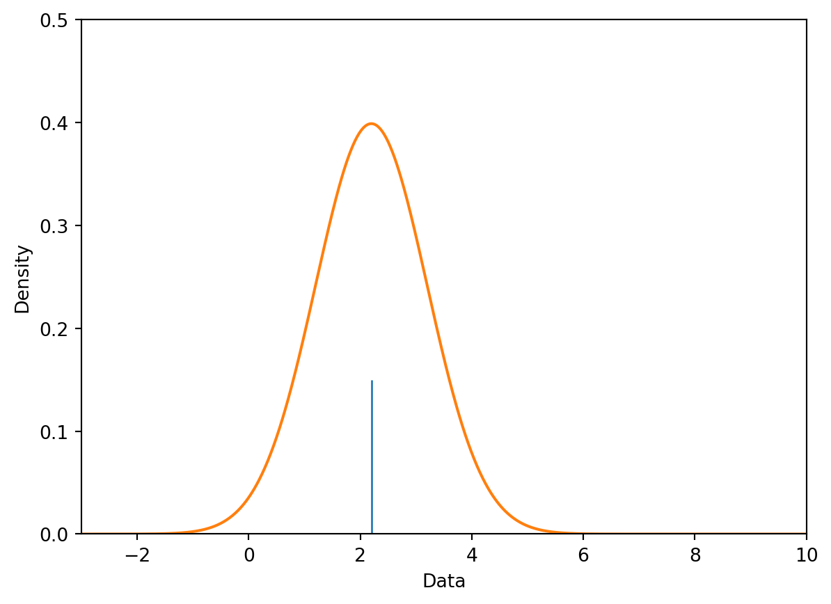
Below, we place a Gaussian kernel, plotted in orange, over the datapoint \(2.2\). A Gaussian kernel is simply the normal distribution, which you may have called a bell curve in Data 8.
Code
def gaussian_kernel(x, z, a):# We'll discuss where this mathematical formulation came from laterreturn (1/np.sqrt(2*np.pi*a**2)) * np.exp((-(x - z)**2/ (2* a**2)))# Plot our datapointsns.rugplot([2.2], height=0.3)# Plot the kernelx = np.linspace(-3, 10, 1000)plt.plot(x, gaussian_kernel(x, 2.2, 1))plt.xlabel("Data")plt.ylabel("Density")plt.xlim(-3, 10)plt.ylim(0, 0.5);
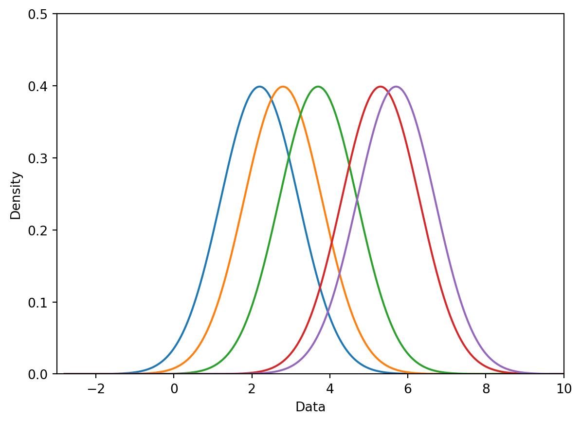
To begin creating our KDE, we place a kernel on each datapoint in our dataset. For our dataset of 5 points, we will have 5 kernels.
Code
# You will work with the functions below in Lab 4def create_kde(kernel, pts, a):# Takes in a kernel, set of points, and alpha# Returns the KDE as a functiondef f(x): output =0for pt in pts: output += kernel(x, pt, a)return output /len(pts) # Normalization factorreturn fdef plot_kde(kernel, pts, a):# Calls create_kde and plots the corresponding KDE f = create_kde(kernel, pts, a) x = np.linspace(min(pts) -5, max(pts) +5, 1000) y = [f(xi) for xi in x] plt.plot(x, y);def plot_separate_kernels(kernel, pts, a, norm=False):# Plots individual kernels, which are then summed to create the KDE x = np.linspace(min(pts) -5, max(pts) +5, 1000)for pt in pts: y = kernel(x, pt, a)if norm: y /=len(pts) plt.plot(x, y) plt.show();plt.xlim(-3, 10)plt.ylim(0, 0.5)plt.xlabel("Data")plt.ylabel("Density")plot_separate_kernels(gaussian_kernel, data, a =1)
7.7.2.2 Step 2: Normalize Kernels to Have a Total Area of 1
Above, we said that each kernel has an area of 1. Earlier, we also said that our goal is to construct a KDE curve using these kernels with a total area of 1. If we were to directly sum the kernels as they are, we would produce a KDE curve with an integrated area of (5 kernels) \(\times\) (area of 1 each) = 5. To avoid this, we will normalize each of our kernels. This involves multiplying each kernel by \(\frac{1}{\#\:\text{datapoints}}\).
In the cell below, we multiply each of our 5 kernels by \(\frac{1}{5}\) to apply normalization.
Code
plt.xlim(-3, 10)plt.ylim(0, 0.5)plt.xlabel("Data")plt.ylabel("Density")# The `norm` argument specifies whether or not to normalize the kernelsplot_separate_kernels(gaussian_kernel, data, a =1, norm =True)
7.7.2.3 Step 3: Sum the Normalized Kernels
Our KDE curve is the sum of the normalized kernels. Notice that the final curve is identical to the plot generated by sns.kdeplot we saw earlier!
Note that it would be equivalent to sum the kernels and then normalize the result.
7.7.3 Mathematical Notation of KDE
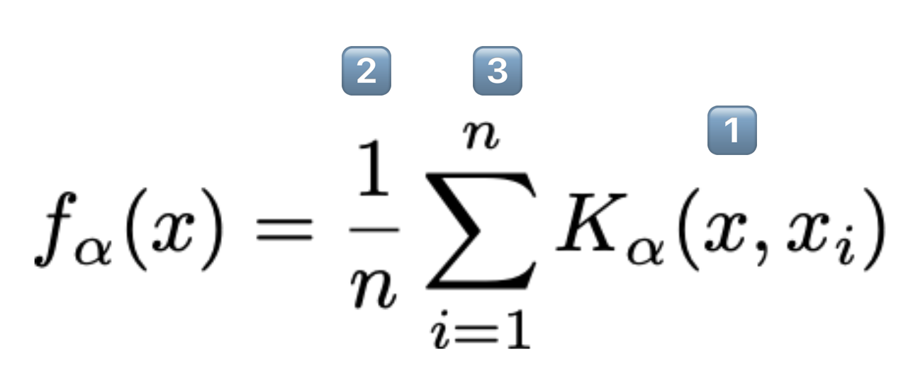
A general “KDE formula” function is given above.
\(f_{\alpha}(x)\) is the end result.\(\rightarrow\)Height of the final KDE curve at any x-value.
\(K_{\alpha}(x, x_i)\) is the kernel centered on the observation i.
Each kernel individually has area 1.
x represents any number on the number line. It is the input to our function.
\(n\) is the number of observed datapoints that we have.
We multiply by \(\frac{1}{n}\) so that the total area of the KDE is still 1.
Each \(x_i \in \{x_1, x_2, \dots, x_n\}\) represents an observed datapoint.
These are what we use to create our KDE by summing multiple shifted kernels centered at these points.
\(\alpha\) (alpha) is the bandwidth or smoothing parameter.
A kernel (for our purposes) is a valid density function. This means it:
Must be non-negative for all inputs.
Must integrate to 1.
7.7.3.1 Gaussian Kernel
The most common kernel is the Gaussian kernel. The Gaussian kernel is equivalent to the Gaussian probability density function (the Normal distribution), centered at the observed value with a standard deviation of \(\alpha\) (this is known as the bandwidth parameter).
\(x\) (no subscript) represents any value along the x-axis of our plot
\(x_i\) represents the \(i\) -th datapoint in our dataset. It is one of the values that we have actually collected in our data sampling process. In our example earlier, \(x_i=2.2\). Those of you who have taken a probability class may recognize \(x_i\) as the mean of the normal distribution.
Each kernel is centered on our observed values, so its distribution mean is \(x_i\).
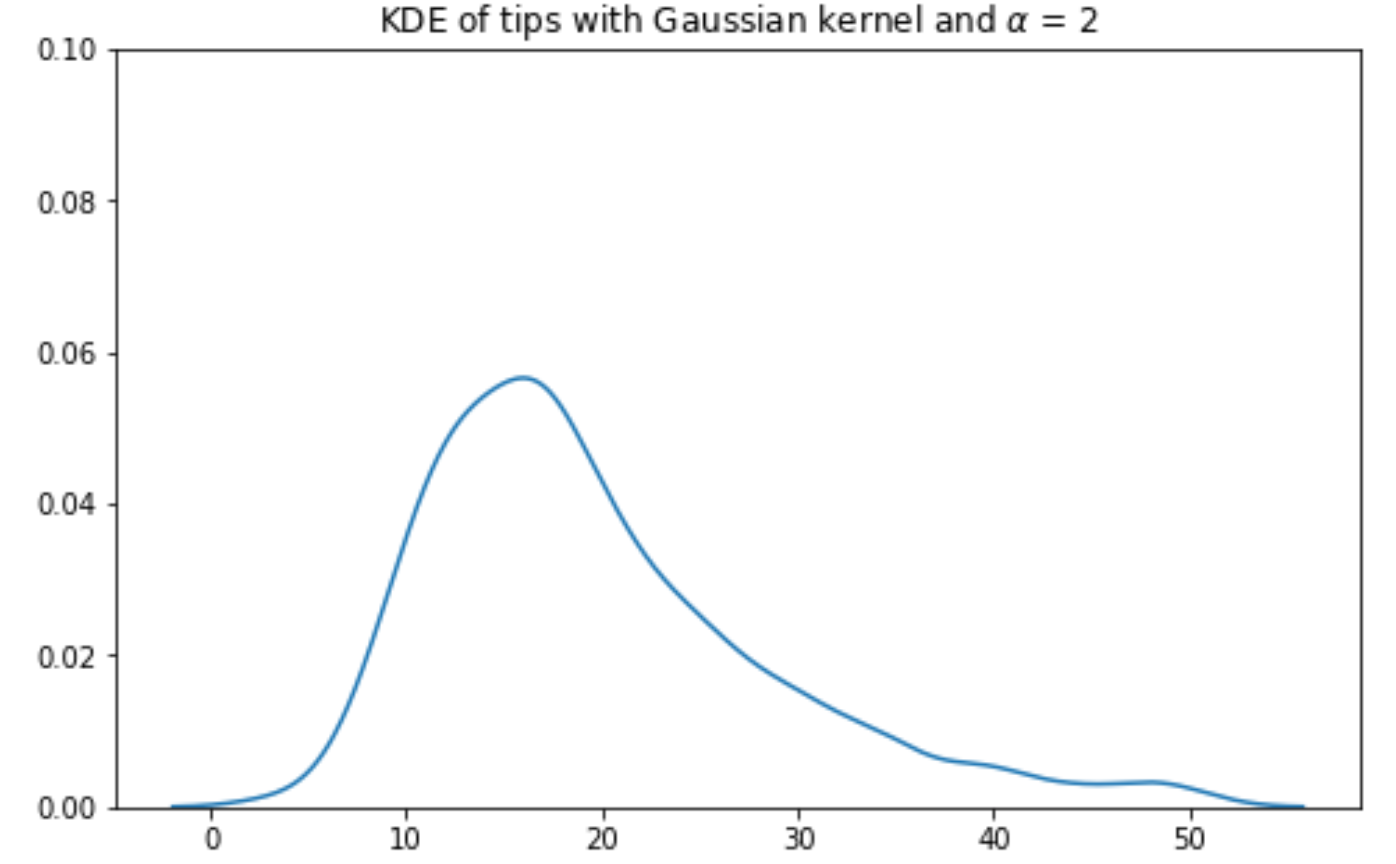
\(\alpha\) is the bandwidth parameter, representing the width of our kernel. More formally, \(\alpha\) is the standard deviation of the Gaussian curve.
A large value of \(\alpha\) will produce a kernel that is wider and shorter – this leads to a smoother KDE when the kernels are summed together.
A small value of \(\alpha\) will produce a narrower, taller kernel, and, with it, a noisier KDE.
The details of this (admittedly intimidating) formula are less important than understanding its role in kernel density estimation – this equation gives us the shape of each kernel.
Gaussian Kernel, \(\alpha\) = 0.1
Gaussian Kernel, \(\alpha\) = 1
Gaussian Kernel, \(\alpha\) = 2
Gaussian Kernel, \(\alpha\) = 5
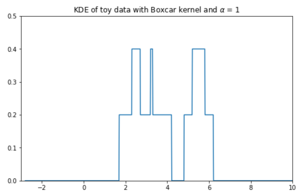
7.7.3.2 Boxcar Kernel
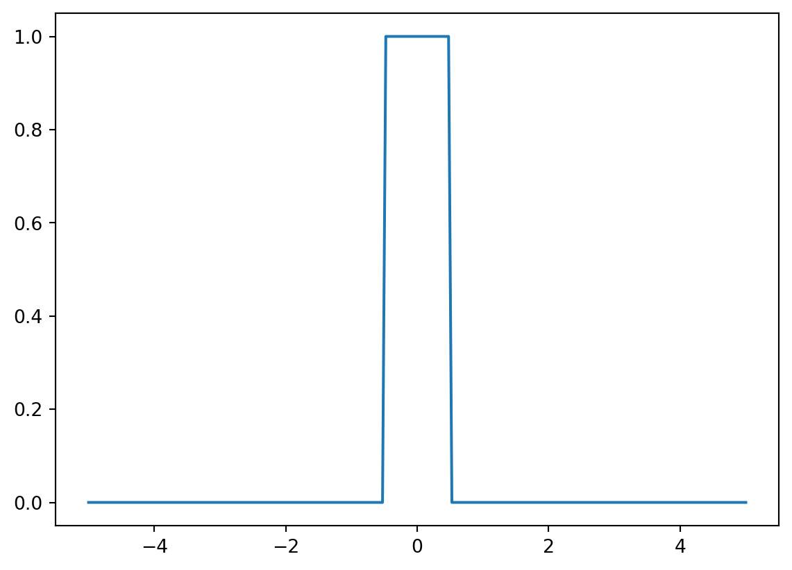
Another example of a kernel is the Boxcar kernel. The boxcar kernel assigns a uniform density to points within a “window” of the observation, and a density of 0 elsewhere. The equation below is a boxcar kernel with the center at \(x_i\) and the bandwidth of \(\alpha\).
The boxcar kernel is seldom used in practice – we include it here to demonstrate that a kernel function can take whatever form you would like, provided it integrates to 1 and does not output negative values.
Code
def boxcar_kernel(alpha, x, z):return (((x-z)>=-alpha/2)&((x-z)<=alpha/2))/alphaxs = np.linspace(-5, 5, 200)alpha=1kde_curve = [boxcar_kernel(alpha, x, 0) for x in xs]plt.plot(xs, kde_curve);
The Boxcar kernel centered at 0 with bandwidth \(\alpha\) = 1.
The diagram on the right is how the density curve for our 5 point dataset would have looked had we used the Boxcar kernel with bandwidth \(\alpha\) = 1.
KDE
Boxcar
We’ll continue covering visualization in the next lecture!