Code
import warnings
warnings.filterwarnings("ignore")

import pandas as pd
import numpy as np
import matplotlib.pyplot as plt
np.seterr(divide='ignore')
{'divide': 'warn', 'over': 'warn', 'under': 'ignore', 'invalid': 'warn'}Today, we will continue studying the Logistic Regression model and discuss decision boundaries that help inform the classification of a particular prediction and learn about linear separability. Starting off from cross-entropy loss, we’ll study a few of its pitfalls, and learn potential remedies. We will also provide an implementation of sklearn’s logistic regression model. Lastly, we’ll return to decision rules and discuss metrics that allow us to determine our model’s performance in different scenarios.
This will introduce us to the process of thresholding – a technique used to classify data from our model’s predicted probabilities, or \(P(Y=1|x)\). In doing so, we’ll focus on how these thresholding decisions affect the behavior of our model and learn various evaluation metrics useful for binary classification, and apply them to our study of logistic regression.
To quantify the error of our logistic regression model, we’ll need to define a new loss function.
You may wonder: why not use our familiar mean squared error? It turns out that the MSE is not well suited for logistic regression. To see why, let’s consider a simple, artificially generated toy dataset with just one feature (this will be easier to work with than the more complicated games data).
import warnings
warnings.filterwarnings("ignore")
import pandas as pd
import numpy as np
import matplotlib.pyplot as plt
np.seterr(divide='ignore'){'divide': 'warn', 'over': 'warn', 'under': 'ignore', 'invalid': 'warn'}toy_df = pd.DataFrame({
"x": [-4, -2, -0.5, 1, 3, 5],
"y": [0, 0, 1, 0, 1, 1]})
toy_df.head()| x | y | |
|---|---|---|
| 0 | -4.0 | 0 |
| 1 | -2.0 | 0 |
| 2 | -0.5 | 1 |
| 3 | 1.0 | 0 |
| 4 | 3.0 | 1 |
We’ll construct a basic logistic regression model with only one feature and no intercept term. Our predicted probabilities take the form:
\[p=\hat{P}_\theta(Y=1|x)= \sigma({x^{T}\theta}) = \frac{1}{1+e^{-\theta_1 x}}\]
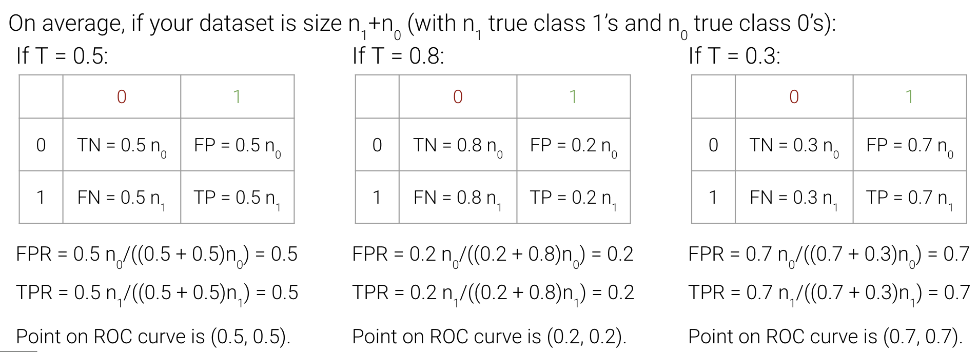
In the cell below, we plot the MSE for our model on the data.
def sigmoid(z):
return 1/(1+np.e**(-z))
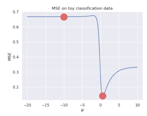
def mse_on_toy_data(theta):
p_hat = sigmoid(toy_df['x'] * theta)
return np.mean((toy_df['y'] - p_hat)**2)
thetas = np.linspace(-15, 5, 100)
plt.plot(thetas, [mse_on_toy_data(theta) for theta in thetas])
plt.title("MSE on toy classification data")
plt.xlabel(r'$\theta_1$')
plt.ylabel('MSE');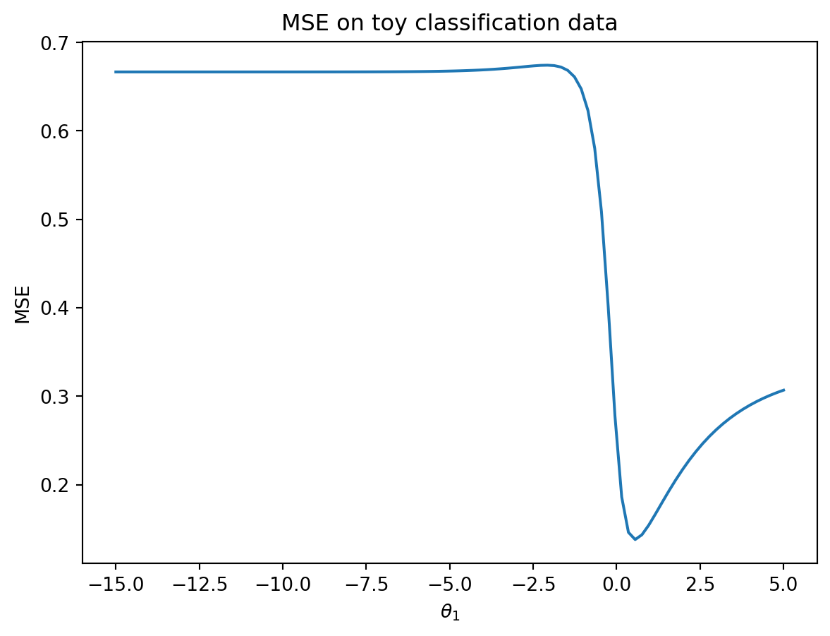
This looks nothing like the parabola we found when plotting the MSE of a linear regression model! In particular, we can identify two flaws with using the MSE for logistic regression:
Suffice to say, we don’t want to use the MSE when working with logistic regression. Instead, we’ll consider what kind of behavior we would like to see in a loss function.
Let \(y\) be the binary label (it can either be 0 or 1), and \(p\) be the model’s predicted probability of the label \(y\) being 1.
In other words, our loss function should behave differently depending on the value of the true class, \(y\).
The cross-entropy loss incorporates this changing behavior. We will use it throughout our work on logistic regression. Below, we write out the cross-entropy loss for a single datapoint (no averages just yet). Again let \(y\) be a binary label {0, 1}, and \(p\) be the probability of the label being 1.
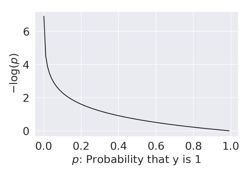
\[\text{Cross-Entropy Loss} = \begin{cases} -\log{(p)} & \text{if } y=1 \\ -\log{(1-p)} & \text{if } y=0 \end{cases}\]
Why does this (seemingly convoluted) loss function “work”? Let’s break it down.
| When \(y=1\) | When \(y=0\) |
|---|---|
 |
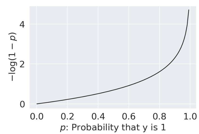 |
| As \(p \rightarrow 0\), loss approches \(\infty\) | As \(p \rightarrow 0\), loss approches 0 |
| As \(p \rightarrow 1\), loss approaches 0 | As \(p \rightarrow 1\), loss approaches \(\infty\) |
All good – we are seeing the behavior we want for our logistic regression model.
The piecewise function we outlined above is difficult to optimize: we don’t want to constantly “check” which form of the loss function we should be using at each step of choosing the optimal model parameters. We can re-express cross-entropy loss in a more convenient way:
\[\text{Cross-Entropy Loss} = -\left(y\log{(p)}+(1-y)\log{(1-p)}\right)\]
By setting \(y\) to 0 or 1, we see that this new form of cross-entropy loss gives us the same behavior as the original formulation. Another way to think about this is that in either scenario (y being equal to 0 or 1), only one of the cross-entropy loss terms is activated, which gives us a convenient way to combine the two independent loss functions.
When \(y=1\):
\[\begin{align} \text{CE} &= -\left((1)\log{(p)}+(1-1)\log{(1-p)}\right)\\ &= -\log{(p)} \end{align}\]
When \(y=0\):
\[\begin{align} \text{CE} &= -\left((0)\log{(p)}+(1-0)\log{(1-p)}\right)\\ &= -\log{(1-p)} \end{align}\]
The empirical risk of the logistic regression model is then the mean cross-entropy loss across all datapoints in the dataset. When fitting the model, we want to determine the model parameter \(\theta\) that leads to the lowest mean cross-entropy loss possible. For logistic regression, the empirical risk over a sample of size n is:
\[ \begin{align} R(\theta) &= - \frac{1}{n} \sum_{i=1}^n \left(y_i\log{(p_i)}+(1-y_i)\log{(1-p_i)}\right) \\ &= - \frac{1}{n} \sum_{i=1}^n \left(y_i\log{\sigma(\mathbb{X}_i^{\top}\theta)}+(1-y_i)\log{(1-\sigma(\mathbb{X}_i^{\top}\theta))}\right) \end{align} \]
The optimization problem is therefore to find the estimate \(\hat{\theta}\) that minimizes \(R(\theta)\):
\[ \hat{\theta} = \underset{\theta}{\arg\min} - \frac{1}{n} \sum_{i=1}^n \left(y_i\log{(\sigma(\mathbb{X}_i^{\top}\theta))}+(1-y_i)\log{(1-\sigma(\mathbb{X}_i^{\top}\theta))}\right) \]
Plotting the cross-entropy loss surface for our toy dataset gives us a more encouraging result – our loss function is now convex. This means we can optimize it using gradient descent. Computing the gradient of the logistic model is fairly challenging, so we’ll let sklearn take care of this for us. You won’t need to compute the gradient of the logistic model in Data 100.
def cross_entropy(y, p_hat):
    return - y * np.log(p_hat) - (1 - y) * np.log(1 - p_hat)

def mean_cross_entropy_on_toy_data(theta):
    p_hat = sigmoid(toy_df['x'] * theta)
    return np.mean(cross_entropy(toy_df['y'], p_hat))

plt.plot(thetas, [mean_cross_entropy_on_toy_data(theta) for theta in thetas], color = 'green')
plt.ylabel(r'Mean Cross-Entropy Loss($\theta$)')
plt.xlabel(r'$\theta$');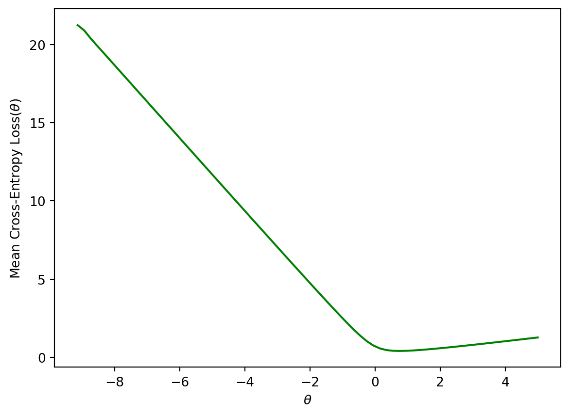
Let’s start with a recap of decision boundaries that we covered at the end of the previous lecture. In logistic regression, we model the probability that a datapoint belongs to Class 1.
In the last lecture, we developed the logistic regression model to predict that probability, but we never actually made any classifications for whether our prediction \(y\) belongs in Class 0 or Class 1.
\[ p = \hat{P}_\theta(Y=1 | x) = \frac{1}{1 + e^{-x^{\top}\theta}}\]
A decision rule tells us how to interpret the output of the model to make a decision on how to classify a datapoint. We commonly make decision rules by specifying a threshold, \(T\). If the predicted probability is greater than or equal to \(T\), predict Class 1. Otherwise, predict Class 0.
\[\hat y = \text{classify}(x) = \begin{cases} \text{Class 1}, & p \ge T\\ \text{Class 0}, & p < T \end{cases}\]
The threshold is often set to \(T = 0.5\), but not always. We’ll discuss why we might want to use other thresholds \(T \neq 0.5\) later in this lecture.
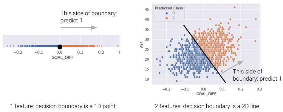
Using our decision rule, we can define a decision boundary as the “line” that splits the data into classes based on its features. For logistic regression, since we are working in \(p\) dimensions, the decision boundary is a hyperplane – a linear combination of the features in \(p\)-dimensions – and we can recover it from the final logistic regression model. For example, if we have a model with 2 features (2D), we have \(\theta = [\theta_0, \theta_1, \theta_2]\) including the intercept term, and we can solve for the decision boundary like so:
\[ \begin{align} T &= \frac{1}{1 + e^{-(\theta_0 + \theta_1 * \text{feature1} + \theta_2 * \text{feature2})}} \\ 1 + e^{-(\theta_0 + \theta_1 \cdot \text{feature1} + \theta_2 \cdot \text{feature2})} &= \frac{1}{T} \\ e^{-(\theta_0 + \theta_1 \cdot \text{feature1} + \theta_2 \cdot \text{feature2})} &= \frac{1}{T} - 1 \\ \theta_0 + \theta_1 \cdot \text{feature1} + \theta_2 \cdot \text{feature2} &= -\log(\frac{1}{T} - 1) \end{align} \]
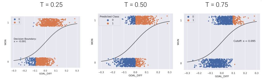
For a model with 2 features, the decision boundary is a line in terms of its features. Let’s prove this by again looking at the basketball example from the previous lecture where our two features are GOAL_DIFF and AST. Rewriting the previous equation in terms of these features, we get the following:
\[\theta_0 + \theta_1 \cdot \text{GOAL\_DIFF} + \theta_2 \cdot \text{AST} = -\log(\frac{1}{T} - 1)\]
Now if we assume that the threshold T = 0.5, then \(\log(\frac{1}{0.5} - 1) = \log(1) = 0\), so substituting this in and rearranging terms, we get the following:
\[ \begin{align} 0 &= \theta_0 + \theta_1 \cdot \text{GOAL\_DIFF} + \theta_2 \cdot \text{AST} \\ \text{AST} &= \frac{\theta_0 + \theta_1 \cdot \text{GOAL\_DIFF}}{-\theta_2} \end{align} \]
This is the equation of a line of form \(y=mx+b\) relating AST to GOAL_DIFF, so we’ve just proved that the decision boundary is a hyperplane that can split points into two classes! To make it easier to visualize, we’ve included an example of a 1-dimensional and a 2-dimensional decision boundary below. Notice how the decision boundary predicted by our logistic regression model perfectly separates the points into two classes. Here the color is the predicted class, rather than the true class.
In real life, however, that is often not the case, and we often see some overlap between points of different classes across the decision boundary. The true classes of the 2D data are shown below:
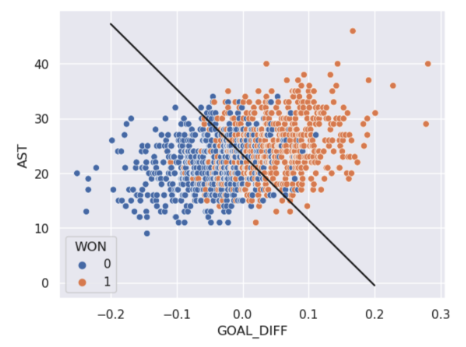
As you can see, the decision boundary predicted by our logistic regression does not perfectly separate the two classes. There’s a “muddled” region near the decision boundary where our classifier predicts the wrong class. What would the data have to look like for the classifier to make perfect predictions?
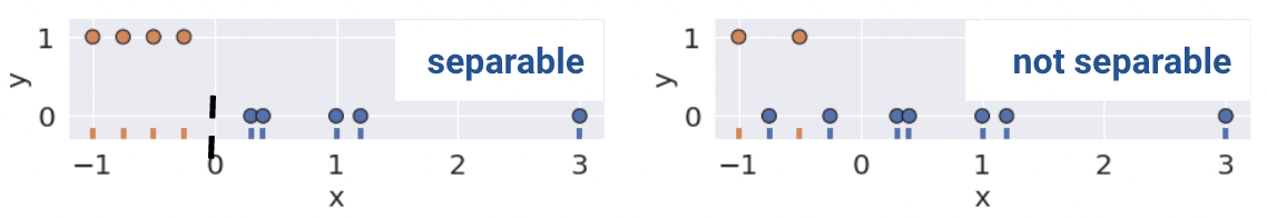
A classification dataset is said to be linearly separable if there exists a hyperplane among input features \(x\) that separates the two classes \(y\).
Linear separability in 1D can be found with a rugplot of a single feature where a point perfectly separates the classes (Remember that in 1D, our decision boundary is just a point). For example, notice how the plot on the bottom left is linearly separable along the vertical line \(x=0\). However, no such line perfectly separates the two classes on the bottom right.
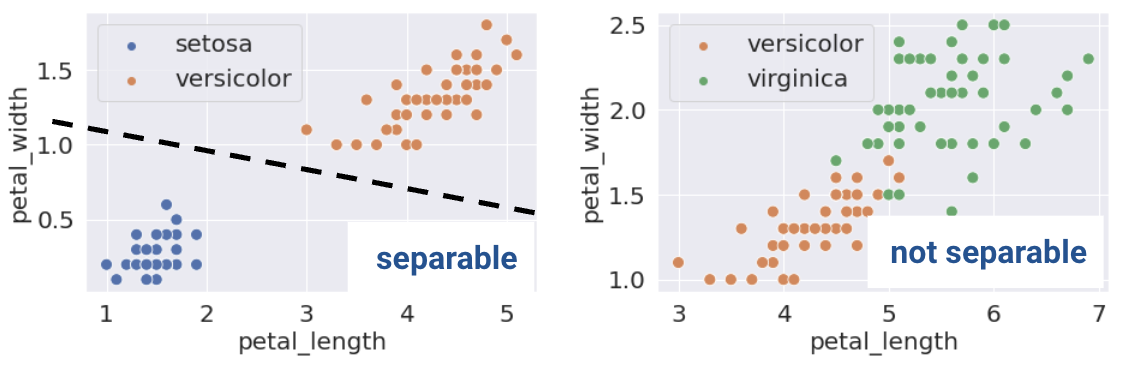
This same definition holds in higher dimensions. If there are two features, the separating hyperplane must exist in two dimensions (any line of the form \(y=mx+b\)). We can visualize this using a scatter plot.
This sounds great! When the dataset is linearly separable, a logistic regression classifier can perfectly assign datapoints into classes. Can it achieve 0 cross-entropy loss?
\[-(y \log(p) + (1 - y) \log(1 - p))\]
Cross-entropy loss is 0 if \(p = 1\) when \(y = 1\), and \(p = 0\) when \(y = 0\). Consider a simple model with one feature and no intercept.
\[P_{\theta}(Y = 1|x) = \sigma(\theta x) = \frac{1}{1 + e^{-\theta x}}\]
What \(\theta\) will achieve 0 loss if we train on the datapoint \(x = 1, y = 1\)? We would want \(p = 1\) which occurs when \(\theta \rightarrow \infty\).
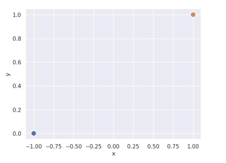
However, (unexpected) complications may arise. When data is linearly separable, the optimal model parameters diverge to \(\pm \infty\). The sigmoid can never output exactly 0 or 1, so no finite optimal \(\theta\) exists. This can be a problem when using gradient descent to fit the model. Consider a simple, linearly separable “toy” dataset with two datapoints.
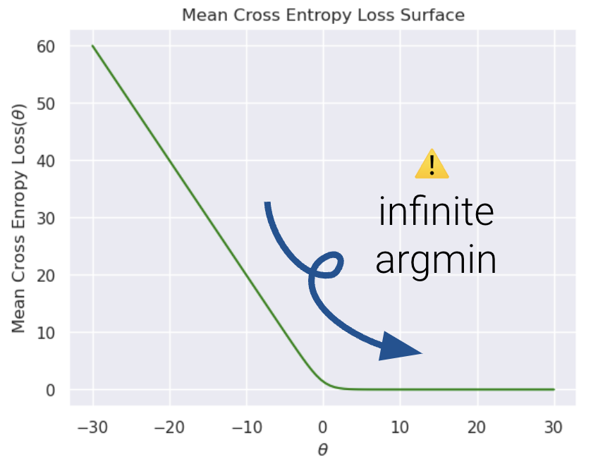
Let’s also visualize the mean cross entropy loss along with the direction of the gradient (how this loss surface is calculated is out of scope).
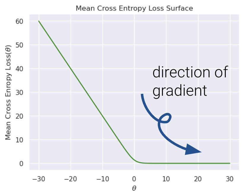
It’s nearly impossible to see, but the plateau to the right is slightly tilted. Because gradient descent follows the tilted loss surface downwards, it never converges. Loss keeps approaching 0 as \(\theta\) increases.
The diverging weights cause the model to be overconfident. Say we add a new point \((x, y) = (-0.5, 1)\). Following the behavior above, our model will incorrectly predict \(p=0\), and thus, \(\hat y = 0\).
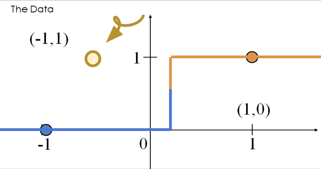
The loss incurred by this misclassified point is infinite.
\[-(y\text{ log}(p) + (1-y)\text{ log}(1-p))=1 * \text{log}(0)\]
Thus, diverging weights (\(|\theta| \rightarrow \infty\)) occur with linearly separable data. “Overconfidence”, as shown here, is a particularly dangerous version of overfitting.
To avoid large weights and infinite loss (particularly on linearly separable data), we use regularization. The same principles apply as with linear regression - make sure to standardize your features first.
For example, \(L2\) (Ridge) Logistic Regression takes on the form:
\[\underset{\theta}{\arg\min} -\frac{1}{n} \sum_{i=1}^{n} (y_i \text{log}(\sigma(X_i^T\theta)) + (1-y_i)\text{log}(1-\sigma(X_i^T\theta))) + \lambda \sum_{j=1}^{d} \theta_j^2\]
Now, let us compare the loss functions of un-regularized and regularized logistic regression.
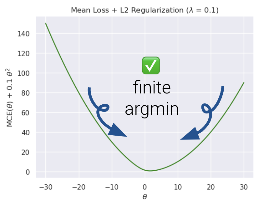
As we can see, \(L2\) regularization helps us prevent diverging weights and deters against “overconfidence.”
sklearn’s logistic regression defaults to \(L2\) regularization and C=1.0; C is the inverse of \(\lambda\): \[C = \frac{1}{\lambda}\] Setting C to a large value, for example, C=300.0, results in minimal regularization.
# sklearn defaults
model = LogisticRegression(penalty = 'l2', C = 1.0, ...)
model.fit()
Note that in Data 100, we only use sklearn to fit logistic regression models. There is no closed-form solution to the optimal theta vector, and the gradient is a little messy (see the bonus section below for details).
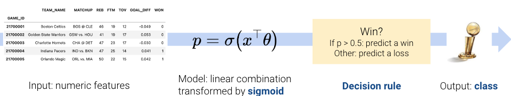
From here, the .predict function returns the predicted class \(\hat y\) of the point. In the simple binary case where the threshold is 0.5,
\[\hat y = \begin{cases} 1, & P(Y=1|x) \ge 0.5\\ 0, & \text{otherwise } \end{cases}\]
You might be thinking, if we’ve already introduced cross-entropy loss, why do we need additional ways of assessing how well our models perform? In linear regression, we made numerical predictions and used a loss function to determine how “good” these predictions were. In logistic regression, our ultimate goal is to classify data – we are much more concerned with whether or not each datapoint was assigned the correct class using the decision rule. As such, we are interested in the quality of classifications decisions for a choice of threshold, not the predicted probabilities.
The most basic evaluation metric is accuracy, that is, the proportion of correctly classified points.
\[\text{accuracy} = \frac{\# \text{ of points classified correctly}}{\# \text{ of total points}}\]
Translated to code:
def accuracy(X, Y):
    return np.mean(model.predict(X) == Y)

model.score(X, y) # built-in accuracy function
You can find the sklearn documentation here.
However, accuracy is not always a great metric for classification. To understand why, let’s consider a classification problem with 100 emails where only 5 are truly spam, and the remaining 95 are truly ham. We’ll investigate two models where accuracy is a poor metric.
As this example illustrates, accuracy is not always a good metric for classification, particularly when your data could exhibit class imbalance (e.g., very few 1’s compared to 0’s).
There are 4 different different classifications that our model might make:
These classifications can be concisely summarized in a confusion matrix.
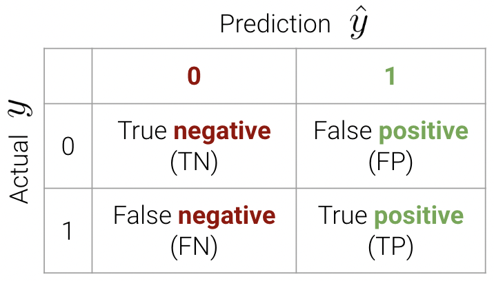
An easy way to remember this terminology is as follows:
We can now write the accuracy calculation as \[\text{accuracy} = \frac{TP + TN}{n}\]
In sklearn, we use the following syntax to plot a confusion matrix:
from sklearn.metrics import confusion_matrix
cm = confusion_matrix(Y_true, Y_pred)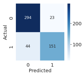
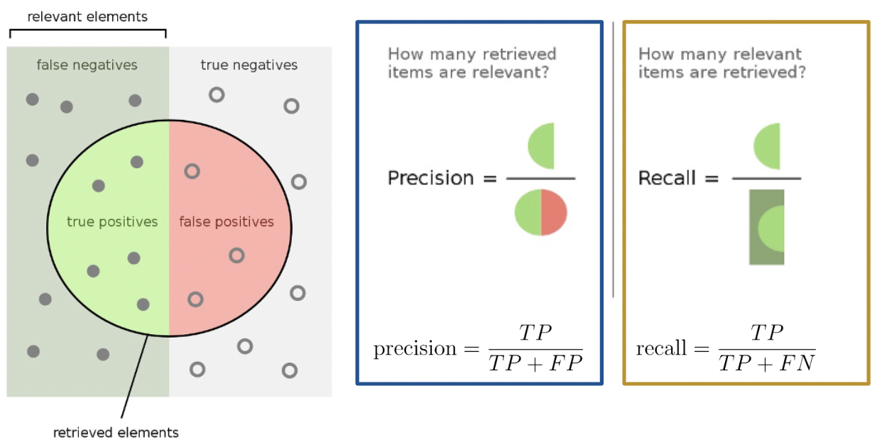
The purpose of our discussion of the confusion matrix was to motivate better performance metrics for classification problems with class imbalance - namely, precision and recall.
Precision is defined as
\[\text{precision} = \frac{\text{TP}}{\text{TP + FP}}\]
Precision answers the question: “Of all observations that were predicted to be \(1\), what proportion was actually \(1\)?” It measures how precise the classifier is when the predictions are positive, and it penalizes false positives.
Recall (or sensitivity) is defined as
\[\text{recall} = \frac{\text{TP}}{\text{TP + FN}}\]
Recall aims to answer: “Of all observations that were actually \(1\), what proportion was predicted to be \(1\)?” It measures how sensitive our classifier is to actual positive observations, and it penalizes false negatives.
Here’s a helpful graphic that summarizes our discussion above.
In this section, we will calculate the accuracy, precision, and recall performance metrics for our earlier spam classification example. As a reminder, we had 100 emails, 5 of which were truly spam and 95 of which were ham. We designed two models:
First, let’s begin by creating the confusion matrix.
| 0 | 1 | |
|---|---|---|
| 0 | True Negative: 95 | False Positive: 0 |
| 1 | False Negative: 5 | True Positive: 0 |
\[\text{accuracy} = \frac{95}{100} = 0.95\] \[\text{precision} = \frac{0}{0 + 0} = \text{undefined}\] \[\text{recall} = \frac{0}{0 + 5} = 0\]
Notice how our precision is undefined because we never predicted class \(1\). Our recall is 0 for the same reason – the numerator is 0 (we had no positive predictions).
The confusion matrix for Model 2 is:
| 0 | 1 | |
|---|---|---|
| 0 | True Negative: 0 | False Positive: 95 |
| 1 | False Negative: 0 | True Positive: 5 |
\[\text{accuracy} = \frac{5}{100} = 0.05\] \[\text{precision} = \frac{5}{5 + 95} = 0.05\] \[\text{recall} = \frac{5}{5 + 0} = 1\]
Our precision is low because we have many false positives, and our recall is perfect - we correctly classified all spam emails (we never predicted class \(0\)).
Precision (\(\frac{\text{TP}}{\text{TP} + \textbf{ FP}}\)) penalizes false positives, while recall (\(\frac{\text{TP}}{\text{TP} + \textbf{ FN}}\)) penalizes false negatives. In fact, precision and recall are inversely related. This is evident in our second model – we observed a high recall and low precision. Usually, there is a tradeoff in these two (most models can either minimize the number of FP or FN; and in rare cases, both).
The specific performance metric(s) to prioritize depends on the context. In many medical settings, there might be a much higher cost to missing positive cases. For instance, in our breast cancer example, it is more costly to misclassify malignant tumors (false negatives) than it is to incorrectly classify a benign tumor as malignant (false positives). In the case of the latter, pathologists can conduct further studies to verify malignant tumors. As such, we should minimize the number of false negatives. This is equivalent to maximizing recall.
The True Positive Rate (TPR) is defined as
\[\text{true positive rate} = \frac{\text{TP}}{\text{TP + FN}}\]
You’ll notice this is equivalent to recall. In the context of our spam email classifier, it answers the question: “What proportion of spam did I mark correctly?”. We’d like this to be close to \(1\).
The True Negative Rate (TNR) is defined as
\[\text{true negative rate} = \frac{\text{TN}}{\text{TN + FP}}\]
Another word for TNR is specificity. This answers the question: “What proportion of ham did I mark correctly?”. We’d like this to be close to \(1\).
The False Positive Rate (FPR) is defined as
\[\text{false positive rate} = \frac{\text{FP}}{\text{FP + TN}}\]
FPR is equal to 1 - specificity, or 1 - TNR. This answers the question: “What proportion of regular email did I mark as spam?”. We’d like this to be close to \(0\).
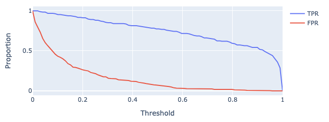
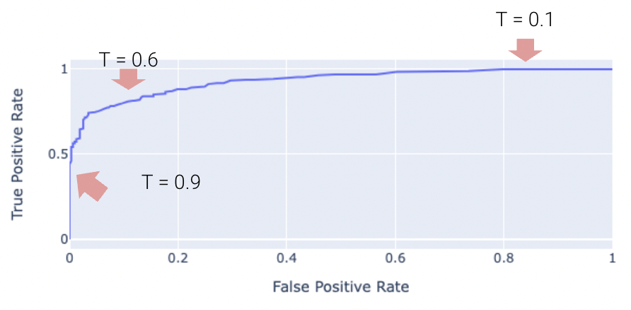
As we increase threshold \(T\), both TPR and FPR decrease. We’ve plotted this relationship below for some model on a toy dataset.
One way to minimize the number of FP vs. FN (equivalently, maximizing precision vs. recall) is by adjusting the classification threshold \(T\).
\[\hat y = \begin{cases} \text{Class 1}, & p \ge T\\ \text{Class 0}, & p < T \end{cases}\]
The default threshold in sklearn is \(T = 0.5\). As we increase the threshold \(T\), we “raise the standard” of how confident our classifier needs to be to predict 1 (i.e., “positive”).
As you may notice, the choice of threshold \(T\) impacts our classifier’s performance.
In fact, we can choose a threshold \(T\) based on our desired number, or proportion, of false positives and false negatives. We can do so using a few different tools. We’ll touch on three of the most important ones in Data 100.
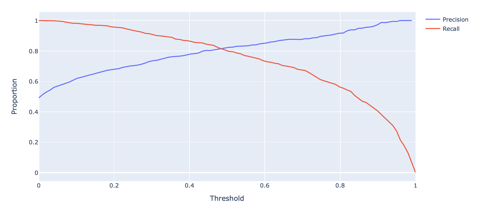
A Precision-Recall Curve (PR Curve) is a curve that displays the relationship between precision and recall for various threshold values. In this curve, we test out many different possible thresholds and for each one we compute the precision and recall of the classifier.
Let’s first consider how precision and recall change as a function of the threshold \(T\). We know this quite well from earlier – precision will generally increase, and recall will decrease.
Displayed below is the PR Curve for the same toy dataset. Notice how threshold values increase as we move to the left.
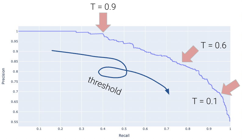
Once again, the perfect classifier will resemble the orange curve, this time, facing the opposite direction.
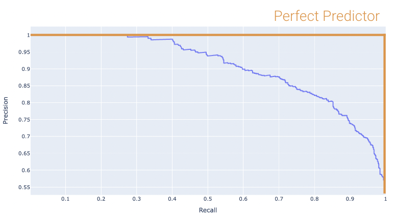
We want our PR curve to be as close to the “top right” of this graph as possible. We can use the area under curve (or AUC) to determine “closeness”, with the perfect classifier exhibiting an AUC = 1 (and the worst with an AUC = 0.5).
Another way to balance precision and recall is to maximize the \(F_1\) Score:
\[ F_1\ \text{Score} = \frac{2}{\frac{1}{\text{Precision}} + \frac{1}{\text{Recall}}} = \frac{2 \times \text{Precision} \times \text{Recall}}{\text{Precision}+\text{Recall}}\]
The \(F_1\) score is the harmonic mean of precision and recall, and it is often used when there is a large class imbalance. The score optimizes for the true-positive case and balances precision and recall, so if we want to optimize for true-negatives or favor either precision or recall, it may be better to pick a different metric.
We can begin by calculating the \(F_1\) score for different thresholds, and plotting the results below:
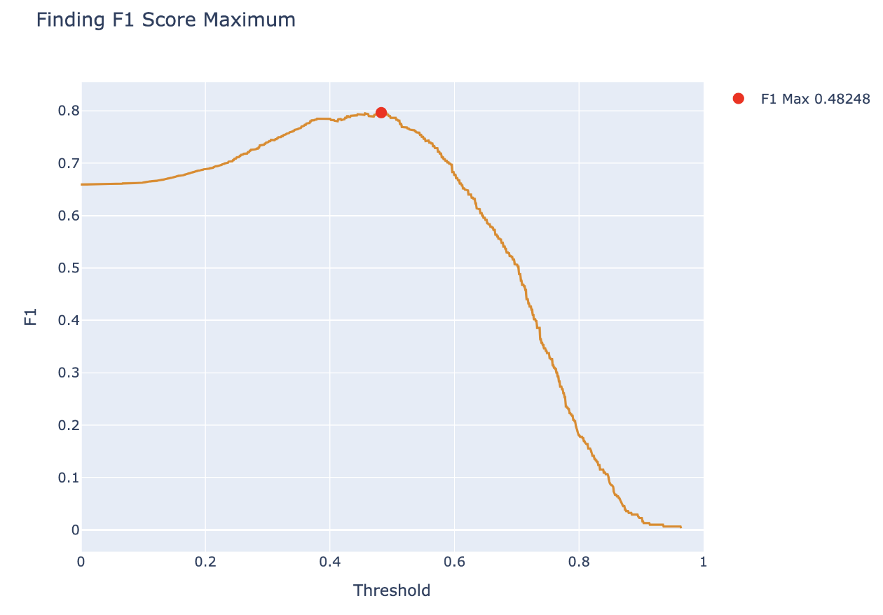
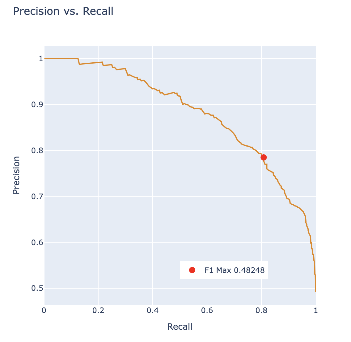
From this, we want to pick the threshold that maximizes the \(F_1\) score and report the \(F_1\) score as a metric describing the classifier. We can also plot this point on a PR curve to see how the \(F_1\) score determined a point with balance between precision and recall.
The “Receiver Operating Characteristic” Curve (ROC Curve) is another method that plots the tradeoff between FPR and TPR. Notice how the far-left of the curve corresponds to higher threshold \(T\) values. At lower thresholds, the FPR and TPR are both high as there are many positive predictions while at higher thresholds the FPR and TPR are both low as there are fewer positive predictions.
The “perfect” classifier is the one that has a TPR of 1, and FPR of 0. This is achieved at the top-left of the plot below. More generally, it’s ROC curve resembles the curve in orange.
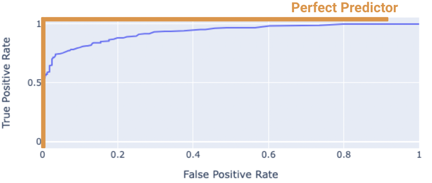
We want our model to be as close to this orange curve as possible. How do we quantify “closeness”?
We can compute the area under curve (AUC) of the ROC curve. Notice how the perfect classifier has an AUC = 1. The closer our model’s AUC is to 1, the better it is.
On the other hand, a terrible model will have an AUC closer to 0.5. A predictor that predicts randomly has an AUC of 0.5. This indicates the classifier is not able to distinguish between positive and negative classes, and thus, randomly predicts one of the two. The proof for this is out of scope and is in the Bonus section.
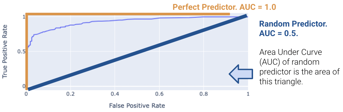
Real-world classifiers have an AUC between 0.5 and 1.
Note that both the Accuracy and \(F_1\) score are threshold dependent while area under the curve metrics are not.
Overall, be warned that working with class imbalance can be challenging because
It may have seemed like we pulled cross-entropy loss out of thin air. How did we know that taking the negative logarithms of our probabilities would work so well? It turns out that cross-entropy loss is justified by probability theory.
The following section is out of scope, but is certainly an interesting read!
To build some intuition for logistic regression, let’s look at an introductory example to classification: the coin flip. Suppose we observe some outcomes of a coin flip (1 = Heads, 0 = Tails).
flips = [0, 0, 1, 1, 1, 1, 0, 0, 0, 0]
flips
[0, 0, 1, 1, 1, 1, 0, 0, 0, 0]A reasonable model is to assume all flips are IID (independent and identically distributed). In other words, each flip has the same probability of returning a 1 (or heads). Let’s define a parameter \(\theta\), the probability that the next flip is a heads. We will use this parameter to inform our decision for \(\hat y\) (predicting either 0 or 1) of the next flip. If \(\theta \ge 0.5, \hat y = 1, \text{else } \hat y = 0\).
You may be inclined to say \(0.5\) is the best choice for \(\theta\). However, notice that we made no assumption about the coin itself. The coin may be biased, so we should make our decision based only on the data. We know that exactly \(\frac{4}{10}\) of the flips were heads, so we might guess \(\hat \theta = 0.4\). In the next section, we will mathematically prove why this is the best possible estimate.
Let’s call the result of the coin flip a random variable \(Y\). This is a Bernoulli random variable with two outcomes. \(Y\) has the following distribution:
\[P(Y = y) = \begin{cases} p, \text{if } y=1\\ 1 - p, \text{if } y=0 \end{cases} \]
\(p\) is unknown to us. But we can find the \(p\) that makes the data we observed the most likely.
The probability of observing 4 heads and 6 tails follows the binomial distribution.
\[\binom{10}{4} (p)^4 (1-p)^6\]
We define the likelihood of obtaining our observed data as a quantity proportional to the probability above. To find it, simply multiply the probabilities of obtaining each coin flip.
\[(p)^{4} (1-p)^6\]
The technique known as maximum likelihood estimation finds the \(p\) that maximizes the above likelihood. You can find this maximum by taking the derivative of the likelihood, but we’ll provide a more intuitive graphical solution.
thetas = np.linspace(0, 1)
plt.plot(thetas, (thetas**4)*(1-thetas)**6)
plt.xlabel(r"$\theta$")
plt.ylabel("Likelihood");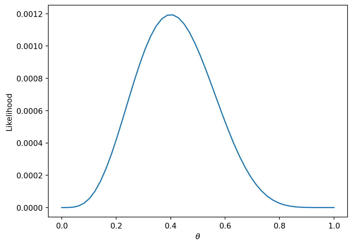
More generally, the likelihood for some Bernoulli(\(p\)) random variable \(Y\) is:
\[P(Y = y) = \begin{cases} 1, \text{with probability } p\\ 0, \text{with probability } 1 - p \end{cases} \]
Equivalently, this can be written in a compact way:
\[P(Y=y) = p^y(1-p)^{1-y}\]
In our example, a Bernoulli random variable is analogous to a single data point (e.g., one instance of a basketball team winning or losing a game). All together, our games data consists of many IID Bernoulli(\(p\)) random variables. To find the likelihood of independent events in succession, simply multiply their likelihoods.
\[\prod_{i=1}^{n} p^{y_i} (1-p)^{1-y_i}\]
As with the coin example, we want to find the parameter \(p\) that maximizes this likelihood. Earlier, we gave an intuitive graphical solution, but let’s take the derivative of the likelihood to find this maximum.
At a first glance, this derivative will be complicated! We will have to use the product rule, followed by the chain rule. Instead, we can make an observation that simplifies the problem.
Finding the \(p\) that maximizes \[\prod_{i=1}^{n} p^{y_i} (1-p)^{1-y_i}\] is equivalent to the \(p\) that maximizes \[\text{log}(\prod_{i=1}^{n} p^{y_i} (1-p)^{1-y_i})\]
This is because \(\text{log}\) is a strictly increasing function. It won’t change the maximum or minimum of the function it was applied to. From \(\text{log}\) properties, \(\text{log}(a*b)\) = \(\text{log}(a) + \text{log}(b)\). We can apply this to our equation above to get:
\[\underset{p}{\text{argmax}} \sum_{i=1}^{n} \text{log}(p^{y_i} (1-p)^{1-y_i})\]
\[= \underset{p}{\text{argmax}} \sum_{i=1}^{n} (\text{log}(p^{y_i}) + \text{log}((1-p)^{1-y_i}))\]
\[= \underset{p}{\text{argmax}} \sum_{i=1}^{n} (y_i\text{log}(p) + (1-y_i)\text{log}(1-p))\]
We can add a constant factor of \(\frac{1}{n}\) out front. It won’t affect the \(p\) that maximizes our likelihood.
\[=\underset{p}{\text{argmax}} \frac{1}{n} \sum_{i=1}^{n} y_i\text{log}(p) + (1-y_i)\text{log}(1-p)\]
One last “trick” we can do is change this to a minimization problem by negating the result. This works because we are dealing with a concave function, which can be made convex.
\[= \underset{p}{\text{argmin}} -\frac{1}{n} \sum_{i=1}^{n} y_i\text{log}(p) + (1-y_i)\text{log}(1-p)\]
Now let’s say that we have data that are independent with different probability \(p_i\). Then, we would want to find the \(p_1, p_2, \dots, p_n\) that maximize \[\prod_{i=1}^{n} p_i^{y_i} (1-p_i)^{1-y_i}\]
Setting up and simplifying the optimization problems as we did above, we ultimately want to find:
\[= \underset{p}{\text{argmin}} -\frac{1}{n} \sum_{i=1}^{n} y_i\text{log}(p_i) + (1-y_i)\text{log}(1-p_i)\]
For logistic regression, \(p_i = \sigma(x^{\top}\theta)\). Plugging that in, we get:
\[= \underset{p}{\text{argmin}} -\frac{1}{n} \sum_{i=1}^{n} y_i\text{log}(\sigma(x^{\top}\theta)) + (1-y_i)\text{log}(1-\sigma(x^{\top}\theta))\]
This is exactly our average cross-entropy loss minimization problem from before!
Why did we do all this complicated math? We have shown that minimizing cross-entropy loss is equivalent to maximizing the likelihood of the training data.
Note that this is under the assumption that all data is drawn independently from the same logistic regression model with parameter \(\theta\). In fact, many of the model + loss combinations we’ve seen can be motivated using MLE (e.g., OLS, Ridge Regression, etc.). In probability and ML classes, you’ll get the chance to explore MLE further.
Let’s define the following terms: \[ \begin{align} t_i &= \phi(x_i)^T \theta \\ p_i &= \sigma(t_i) \\ t_i &= \log(\frac{p_i}{1 - p_i}) \\ 1 - \sigma(t_i) &= \sigma(-t_i) \\ \frac{d}{dt} \sigma(t) &= \sigma(t) \sigma(-t) \end{align} \]
Now, we can simplify the cross-entropy loss \[ \begin{align} y_i \log(p_i) + (1 - y_i) \log(1 - p_i) &= y_i \log(\frac{p_i}{1 - p_i}) + \log(1 - p_i) \\ &= y_i \phi(x_i)^T + \log(\sigma(-\phi(x_i)^T \theta)) \end{align} \]
Hence, the optimal \(\hat{\theta}\) is \[\text{argmin}_{\theta} - \frac{1}{n} \sum_{i=1}^n (y_i \phi(x_i)^T + \log(\sigma(-\phi(x_i)^T \theta)))\]
We want to minimize \[L(\theta) = - \frac{1}{n} \sum_{i=1}^n (y_i \phi(x_i)^T + \log(\sigma(-\phi(x_i)^T \theta)))\]
So we take the derivative \[ \begin{align} \triangledown_{\theta} L(\theta) &= - \frac{1}{n} \sum_{i=1}^n \triangledown_{\theta} y_i \phi(x_i)^T + \triangledown_{\theta} \log(\sigma(-\phi(x_i)^T \theta)) \\ &= - \frac{1}{n} \sum_{i=1}^n y_i \phi(x_i) + \triangledown_{\theta} \log(\sigma(-\phi(x_i)^T \theta)) \\ &= - \frac{1}{n} \sum_{i=1}^n y_i \phi(x_i) + \frac{1}{\sigma(-\phi(x_i)^T \theta)} \triangledown_{\theta} \sigma(-\phi(x_i)^T \theta) \\ &= - \frac{1}{n} \sum_{i=1}^n y_i \phi(x_i) + \frac{\sigma(-\phi(x_i)^T \theta)}{\sigma(-\phi(x_i)^T \theta)} \sigma(\phi(x_i)^T \theta)\triangledown_{\theta} \sigma(-\phi(x_i)^T \theta) \\ &= - \frac{1}{n} \sum_{i=1}^n (y_i - \sigma(\phi(x_i)^T \theta)\phi(x_i)) \end{align} \]
Setting the derivative equal to 0 and solving for \(\hat{\theta}\), we find that there’s no general analytic solution. Therefore, we must solve using numeric methods.
\[\theta^{(0)} \leftarrow \text{initial vector (random, zeros, ...)} \]
For \(\tau\) from 0 to convergence: \[ \theta^{(\tau + 1)} \leftarrow \theta^{(\tau)} - \rho(\tau)\left( \frac{1}{n} \sum_{i=1}^n \triangledown_{\theta} L_i(\theta) \mid_{\theta = \theta^{(\tau)}}\right) \]
\[\theta^{(0)} \leftarrow \text{initial vector (random, zeros, ...)} \]
For \(\tau\) from 0 to convergence, let \(B\) ~ \(\text{Random subset of indices}\). \[ \theta^{(\tau + 1)} \leftarrow \theta^{(\tau)} - \rho(\tau)\left( \frac{1}{|B|} \sum_{i \in B} \triangledown_{\theta} L_i(\theta) \mid_{\theta = \theta^{(\tau)}}\right) \]
Recall that the best possible AUC = 1. On the other hand, a terrible model will have an AUC closer to 0.5. A random predictor randomly predicts \(P(Y = 1 | x)\) to be uniformly between 0 and 1. This indicates the classifier is not able to distinguish between positive and negative classes, and thus, randomly predicts one of the two.
We can illustrate this by comparing different thresholds and seeing their points on the ROC curve.