Up until this point in the class , we’ve focused on regression tasks - that is, predicting an unbounded numerical quantity from a given dataset. We discussed optimization, feature engineering, and regularization all in the context of performing regression to predict some quantity.
Now that we have this deep understanding of the modeling process, let’s expand our knowledge of possible modeling tasks.
Classification
In the next two lectures, we’ll tackle the task of classification. A classification problem aims to classify data into categories. Unlike in regression, where we predicted a numeric output, classification involves predicting some categorical variable, or response, . Examples of classification tasks include:
Predicting which team won from its turnover percentage
Predicting the day of the week of a meal from the total restaurant bill
Predicting the model of car from its horsepower
There are a couple of different types of classification:
Binary classification: classify data into two classes, and responses are either 0 or 1
Multiclass classification: classify data into multiple classes (e.g., image labeling, next word in a sentence, etc.)
We can further combine multiple related classfication predictions (e.g., translation, voice recognition, etc.) to tackle complex problems through structured prediction tasks.
In Data 100, we will mostly deal with binary classification, where we are attempting to classify data into one of two classes.
Modeling Process
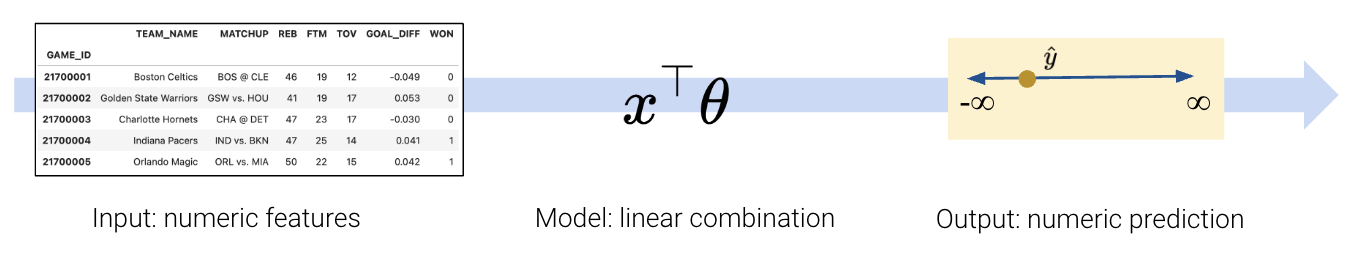
To build a classification model, we need to modify our modeling workflow slightly. Recall that in regression we:
Created a design matrix of numeric features
Defined our model as a linear combination of these numeric features
Used the model to output numeric predictions
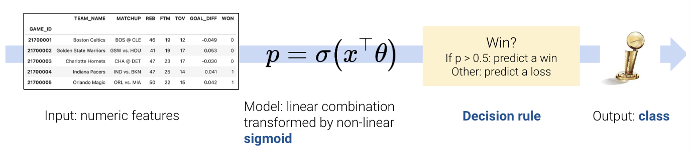
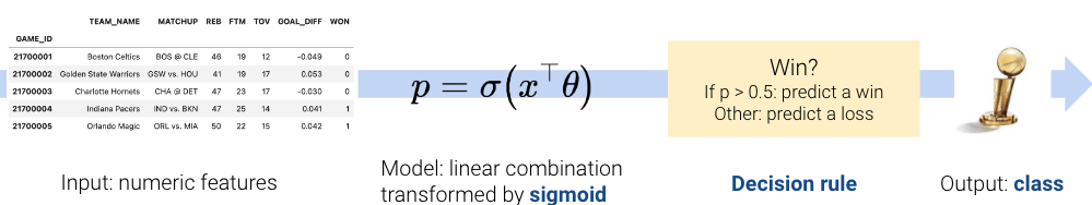
In classification, however, we no longer want to output numeric predictions; instead, we want to predict the class to which a datapoint belongs. This means that we need to update our workflow. To build a classification model, we will:
Create a design matrix of numeric features.
Define our model as a linear combination of these numeric features, transformed by a non-linear sigmoid function. This outputs a numeric quantity.
Apply a decision rule to interpret the outputted quantity and decide a classification.
Output a predicted class.
There are two key differences: as we’ll soon see, we need to incorporate a non-linear transformation to capture the non-linear relationships hidden in our data. We do so by applying the sigmoid function to a linear combination of the features. Secondly, we must apply a decision rule to convert the numeric quantities computed by our model into an actual class prediction. This can be as simple as saying that any datapoint with a feature greater than some number belongs to Class 1.
Regression:
Classification:
This was a very high-level overview. Let’s walk through the process in detail to clarify what we mean.
The Logistic Regression Model
Throughout this lecture, we will work with the games dataset, which contains information about games played in the NBA basketball league. Our goal will be to use a basketball team’s "GOAL_DIFF" to predict whether or not a given team won their game ("WON"). If a team wins their game, we’ll say they belong to Class 1. If they lose, they belong to Class 0.
For those who are curious, "GOAL_DIFF" represents the difference in successful field goal percentages between the two competing teams.
Click to see the code
import warnings
warnings.filterwarnings("ignore")

import pandas as pd
import numpy as np
np.seterr(divide='ignore')

games = pd.read_csv("data/games").dropna()
games.head()Let’s visualize the relationship between "GOAL_DIFF" and "WON" using the Seaborn function sns.stripplot. A strip plot automatically introduces a small amount of random noise to jitter the data. Recall that all values in the "WON" column are either 1 (won) or 0 (lost) – if we were to directly plot them without jittering, we would see severe overplotting.
Click to see the code
import seaborn as sns
import matplotlib.pyplot as plt

sns.stripplot(data=games, x="GOAL_DIFF", y="WON", orient="h", hue='WON', alpha=0.7)
# By default, sns.stripplot plots 0, then 1. We invert the y axis to reverse this behavior
plt.gca().invert_yaxis();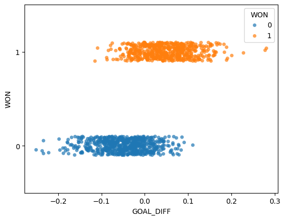
This dataset is unlike anything we’ve seen before – our target variable contains only two unique values! (Remember that each y value is either 0 or 1; the plot above jitters the y data slightly for ease of reading.)
The regression models we have worked with always assumed that we were attempting to predict a continuous target. If we apply a linear regression model to this dataset, something strange happens.
Click to see the code
import sklearn.linear_model as lm

X, Y = games[["GOAL_DIFF"]], games["WON"]
regression_model = lm.LinearRegression()
regression_model.fit(X, Y)

plt.plot(X.squeeze(), regression_model.predict(X), "k")
sns.stripplot(data=games, x="GOAL_DIFF", y="WON", orient="h", hue='WON', alpha=0.7)
plt.gca().invert_yaxis();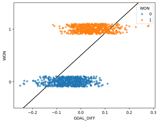
The linear regression fit follows the data as closely as it can. However, this approach has a key flaw - the predicted output, , can be outside the range of possible classes (there are predictions above 1 and below 0). This means that the output can’t always be interpreted (what does it mean to predict a class of -2.3?).
Our usual linear regression framework won’t work here. Instead, we’ll need to get more creative.
Graph of Averages
Back in Data 8, you gradually built up to the concept of linear regression by using the graph of averages. Before you knew the mathematical underpinnings of the regression line, you took a more intuitive approach: you bucketed the data into bins of common values, then computed the average for all datapoints in the same bin. The result gave you the insight needed to derive the regression fit.
Let’s take the same approach as we grapple with our new classification task. In the cell below, we 1) bucket the "GOAL_DIFF" data into bins of similar values and 2) compute the average "WON" value of all datapoints in a bin.
# bucket the GOAL_DIFF data into 20 bins
bins = pd.cut(games["GOAL_DIFF"], 20)
games["bin"] = [(b.left + b.right) / 2 for b in bins]
win_rates_by_bin = games.groupby("bin")["WON"].mean()

# plot the graph of averages
sns.stripplot(data=games, x="GOAL_DIFF", y="WON", orient="h", alpha=0.5, hue='WON') # alpha makes the points transparent
plt.plot(win_rates_by_bin.index, win_rates_by_bin, c="tab:red")
plt.gca().invert_yaxis();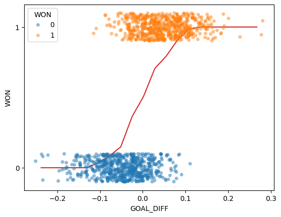
Interesting: our result is certainly not like the straight line produced by finding the graph of averages for a linear relationship. We can make two observations:
All predictions on our line are between 0 and 1
The predictions are non-linear, following a rough “S” shape
Let’s think more about what we’ve just done.
To find the average value for each bin, we computed:
This is simply the probability of a datapoint in that bin belonging to Class 1! This aligns with our observation from earlier: all of our predictions lie between 0 and 1, just as we would expect for a probability.
Our graph of averages was really modeling the probability, , that a datapoint belongs to Class 1, or essentially that for a particular value of .
In logistic regression, we have a new modeling goal. We want to model the probability that a particular datapoint belongs to Class 1 by approximating the S-shaped curve we plotted above. However, we’ve only learned about linear modeling techniques like Linear Regression and OLS.
The Sigmoid Function
Let’s start by identifying an S-shaped function that maps (, ) inputs to (0,1) outputs—the sigmoid () function. It is also known as the logistic function or the inverse logit function.
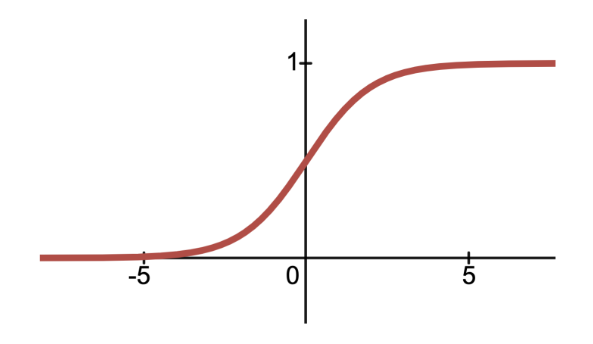
As it turns out, the logistic regression model fits a sigmoid function to the data. We can also shift and scale the sigmoid function just as if we were transforming any other function to fit our data:
Note that our input to the sigmoid function here looks exactly like simple linear regression! And just like in ordinary least squares, we’re not limited to one input:
Click to see the code
import plotly.graph_objects as go

# Plot a 3D sigmoid surface
x1 = np.linspace(-10, 10, 100)
x2 = np.linspace(-10, 10, 100)
X1, X2 = np.meshgrid(x1, x2)
y_values = 1/(1 + np.exp(-(X1 + X2)))

# Create a 3D surface plot for the sigmoid function
fig = go.Figure(data=[go.Surface(z=y_values, x=X1[0], y=X2[:, 0])])

# Update layout for better visualization
fig.update_layout(
  title="Sigmoid with two inputs",
  scene=dict(
    xaxis_title="X1",
    yaxis_title="X2",
    zaxis_title="\u03C3(X1, X2)"
  ),
  width=800,
  height=600
)

# Reduce tick label size
fig.update_layout(
    scene=dict(
        xaxis=dict(tickfont=dict(size=14)),
        yaxis=dict(tickfont=dict(size=14)),
        zaxis=dict(tickfont=dict(size=14))
    )
)

fig.show()Below, we fit a logistic regression model to our data. You do not need to worry about what’s going on “under the hood” for now. Just notice how similar the logistic regression model is to our graph of averages.
Click to see the code
# We'll discuss the `LogisticRegression` class next time
xs = np.linspace(-0.3, 0.3)

logistic_model = lm.LogisticRegression(C=20)
logistic_model.fit(X, Y)
predicted_prob = logistic_model.predict_proba(xs[:, np.newaxis])[:, 1]

sns.stripplot(data=games, x="GOAL_DIFF", y="WON", orient="h", alpha=0.5, hue="WON", legend=False)
plt.plot(xs, predicted_prob, c="k", lw=3, label="Logistic regression model")
plt.plot(win_rates_by_bin.index, win_rates_by_bin, lw=2, c="tab:red", label="Graph of averages")
plt.legend(loc="upper left")
plt.gca().invert_yaxis();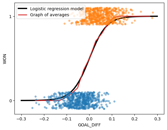
Formalizing the Logistic Regression Model
Let’s now generalize our model to multiple inputs rather than just one or two inputs. The probability of a datapoint belonging to Class 1 is:
To predict a probability using the logistic regression model, we:
Compute a linear combination of the features,
Apply the sigmoid activation function, .
Our main takeaway from this section is that we can:
Model the probability using a sigmoid transformation of a linear model
Indeed, the estimated probability that the response is 1 given the features , is equal to the logistic function at the value :
More commonly, the logistic regression model is written as:
With our logistic regression model formalized, we have 2 natural questions about the parameters that follow:
How do we interpret the ’s?
How do we estimate the ’s?
We’ll dive deep into answering the first question in the next section, and answer the second question in the next lecture.
Log-Odds and Linearity
Interpreting Logistic Regression Coefficients
Let’s focus on the simple logistic regression model with just one input:
Recall that in simple linear regression (), we interpret as the change in for a one-unit increase in . However, in logistic regression, the change in the predicted outcome is not constant for every one-unit increase in since the sigmoid function is non-linear (not a straight line). To make interpretation a little easier, we can isolate the linear combination using some algebra:
We have just derived that as increases by one, increases by . Does this really have a meaningful interpretation?
To help with our interpretation, consider the expression: “Cal has 10 to 1 odds of winning the game.” These odds means that . The odds is defined as the probability of a datapoint Y belonging to Class 1 divided by the probability of it belonging to Class 0.
Great! Now we have a much more meaningful interpretation of the logistic regression coefficients as log-odds:
For every one-unit increase in , increases by .
Linearity
To summarize, probability is a non-linear function of the features because applies a non-linear sigmoid transformation to . However, we have just found that the log-odds are a linear function with respect to the ’s. Namely, . Indeed, this means there is linearity in the logistic regression model! This linearity in the log-odds leads to a linear decision boundary between Class 0 and Class 1, which we will explore more in the next section.
Decision Boundaries
In logistic regression, we model the probability that a datapoint belongs to Class 1.
In this lecture, we developed the logistic regression model to predict that probability, but the model itself does not classify whether a prediction is Class 0 or Class 1.
A decision rule tells us how to convert model outputs into classifications. We commonly make decision rules by specifying a threshold, . If the predicted probability is greater than or equal to , predict Class 1. Otherwise, predict Class 0.
The threshold is often set to , but not always. We’ll discuss why we might want to use other thresholds later in this lecture and the next.
Using our decision rule, we can define a decision boundary as the “line” that splits the data into classes based on its features. For logistic regression, since we are working in dimensions, the decision boundary is a hyperplane—a linear combination of the features in -dimensions—and we can recover it from the log-odds.
For instance, suppose we decide to classify all new data points with as Class 1, and all points with as Class 0. In other words, we choose 0.5 as our chosen probability threshold. We can calculate our log-odds as follows:
This is the same as labeling all points with as Class 1, and all points with as Class 0. Since , we have just found that
is our linear decision boundary for classification given a threshold of 0.5.
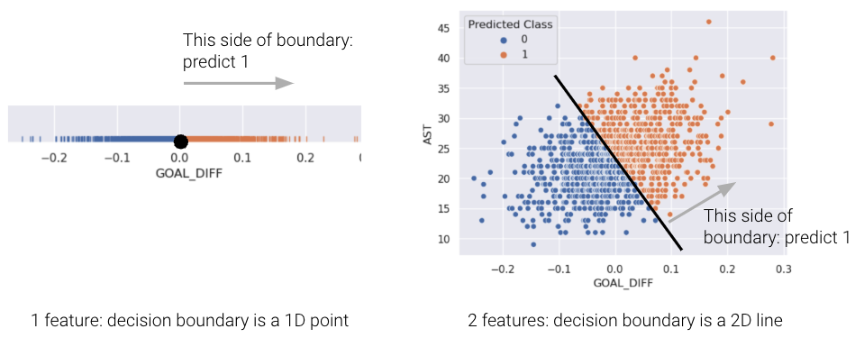
For a model with 2 features, the decision boundary is a line in terms of its features. To make it easier to visualize, we’ve included an example of a 1-dimensional and a 2-dimensional decision boundary below. Notice how the decision boundary predicted by our logistic regression model perfectly separates the points into two classes. Here the color is the predicted class, rather than the true class.
In real life, however, that is often not the case, and we often see some overlap between points of different classes across the decision boundary. The true classes of the 2D data are shown below:
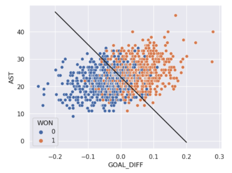
As you can see, the decision boundary predicted by our logistic regression does not perfectly separate the two classes. There’s a “muddled” region near the decision boundary where our classifier predicts the wrong class. What would the data have to look like for the classifier to make perfect predictions?