In this chapter, we will finish the UC Berkeley admissions case study. We will follow admitted students to attendance, bring distance in as a third variable, and make the decisions we need to hand our manager five schools.
Recall the task: your manager asks you to identify five California public high schools that defy typical patterns of application, admission, or attendance. Over the last three chapters, we have looked at each school’s application rate, related it to the share of its students who qualify for free or reduced-price meals (FRL), and computed admission rates in the face of missing data. This chapter carries the analysis the rest of the way to an answer.
Where We Left Off
EDA III ended on two rates that move in different directions. For each FRL-percentile bucket, it computed the application rate, total applicants divided by total 12th graders, and the admission rate, total admits divided by total applicants. Because UC leaves counts below three blank, many schools have a null admitted, and EDA III replaced each one with a random 0, 1 or 2.
The code in the optional collapsed note below rebuilds that state from the raw file, step for step and with the same random seed, so the numbers match EDA III’s. It keeps the 1,229 schools whose application rate is at most 1, and it ends with a table of both rates for each bucket.
Click to see the code
labels = ["0-25", "25-50", "50-75", "75-100"]

# EDA I: load the data, compute application rates, drop impossible rates
admissions = pl.read_csv("data/pivoted-ucb-data-w-everything.csv")
admissions = admissions.with_columns(app_rate=pl.col("applied") / pl.col("grade_12"))
admissions = admissions.filter(pl.col("app_rate") <= 1)

# EDA III: each school's FRL percentile, then four equal-sized buckets
admissions = admissions.with_columns(
    frl_percentile_raw=pl.col("pct_free_reduced").rank() / pl.col("pct_free_reduced").count()
)
admissions = admissions.with_columns(
    frl_percentile=pl.col("frl_percentile_raw").qcut(4, labels=labels).cast(pl.String)
)
binned = admissions.filter(pl.col("frl_percentile").is_not_null())

# EDA III: replace each null admitted with a random 0, 1 or 2
rng = np.random.default_rng(7342)
replace_random = binned.with_columns(
    admitted=pl.when(pl.col("admitted").is_null())
    .then(pl.Series(rng.integers(0, 3, size=binned.height)))
    .otherwise(pl.col("admitted"))
)

# Both rates for each bucket
rates_by_frl = (
    replace_random.group_by("frl_percentile")
    .agg(
        avg_app_rate=pl.col("applied").sum() / pl.col("grade_12").sum(),
        admission_rate=pl.col("admitted").sum() / pl.col("applied").sum(),
    )
    .sort("frl_percentile")
)
rates_by_frlPlotting the two columns side by side makes the contrast easy to see.
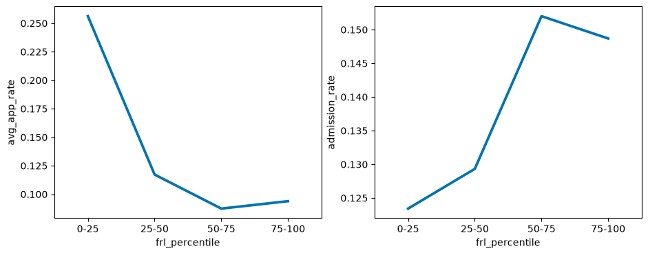
The application rate falls from 0.256 in the 0-25 bucket to 0.087 in the 50-75 bucket, with a small uptick to 0.094 in 75-100. The admission rate goes the other way: it rises from 0.123 to 0.152, then dips slightly to 0.149. Notice that the two panels have different y-axes, and that admission rates cover a much narrower range than application rates do.
Students at high-FRL schools are less likely to apply, but those who do apply are more likely to be admitted. So “students from high-FRL schools do worse” is not a single claim. Two steps of the same pipeline can move in opposite directions across the same groups, and any conclusion has to say which step it is about.
Why Might Admission Rates Rise?
What could be responsible for the reversed pattern? The data we have cannot settle it, but we can state hypotheses precisely enough that someone could go and test them.
Selection effects. At a school where few students apply, the ones who still apply may be the strongest students, the ones most confident of getting in. A school’s applicants are then not a random sample of its 12th graders, and a low application rate can go hand in hand with a strong applicant pool.
Admissions policy. UC considers how an applicant performed relative to other students at the same high school. Suppose that ranking near the top of one’s own class carries real weight. At a school where only a handful of students apply, most of that handful may be near the top of their class, and so most of them may get in.
Attendance Rates and Missing Data, Again
The last step of the pipeline is attending. For each FRL bucket, we want the attendance rate, also called the yield: of the students UC Berkeley admitted, the fraction who chose to attend. As with the other two rates, we pool the counts within each bucket and divide the total number who attended by the total number admitted.
Attendance rates are trickier than admission rates, because both the numerator and the denominator can be missing. The first five schools already show both patterns.
admissions.select("school", "city", "applied", "admitted", "attended").head(5)A B Miller High School has 3 admitted students and a null attended. Able Charter has a null in both columns. How many schools fall into each case?
admissions.select("admitted", "attended").null_count()Of the 1,229 schools, 418 have no admit count and 740 have no attendance count. Before we decide what to do with them, two facts about how these nulls came about will do most of the deciding for us.
First, what does a null attended stand for? EDA III found that the smallest reported admitted is 3, which fits UC’s practice of leaving counts below three blank. The same holds for attended:
admissions["attended"].min()3So a null in attended means that 0, 1 or 2 admitted students attended.
Second, is attended ever known when admitted is not? Answering this takes a filter with two conditions. .filter() accepts several conditions separated by commas, and it keeps only the rows where every one of them holds.
In English: keep the schools whose admitted is null and whose attended is not null, and count them.
admissions.filter(pl.col("admitted").is_null(), pl.col("attended").is_not_null()).height0There are none. Whenever admitted is null, attended is null too, which makes sense: if at most 2 students were admitted, at most 2 could attend, and that count would be suppressed as well.
These two facts justify one reasonable approach:
Ignore the schools where
admittedandattendedare both null. Sinceattendedis never known withoutadmitted, this is the same as dropping the 418 schools with no admit count. Without a denominator, a school has nothing to contribute to an attendance rate.For the schools that remain, replace a null
attendedwith a random 0, 1 or 2, just as EDA III did foradmitted. A random value of at most 2 can never exceed a school’sadmitted, which is at least 3.
Each part of this rule rests on how UC suppressed the counts, which is what makes it more than a convenient guess.
In English: keep the schools whose admitted is not null. Count them, and count how many have a null attended.
That leaves 811 schools, and 322 of them have a null attended value. We fill those in next. The new values go in a new column, attended_random, and the original attended stays as it was, because the next section compares this choice with others.
In English: where attended is null, use a random whole number from 0 to 2. Otherwise, keep attended.
Able Charter, with no admit count, is gone. A B Miller High School’s null became 0 in attended_random, and every school with a reported attended kept its count.
Attendance Rates Fall as FRL Rises
With every remaining school’s attended filled in, we can compute attendance rates. As in EDA III, the schools with no FRL bucket are filtered out first, so that they do not form a group of their own.
In English: for each FRL bucket, divide the total of attended_random by the total of admitted.
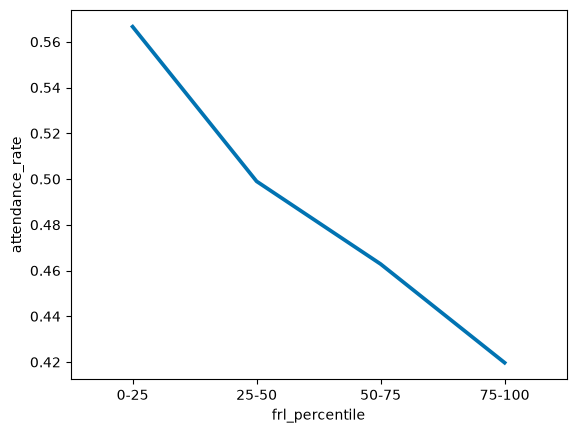
Attendance rates fall steadily as FRL rises, from 0.567 in the 0-25 bucket to 0.420 in 75-100. This is yet another pattern. High-FRL schools apply at lower rates and are admitted at higher rates, and now their admitted students attend at lower rates. What’s going on here? Two hypotheses:
Attending college is expensive. An admitted student from a lower-income family may weigh cost more heavily, and choose a school closer to home or one that offers more aid.
Berkeley may be compensating. If UC Berkeley knows that yield is lower at high-FRL schools, it may admit more students from those schools to make up for it. That would connect this plot to the rising admission rates we started with.
Bringing in a Third Variable: Distance
So far, every comparison has split the schools on one variable. Distance to Berkeley may matter too. Holding FRL status constant, perhaps students at schools closer to Berkeley are more likely to apply, and to attend, than students at schools far away. We will look at applying, the step where every school has a count and nothing needs to be imputed.
admissions = admissions.with_columns(
    dist_percentile=pl.col("dist_to_ucb_miles").qcut(4, labels=labels).cast(pl.String)
)
How should we plot 16 rows and three variables, two bucket columns and a rate? A three-dimensional scatter plot gives each variable its own axis. px.scatter_3d, from the plotly library, draws one from a DataFrame, and its category_orders argument sets the order of the labels on each categorical axis.
How readable is this plot? You can drag it to rotate it, and even then it takes real effort to tell which of two points sits higher, or to follow one distance bucket across the four FRL buckets. Our data has three dimensions, but a page has two.
We are not stuck, though. Position is only one of the channels a plot can use to show a variable. Color, size, shape, line type and shading can each carry one too.
Adding a Variable With Color
The same 16 rows can go into a two-dimensional plot, with the third variable carried by color. The hue= argument tells sns.pointplot which column to map to color, and it draws one line for each value of that column. marker="" removes the dots that would otherwise mark each point in the plot.
sns.pointplot(
    app_by_frl_dist,
    x="frl_percentile",
    y="app_rate",
    hue="dist_percentile",
    marker=""
);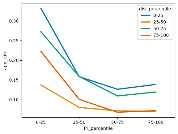
This is the same data as the 3D plot. How would you describe its patterns to someone else? Reading carefully against the table above:
Every line falls from the
0-25FRL bucket to the50-75bucket, and three of the four tick up slightly at75-100, as the overall application rate did. Holding distance roughly constant, the FRL pattern from the start of the chapter still holds.The nearest schools, the
0-25distance line, apply at the highest rate in three of the four FRL buckets. In the25-50FRL bucket, the50-75distance bucket edges past them, 0.159 to 0.158.The
25-50distance line is the lowest in three of the four FRL buckets, and at low FRL it sits far below the rest: 0.137, against 0.223 to 0.332 for the other three.
Is anything unexpected here? If distance alone mattered, the lines would stack in order, with the nearest schools on top and the farthest at the bottom. Instead, the 25-50 line sits at the bottom. One hypothesis is that it has something to do with schools in the Central Valley, such as those in Bakersfield. Perhaps applying to Berkeley is less customary there.
We can check which counties are most common among the schools make up that bucket. We have hidden the code for this below, but here are the counts:
Source
(
    admissions.filter(pl.col("dist_percentile") == "25-50")
    .group_by("county")
    .len()
    .sort("len", "county", descending=[True, False])
    .head(6)
)Five of these six counties are in the Central Valley: Fresno, Kern (home to Bakersfield), Sacramento, Stanislaus and Tulare. Ventura, on the coast northwest of Los Angeles, is the exception. The hypothesis survives this check, although counting counties cannot tell us why these schools apply at low rates.
Tidy Data, Redux
How many rows and columns does the data behind the color plot need? Count the points and the variables:
The plot has 16 points, so the data needs 16 rows.
The plot encodes 3 variables,
frl_percentileon the x-axis,app_rateon the y-axis anddist_percentileas color, so the data needs 3 columns.
The shape, 16 rows and 3 columns, is exactly the plot. Every channel in the sns.pointplot call, x, y and hue, names a column, and every plotted point is a row. The applied and grade_12 columns in app_by_frl_dist were there to compute app_rate; the plot never uses them.
Returning to Our Original Question
We have learned a lot so far:
High-FRL schools tend to have lower application rates, higher admission rates and lower attendance rates.
Schools far from Berkeley tend to have lower application rates, but not in a steady progression. The nearest quartile applies at the highest rate in three of the four FRL buckets, and the Los Angeles quartile applies at a higher rate than the buckets on either side of it in every FRL bucket.
Schools in the Central Valley tend to have especially low application rates, even though they are closer to Berkeley than schools in Los Angeles or San Diego.
There is a lot more to explore. How does distance relate to admission and attendance rates? How do charter schools compare to other schools? Large schools to small ones? Are there similar patterns for UCLA, which is something like the Berkeley of Southern California?
We could keep exploring, but our manager wants an answer. To pick five schools, we first have to decide which schools we are picking from. Some of the decisions this forces:
Should we exclude small schools?
Should we exclude charter schools?
Do we care most about application, admission or attendance?
Should our schools represent California as a whole? For example, is it all right if every one of them is in the Bay Area?
Should we consider schools whose admission or attendance counts we imputed?
None of these questions has an answer in the data. An open-ended task ends when we make decisions like these and state them, not when the data runs out.
One Way to Pick Five Schools
Here is one way to approach the problem. There is no single correct way.
Focus on schools with at least 100 12th graders.
Ignore charter schools.
Focus on application rates, since applying is a single student action that an outreach visit could target. We are open to a school with either an unusually low or an unusually high rate.
For geographic representation, split the schools into five distance buckets and pick one school from each.
Now we can draw the plot the decisions call for: a scatter plot of pct_free_reduced against app_rate for each of the five distance buckets.
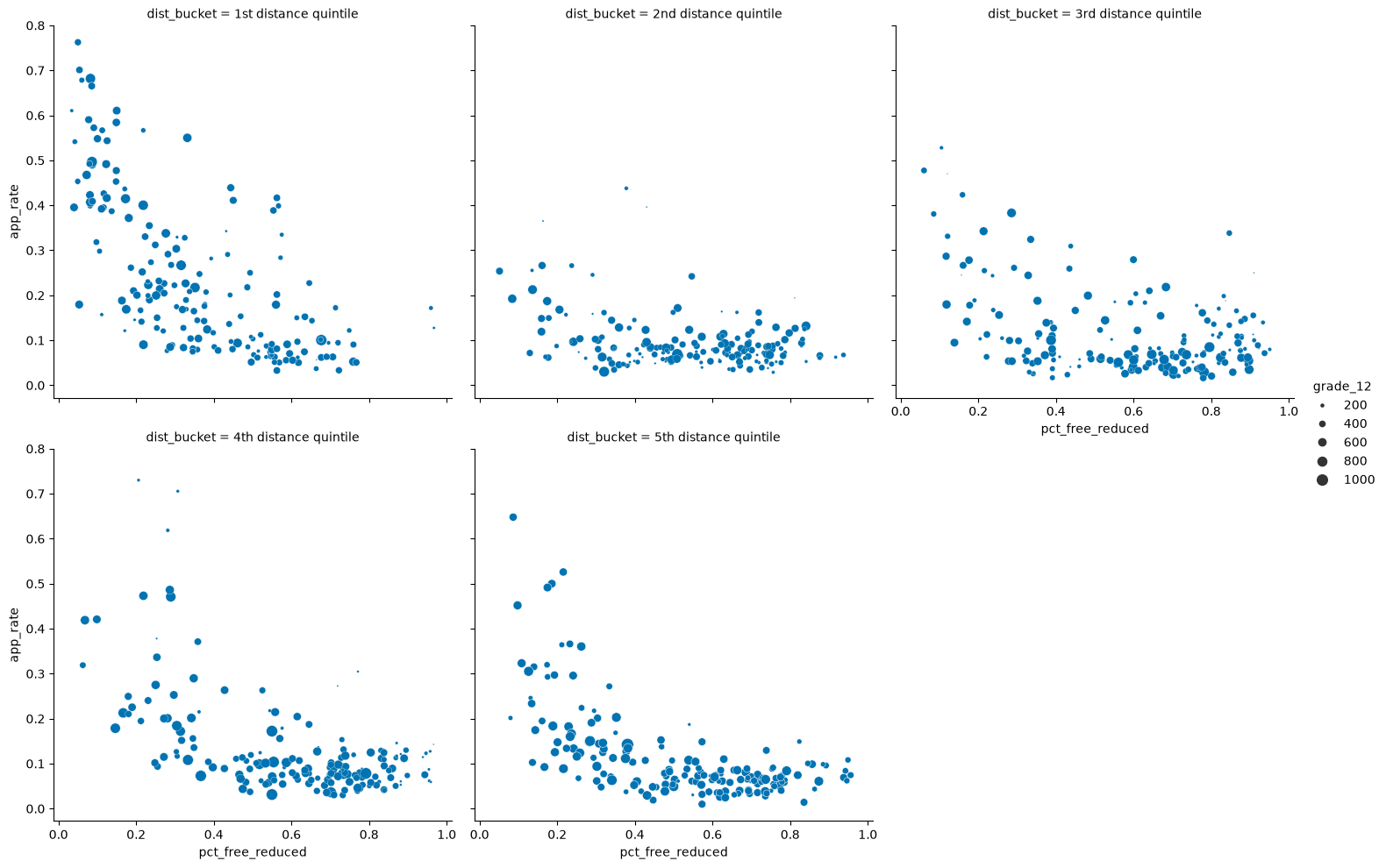
In every panel, the points drift downward from left to right: within each distance bucket, schools with more students eligible for free or reduced-price meals tend to apply at lower rates. That is the “typical pattern” our manager asked about, now drawn separately for each region of the state.
Do any schools stand out? The candidates are the points that sit far from the cloud in their own panel. A point well above the cloud on the right side of a panel is a high-FRL school whose students apply at a rate typical of much wealthier schools. A point well below the cloud on the left is a low-FRL school whose students rarely apply. Large dots matter more if we want to reach many students. Which five would you pick, and could you defend each pick to your manager?
Whatever the answer, it is a product of the choices we stated along the way. An analyst who kept charter schools, or who focused on attendance rather than applications, or who drew the distance buckets differently, could reasonably hand back a different five.
Now, we will step back from the admissions case study and begin to look at four properties every dataset has: its structure, granularity, temporality, and faithfulness.
Key Data Properties
Whatever question we bring to a dataset, a few questions about the data itself come first. Their answers decide which analyses make sense, and they often turn up problems to fix before any analysis can start. We will organize them around four properties:
Structure: the “shape” of a data file.
Granularity: how fine or coarse each datum is.
Temporality: how the data is situated in time.
Faithfulness: how well the data captures “reality”.
Structure has three parts here: the format a file arrives in, the type of each variable, and data that is spread across several tables. We start with rectangular data, file formats, and variable types, then turn to granularity, temporality, and faithfulness. At the end of the chapter we come back to structure, combine tables with joins, and look at how databases organize their tables.
Structure: Rectangular Data
We usually prefer data to be rectangular: a set of records (rows) that all have the same fields (columns). Rectangular data is easy to manipulate and analyze, so a big part of data cleaning is reshaping data until it is rectangular. A folder of spam emails is not rectangular, for example, but a table with one row per email and one column per word, counting how often each word appears, is.
Rectangular data comes in two kinds.
Tables, called
DataFrames in Polars, have named columns, and different columns can hold different types. We manipulate them with data transformations such as filtering, grouping, and joining.Matrices hold numeric data of a single type, such as all floats or all integers. We manipulate them with linear algebra. Computation on a matrix is faster, but a matrix is less flexible than a table.
We can observe each column’s name and type, as well:
Source
admissions.schemaSchema([('school', String),
('city', String),
('county', String),
('applied', Int64),
('admitted', Int64),
('attended', Int64),
('tot_enrolled', Int64),
('grade_12', Int64),
('is_charter', String),
('pct_free_reduced', Float64),
('dist_to_ucb_miles', Float64),
('app_rate', Float64),
('frl_percentile_raw', Float64),
('frl_percentile', String),
('dist_percentile', String)])This brings us to the another aspect of data structure: variable types.
Structure: Variable Types
A variable’s feature type is about what its values mean. Its dtype (String, Int64, and so on) is about how the values are stored. These are separate choices, and a mismatch in either direction causes bugs.
Feature Types
Quantitative variables are measurable numbers: price, temperature, age.
Qualitative (or categorical) variables sort values into categories, and they come in two kinds.
Ordinal variables have categories with a natural order: grade level, age group.
Nominal variables have categories with no natural order: phone brand, or ID numbers assigned at random.
Here are some examples of different variable type classifications:
| Variable | Feature type |
|---|---|
| CO2 level (ppm) | Quantitative |
| Income bracket (low, med, high) | Qualitative ordinal |
| Race/ethnicity | Qualitative nominal |
| Political party | Qualitative nominal |
| Year | Quantitative, or qualitative ordinal |
| GPA | Quantitative, or qualitative ordinal |
| U.S. postal code | Qualitative ordinal, or qualitative nominal |
The distinction between types is sometimes murky, and context matters. GPA is a number, and averaging GPAs is common, so it can be quantitative. But if the question is how many students fall in each GPA band, ordered categories may serve better. The right type depends on the question you are asking of the data.
The Admissions Columns
Here are the admissions columns, classified against the schema above:
| Columns | Feature type | Stored as |
|---|---|---|
school, city, county | Qualitative nominal | String |
is_charter ("Y" or "N") | Qualitative nominal | String |
applied, admitted, attended, tot_enrolled, grade_12 | Quantitative | Int64 |
pct_free_reduced, dist_to_ucb_miles | Quantitative | Float64 |
Every column’s dtype fits its meaning. The frl_percentile column that EDA III and EDA IV built with qcut is a subtler case. Its labels, "0-25", "25-50", "50-75", and "75-100", are ordinal values stored as strings. They sort in the right order only because the labels were chosen so that alphabetical order matches numeric order. A label such as "5-25" would sort after "25-50".
ZIP Codes
What type of variable is a U.S. postal code, such as 94720? It is written with digits, but adding two ZIP codes means nothing, so it is not quantitative. It is not arbitrary either. ZIP codes are assigned by geography: they start at 0 in the Northeast and rise toward the West Coast.
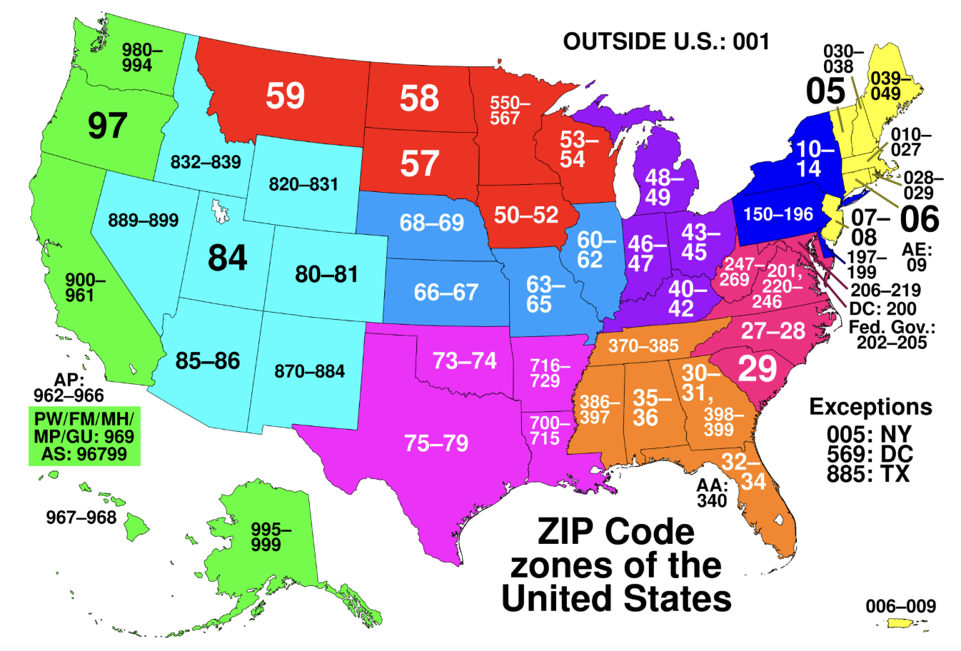
A ZIP code is an identifier with a geographic order, but not in any way that makes sense to think of quantitatively.
We will continue our examination of key data properties in the following chapter.