Data science is an interdisciplinary field with a variety of applications and great potential to address challenging societal issues. By building data science skills, you can empower yourself to participate in and drive conversations that shape your life and society as a whole, whether that be fighting against climate change, launching diversity initiatives, or more.
The field of data science is rapidly evolving; many of the key technical underpinnings in modern-day data science have been popularized during the early 21^st^ century, and you will learn them throughout the course. This field has a wide range of applications, from science and medicine to sports and politics.
While data science has immense potential to address challenging problems facing society by enhancing our critical thinking, it can also be used to obscure complex decisions and reinforce historical trends and biases. This course will implore you to consider the ethics of data science within its applications.
Data science is fundamentally human-centered and facilitates decision-making by quantitatively balancing tradeoffs. To quantify things reliably, we must use and analyze data appropriately, apply critical thinking and skepticism at every step of the way, and consider how our decisions affect others. In fact, the changes currently occurring in the field of data science (which we will address later) are freeing up space to more greatly prioritize this contextual reasoning.
Let us start by looking at a recent and powerful case study.
Case Study: I.R.S. Audit Discrimination
This course is called “Principles and Techniques of Data Science.” Accordingly, we want to answer the question, “What is data science?” Rather than give you a list of what constitutes data science, we’re going to talk about data science through a case study.
This case study is from a recent paper, published last year (2025), with the preliminary paper published a few years ago. It is an example of how data science can drive change in the real world! That said, this case study talks about discrimination and race, and encourage you to engage with this to the extent that you are able.
We are talking about this because it is a great illustration of how data science can make an impact in the real world, as well as both the limitations and potential of data science.
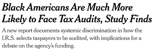
In 2023, the New York Times published an article, which said, “Black Americans Are Much More Likely to Face Tax Audits” and “A new report documents systemic discrimination in how the I.R.S. selects taxpayers to be audited” — let’s unpack this a little.
The I.R.S. is the Internal Revenue Service. It is the U.S. government agency that is responsible for collecting taxes. A tax audit happens when the I.R.S. suspects that something is wrong with someone’s taxes. Maybe the person being audted made a mistake, maybe they’re trying to hide something in order to underpay taxes. The I.R.S. will audit that person to investage, and see what is going on.
This is really burdensome! It is burdensome to the I.R.S., as it costs them time, money, and resources to go out and investigate this person in order to follow up on everything. It is also burdensome to the taxpayer, who may have just made a mistake, or may end up being cleared in the audit if the I.R.S. finds that everything was fine.
Selecting a Metric
There are many ways to define discrimination, such as legal definitions, and many others. For the purposes of this example, we are going to define it as any unjustified differences in decisions that get made, or outcomes that result, between different groups based on race, gender, age, and so on.
As per the New York Times article and the associated study, Black Americans are more likely to face tax audits. When you file your taxes, though, you do not actually give the I.R.S. any information about your race! So, how is it possible for the I.R.S. to discriminate on the basis of race?
In order to answer to that question, we must start by coming up with some quantitative measure that we can use to answer our question. The first step in many data science problems is to identify the thing we are interested in measuring and quantifying.
Comparisons Between Groups
One example in this situation — not the only possible one, but a good example — is to look at the percent of Black taxpayers that get audited and the percent of non-Black taxpayers that get audited. Let’s call the first of those percents X, and the second of those percents Y.
X% of tax returns of Black taxpayers were audited Y% of tax returns of non-Black taxpayers were audited
If there is no discrimination, then maybe we would expect them to be equal. If there is discrimination, then maybe we would expect the first one (X) to be higher.
This is a great illustration of human context! In this course, we will be talking a lot about methods, techniques, ideas, and theory, but we will also be bringing in the human context. Behind every dataset are real people, and real life stories. We want to always keep the context behind this dataset in mind.
Why does this comparison matter?
What is the impact on actual people?
What does it mean if X and Y are different?
What does it mean if they are very far apart?
What does it mean if they are a little far apart?
How do we interpret and think about those differences?
These are important questions that are a key part of data science. Another core part is making comparisons between groups. Much of the work that many data scientists do, in real world projects, is identifying “Here is some value for one group, and here is that same value for another group; let’s compare the two.”
This is a very simple example of that. No fancy calculations here, no fancy models. We are really just looking at percentages across these two groups.
Acquiring the Data
What is the data the researchers had to work with?
Here is an example of a tax form:
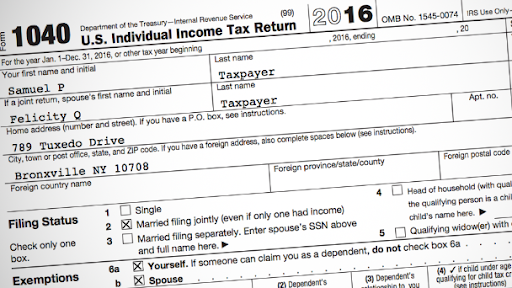
When someone fills out this tax form, it asks for their name, their address, their income and assets, and more.
First off, getting this dataset is not easy! The researchers cannot just call up the I.R.S. and say, “Hey, can you give me all the tax returns for everyebody who filed this year?” The I.R.S. would certainly reply, “No way, that data is private and very secure. We cannot go around just giving it to people.” So, the researchers had a long process of negotiation and collaboration with the I.R.S. before this research was even feasible.
This is a common theme in many data science projects. Data scientists can work on projects where they spend two years negotiating and talking about the data that they are going to get; understanding what the data was and where it came from; and making sure that it was the right data to solve the problem, and then spend just six months doing the analysis!
Getting data can often be really difficult. This involves a partnership, with collaboration, communication, and negotiation. This is often a messy and difficult process, but it’s an important aspect of data science.
Using the Data
For the people included in the study, the researchers have the information on the form and the data on whether the person who filed that form was audited. We can then look at whether certain people were audted more often than others. But again, the problem is that race is not reported anywhere on the form. There is no box for race or ethnicity.
This is also a common theme in data science. We have to make do with imperfect knowlede. Oftentimes, the piece of information we want (in order to answer the question) is just not available, so we have to make some kind of guess. We have to make some kind of assumptions in order to have some kind of proxy, or some way of getting closer to the information we want.
It is very important to be explicit about the assumptions that you make when you do this, so that anyone evaluating your work can judge whether your assumptions make sense. Communicating your assumptions is a really important part of data science.
Identify clever, interesting ways to find the data you want
Potentially make assumptions, and communicate those out
Make an informed prediction of taxpayer race
Use that prediction
Inferring Race
As an example: Let us think about first name, last name, and hometown, and how those three relate to race.
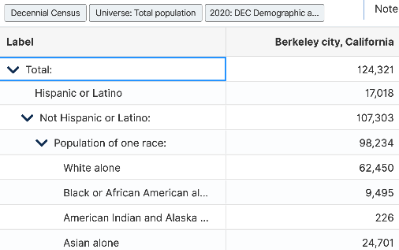
For every location, every city, maybe even down to every census tract (which is a more fine-grained location than city), we can determine how many people there are of each race. Here is the breakdown of Berkeley’s population by race:
We can also go and look up data on the most common names for people of different races. Here is some of that information for first names:
| Race/Ethnicity | Most Popular Baby Name |
|---|---|
| Asian, non-Hispanic | Sophia |
| Black, non-Hispanic | Madison |
| Hispanic | Isabella |
| White, non-Hispanic | Olivia |
There are different patterns and trends in names that people give to people of different races. This can be for many different reasons: social, cultural, historical...there are many different reasons for why this happens.
Again, thinking about the human context, it is important to keep in mind why these differences may exist. We talked about discrimination as unjustified differences between groups. Well, this is a difference between groups. Is it necessarily bad? Why, or why not?
We will use an example to make this a little more concrete. Let us think about New York City and San Francisco.


According to the 2020 census, New York City has 16% of its population that identifies as Asian, and San Francisco has 34% of its population that identifies as Asian. Knowing this, suppose I take on random person from New York City, and one random person from San Francisco. We don’t tell you anything about these people, other than the fact that they are randomly chosen from each of these two cities.
Which one of these two people is more likely to identify as Asian? Well, that will be the one from San Francisco, because there is a larger proportion of people who identify as Asian in San Francisco. All we have to do is use a little bit of probability, and we can make probabilistic inferences about race from hometown.
Probability and Sampling
This is an important key idea in data science, too. Using probability to reason about the world. Maybe I cannot say for sure whether this person is of a certain race or not, but I can quantify and communicate probabilities about what race they might be. So, using probability is a kew idea.
Random sampling is also a key idea. It is important to choose randomly from people in New York so that 16% actually bears out. If I go to certain neighborhoods or certain areas of New York City or San Francisco, I might get a biased sample.
To go one level up, let us think about two people: Robert Johnson, who is from a particular neighborhood in New York City; and Tanisha Tompkins, who is from a particular neighborhood in San Francisco. We can say that each one of those people has a certain percentage probability of identifying as Black. We could calculate this percentage for every taxpayer.
Joining External Data
The researchers in this paper used a whole bunch of external datasets.
They went out and found a mortgage dataset that had information on last names and race
They went out and found a dataset of baby names that had information on first names and race
They went out and used census data to link location and race
They combined all of the information from these different datasets together and used something called BIFSG, which is basically a fancy way of using Bayes’s rule that you learned about in Data 8.
Again, another big idea in data science: joining in multiple external datasets to enable an interesting analysis —- the idea that we can bring different datasets together and use them to do some kind of interesting analysis.
Visualizing the Data
So, what do they find? Here is a graph:
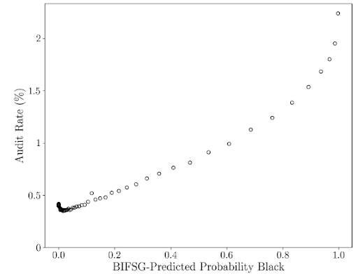
The x-axis is the estimated probability that a particular taxpayer identifies as Black, and the y-axis is the audit rate. So, an audit rate of 1% means that 1 out of every 100 taxpayers is audited. What would you expect this graph to look like if there was no difference in audit rate for different estimated probabilities of being Black? What would you expect to see based on the headline from earlier?
Well, the graph indicates a pretty noticeable pattern. What does that pattern mean? We can see that people who have a higher estimated probability of identifying as black have a much, much, much higher chance of being audited. In fact, it is a 3- to 5-times higher chance.
Another key idea in data science is visualization. Visualization is a really important way to communicate your results. This plot is very simple: it is just black and white, a bunch of simple circles, and two axes. Yet, all of you can look at this and understand what is going on. If you had seen the graph without the data points plotted, you could think about what you would expect to see, and reason about different possibilities.
A really important part of data science is guiding your audience through the process of understanding the data using visuals like this. Think about how people are going to interpret the plot, and construct your visualizations in a way that communicates what you want to communicate.
Stratifying the Data / Controlling for Other Factors
By observing the earlier visualization, we can say that there is this difference in audit rate for different estimated probabilties of identifying as Black. What do you think is the most important factor in determining whether someone gets audited or not? Think about all of the pieces of information collected on a tax return. One good guess is income. So, perhaps the differences we are seeing here are not actually because of race. Maybe they are because of income.
What we can do is stratify the data. We can adjust for race and repeat this visualization. Here is the next visualization the researchers showed:
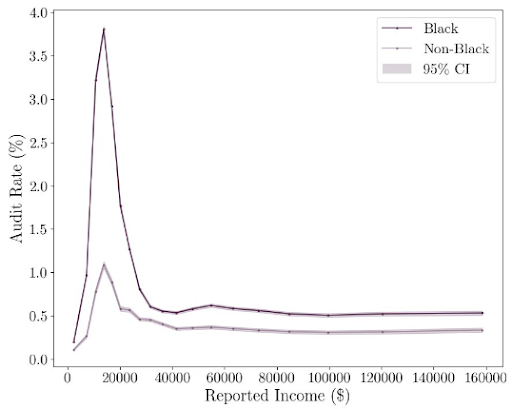
The x-axis is reported income, starting at $0 and cut off at $160,000, and the y-axis is the same audit rate as before. We have one line for Black taxpayers, and one line for non-Black taxpayers.
At every level of income, black taxpayers at that income are audited more often than their non-Black counterparts, with the difference being more severe just below $20,000. At that point of severe difference, non-Black taxpayers have an audit rate around 1%, while Black taxpayers have an audit rate around 4%.
This is another important idea: adjusting for, or controlling for, different variables.
Identifying the Source of the Problem
Remember that the I.R.S. does not collect, or observe, or know a taxpayer’s race. What do you think could be responsible for the patterns in the above plot?
One reasonable guess is location. Due to historical redlining, people from certain neighborhoods are more likely to be of a certain race. Particularly, Black people were discriminated against in housing in the 1960’s onward, and those people are also more likely to have lower incomes.
We can see that there might be reasons behind this difference in audit rate. The researchers thought about this, and about the process that the I.R.S. uses to decide who gets audited. As it happens to be, the I.R.S. takes all of the tax returns and runs them through an algorithm to predict who gets audited.
Algorithms
When the researchers looked closely at it, they thought about what this algorithm is meant to do. What is the point of auditing someone? Is the point to give someone a slap on the wrist for doing something wrong, or is the point to go out and recover money? One might think that the goal of the I.R.S. should be to recover as much money that is legally owed as possible. If somebody owes a lot in taxes, then they should be paying those taxes.
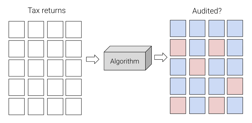
It turns out that the I.R.S.'s algorithm was prioritizing finding people who are making an error with a certain tax credit, rather than prioritizing collecting as much money as possible. Specifically, a tax credit, used by people with low incomes, called earned income tax credits.
Basically, these people were claiming a $500 tax credit that they might potentially have not deserved. On the other hand, an error in under-reporting income could lead to recovering $5,000.
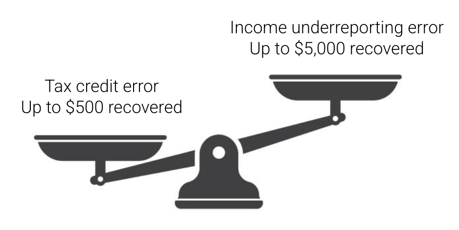
The I.R.S. was prioritizing people making this small mistake over people making a much larger mistake. It also turns out that Black people are more likely to collect that tax credit. If the I.R.S. were to prioritize issues like income under-reporting, they would actually have recovered more money. It is really important, when you design an algorithm, that you think carefully about your metric for success.
The Result
Because Black people tend to claim this tax credit more often, their audit rates were higher. If the I.R.S. had a better policy, they could have recovered more money and had smaller racial disparities. They would not have had to compromise on money collected in order to address these disparities.
The researchers told this to the I.R.S., and this is a great example with a happier ending, where the I.R.S. actually changed the audit practice to reflect the researchers’ suggestion!
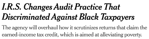
There is a lot more to this story, and we recommend taking a look at the research paper and New York Times article.
The Takeway
Our point here is to illustrate some of the big ideas that we will see come up over and over again, and also to show you that you can improve the world. You can make a pretty significant impact with just the tools from Data 100. No fancy modeling here, no integrals, no deep theoretical stuff. It is really just come smart counting, some probability, and some scrappiness in bringing together different datasets, and the researchers were able to make a pretty significant impact.