Exploratory Data Analysis
The the first step of working with a dataset is called Exploratory Data Analysis, or EDA for short. We are going to show what that means through some examples.
Most of the data we work with in this class is going to be **tabular data. That is data that lives in a table. Typically, it looks something like this:
elections = pl.read_csv("data/elections.csv")
electionsWe have a bunch of rows and columns. Each row represents one observation. In this case, a single person running for president in a particular in the US in a particular year. Each column represents some characteristic/featue/information about that row, about that observation.
In the second row, we have John Quincy Adams, who ran in 1824. You can see the party he ran under, how many votes he won, the percent of the vote that he got, and whether or not he won. This is uh what tabular data looks like.
The vast majority of the data we look in this class will either be tabular, or data that we can massage or push into being tabular.
Languages and Libraries
In Data 8, you worked with tabular data using the datascience library and tables. In Data 100, we are going to use a new-ish industry standard library called polars. We are also going to use SQL, which hopefully you remember from CS 61A or Data 88C.
polars is a Python library (that also works in R, Rust and many other languages) for working with tabular data in what are called data frames. It is very similar to the most widely adopted industry standard, pandas, which is what we used in earlier iterations of this class. In comparison, polars is more similar to the datascience library from Data 8. polars is also growing in popularity very quickly.
The primary goal of this class is not to learn the syntax, but rather to learn the big ideas. If you need to use pandas when you get your first job, you will be able to learn it on the fly. polars is also much more efficient. It scales up better, which is great for many real world applications.
Meanwhile, SQL is a declarative programming language that is completely different from Python, and used for working with tabular data that live in databases. We will talk more about this in later sections. Most of the SQL that we do in this class will be a review from CS 61A, but we will tie it into the polars code as we are learning.
Developing Data Science Skills
In the coming sections, we will explore the mental frameworks around manipulating and visualizing tabular data. This is the same regardless of the language you’re working in, whether that be polars, pandas, R, and even Excel. What we are teaching you is not necessarily the nitty-gritty details of polars.

We want you to come away from the next few weeks understanding the big ideas, as well as questions such as:
What do I do when I get a dataset?
How do I think about manipulating it?
You have to know how to write code to do what we are going to do, and you have to know how to read and understand code. But fundamentally, Data 100 is not a coding class.
We are trying to give you a shared language that you can use to communicate to people, “Here is what I did to my table.” You might also be able to prompt a large language model using this clear language, so that it can write code or visualize something for you.
EDA Workflow
What does a workflow like this look like? Oftentimes, there will be some database that has many many different tables.
Perhaps you are working with a company that has a giant database somewhere in the cloud, with gigabytes, terabytes, or even petabytes of data.
That database may be constantly updated, e.g. for every transaction a customer makes. You are going to use
SQLto get a snapshot of that data at some point in time. You then work with that snapshot for the next few months.You use
polars,R, Excel, orpandasto manipulate and play around with the data.You visualize it using one of the visualization libraries.
Repeat previous steps as necessary, and as new questions come up.
This is a typical data science workflow. You get some data from a database, work with a snapshot, and see what information you can draw out of that data.
Introducing Our Data and Task
We’ll work with an example that you’re all very familiar with: college admissions.
The most common path to UC Berkeley is by applying in 12th grade from a public high school. This path involves three steps, each of which involves a decision:
Students apply to UC Berkeley.
UC Berkeley decides whether to admit each student who applies.
Finally, each student decides whether they will attend UC Berkeley.
We’ll focus on this path for our analysis, but it’s important to remember it isn’t the only one: students can apply from private schools, out-of-state schools, international schools, community colleges, other universities, and so on.
The Task
Suppose you’re an analyst working with the UC Berkeley admissions office. Your manager asks you to “find five schools that defy typical patterns of application, admission, or attendance.” Based on your analysis, they’ll visit the schools and understand what is and isn’t working.
In answering this question, we’ll learn a lot along the way about how to approach open-ended questions like this that are common in real-world data science workflows. We’ll learn how to understand and contextualize data, how to make analysis plans and implement them in code, and how to visualize results.
Questions Relevant to Our Task
We will now focus on asking good clarifying questions. Some examples that are relevant to your manager’s question about five atypical schools:
What is the motivation for this task in the first place?
Are there fewer people attending than we would usually expect?
Are we exploring changes in the student population?
What data can we access?
Where do we have to look for relevant data?
Who has access to the data we need?
Why five schools?
Why not fewer?
Why not more?
Why California public schools specifically?
Why not a different state?
Why not private schools?
Why not transfer students?
Why not community colleges?
What does “typical” mean?
Typical in what way?
There are so many ways for something to be typical or not typical.
What does it mean to defy typical?
Out of the three stages we defined, which one do we care about?
All of them equally?
Two of them more than one?
Do we want to look at schools over time or just in one year?
Are we only interested in what is happening right now?
Are we interested in the past?
Right now, there is an active debate over whether the SAT should be brought back for admissions for students in the UC system. Do we want to compare data from before the SAT requirement was removed with data from after the SAT was removed?
Are we more interested in high-performing versus low-performing?
These are all important questions to ask. For every one of them, the answer will shape how we go about our analysis. For example, if we care a lot more about high-performing than low-performing, then we should spend more of our analysis time and effort on the schools that do well. For low-performing, vice versa.
Most importantly: What kind of data do we have access to? And what data could we request access to? You will see that the answer is often more than you might think.
Finding Our Data
What is the data that we are going to be working with? This is data from the University of California’s official website.
We have all this information on freshman admission and transfer admission. Out of the options for freshman admission, we will be looking at “Counts of fall freshmmen by race/ethnicity”, and then selecting “California public high schools” out of the available datasets.
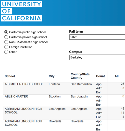
For each of these schools, we have the following information:
the name of the school
the city
the county
the counts for these three stages:
applied
admitted
enrolled
Explaining Missing Data
There are some things we should notice. First off, some of these are blank. Why might some of these entries be blank? Here are some possible explanations:
Blank entries could represent zero students who applied, were admitted, or chose to enroll.
Blank entries could reflect data that the schools or UC could not access or verify.
Blank entries could be instances when there were not enough people for the data to remain anonymous[1].
If only one person from a given school applied to UC Berkeley, and you know that your friend applied there, then you could immediately find out whether or not your friend was admitted. This is a serious privacy concern.
In this case, the answer is noted directly below the dataset. Blank cells do reflect instances where fewer than five students in a given category (“all”, or a specific race/ethncity) applied, or fewer than three were admitted/enrolled. A lot of the time, it will not be that easy. You may have to go on a whole quest to understand the cause of missing data!
However, these are important concerns. We cannot do any analysis on the schools that have blank data, which means that we are probably going to have to exclude them from whatever we do. When we end up excluding missing information, it is important to keep in mind what we are losing. Data from an important subgroup could be missing at a higher rate, and thus affect any subsequent analysis!
Opening Our Data
For our purposes, we are going to focus on public high school data for students admitted in 2025. I would use 2026, but the University of California has not released that information yet.
Let us start by looking at the data.
hs = pl.read_csv('data/pivoted-ucb-data.csv')
hsEnglish:
Load in the dataset.
Polars code:
hs = pl.read_csv('data/pivoted-ucb-data.csv')
hsSQL code:
SELECT *
FROM admissionsCSV: Comma separated values file.
Common way to store tabular data.
hs: A
DataFrame, thepolarsobject for tabular data.
CSV Structure
What does CSV data look like?

The first row contains the names of all of the column names, separated by commas. Each subsequent row contains the information for these columns, in the same order as the labels in the first row, and also separated by commas. Sometimes, there are two commas in a row when the value between those commas is missing. polars treats these blank, missing values as null values.
Our data could have instead come in other data types, such as TSV (Tab Separated Values) and JSON (JavaScript Object Notation).
We have taken the applied, admitted, and enrolled data that were all piled together and pulled them out into a separate column for each step. This operation is called a pivot, and we will discuss this a little further at a later time.
Looking at this preview, what do you know about this dataset, and what questions do you have?
Some observations:
We know the data types of each column (str, i64, etc.)
There are 1,268 schools in this dataset.
There are multiple high schools with the same name (e.g. Abraham Lincoln High School)
Some possible questions:
How do you work with data where some of the entries are empty or null?
We will take a shortcut answer for now, and discuss this in more depth in the future.
Can we know graduating class size?
200 students from Abraham Lincoln High School in San Francisco applied to UC Berkeley. Does this reflect a huge class size, or did almost all of the students from that school apply?
While we need code in order to load and manipulate the data, we want to emphasize the thought process and the English descriptions of what we are doing. These days, the industry is shifting more and more towards the use of large language models (LLMs for short) to write code. This kind of plain-language-first approach is helpful both for prompting LLMs, and for organizing your own plan.
In this case, the plain language for what we are doing is that we are loading in the dataset and showing a preview of the data.
How do we do that in polars, our data processing library? First, we use pl, to refer to polars (just like we would use np to refer to NumPy). From there, we have pl.read_csv, where CSV stands for “Comma Separated Values” (a common data format). We give this method the name of the file, and then we print the resulting DataFrame. Here it is again for your convenience:
hs = pl.read_csv('data/pivoted-ucb-data.csv')
hsExploring Our Data
Returning to the topic of asking questions about our data, we will provide four in order to frame the coming exploration:
Context and Inspection
First, we always want to ask: Do you actually trust the data? How closely does it correspond to the truth?
Anytime we do data analysis, we’re trying to understand some phenomenon in the real world, and data is always going to be an imperfect representation of the real world.
In this dataset, we saw that schools with very small numbers of applicants do not have data here, and thus are not reflected in this dataset. Context and inspection are extremely important.
Extremes
Which schools have the highest application, admission, or attendance rates?
We saw that Abraham Lincoln High School in San Francisco had 200 people applying. Is that big? How does that stack up as an application rate?
Distributions
How much do application, admission, and attendance rates differ across schools?
Are they all fairly similar? Are they really spread out? How much variation is there?
Why is that variation there? What is the distribution? What are the different values that these rates take on across different schools?
Correlation
Are there other characteristics of the schools that are related and linked to these three (application, admission, and attendance rates)?
We’ll get to correlation at a later point.
Context and Inspection
We’ll start with questions about data provenence. “Provenence” is a word that just mean data providence just means “where the data comes from”. In this case, we got our data from the official UC website.
However, as you can observe, the data we loaded in looks different than the data directly on the website. We can observe that there is an Abraham Lincoln High School from Riverside in the data on the website, but our dataset does not have it. Our dataset only has LA, San Francisco, and San Jose.
Why? The answer is that we have removed schools that have entirely missing values. Then, we show any missing values using null. Null is a standard computer science term that means “missing”. Null is not the same as zero. Was it a good idea to drop rows entirely? Maybe, maybe not. Again, we will discuss ways to handle missing data a little later.
Do we trust this data? As mentioned, we drop schools that have fewer than five applicants. If we go to the California Department of Education website, we can see that there are 1,700 public schools in California that have 12th grade, but there are only 1,268 in our dataset. So, this data is not complete. It is important to communicate this to anyone with whom you are sharing this data, or any resulting analysis!
len(hs)1268English:
Count the nubmer of rows in the dataset.
Polars code:
len(hs)OR
hs.shape[0]SQL code:
SELECT COUNT(*)
FROM admissionshs.shape(1268, 6)The first item in this tuple is the number of rows, and the second item is the number of columns. To access these, we would use brackets and the index of the item in the tuple. Thus, to get the number of rows, we would use hs.shape[0], and to get the number of columns, we would use hs.shape[1]. Here is the latter:
hs.shape[1]6Extremes and Sorting
Here, we have a version of the dataset that is sorted by the number of people who who have applied. Because again, we want to know what are the extremes. Are there schools that are doing particularly well or particularly badly? Maybe we want to know what the largest number of applications per school.
hs.sort('applied', descending=False)English:
Sort the dataset in ascending order by the ‘applied’ column.
Polars code:
hs.sort('applied', descending=False)SQL code:
SELECT *
FROM admissions
ORDER BY applied ASCSorting is a common operation in EDA. Specifically, we want to sort the dataset in ascending order by the applied column.
We apply the .sort method to our DataFrame, where the DataFrame is the object type for our table. We pass the name of the column by which we are sorting, and then specify the sort order as ascending or descending using descending=False or descending=True, resepctively. In SQL. you would specify sort order as ascending or descending using ORDER BY column_name ASC or ORDER BY column_name DSC, respectively.
Keep in mind that .sort does not modify our original DataFrame. If we were to view the original DataFrame on its own again, by calling hs, we would see the data unsorted. If we want to modify our original DataFrame to reflect our new sort order, we would have to reassign hs to the result of this operation, using hs = hs.sort('applied, descending=False).
We can see that Dougherty Valley High School in San Ramon had the highest number of applicants. But again, we don’t know whether that’s a reflection of a large class size, a large proportion of students applying, or both.
What if we wanted to find the schools with the smallest number of applicants out of those that remain in our dataset?
hs['applied'].min()5English:
Find the minimum of the ‘applied’ column.
Polars code:
hs['applied'].min()SQL code:
SELECT MIN(applied)
FROM admissionsWe would apply brackets (containing the desired column name) to our DataFrame. This picks out the desired column as an array. It’s not quite a NumPy array, though; it’s slightly different. We’ll talk a little bit more about that later.
But we can pull out the min with .min(). In English, we would describe as, “Find the minimum of the applied column.” Remember, we want to describe what we’re doing in English and be able to write code that does it. And the code in DF applied.mmin SQL query looks like SELECT MIN(applied) from admissions.
Alongside the minimum, we can also find the maximum, mean, standard deviation, etc.
Now, we might want to ask which schools have the highest application or admission or attendance rates.
We could sort in the opposite order, still sorting by the number of people who applied, but this time sorting in descending order (largest to smallest) instead of ascending order (smallest to largest).
hs.sort('applied', descending=True)English:
Sort the dataset in descending order by the ‘applied’ column.
Polars code:
hs.sort('applied', descending=True)SQL code:
SELECT *
FROM admissions
ORDER BY applied DSCJoining and Using External Data
However, these are still just the application counts; if we want to know the application rates, we need the denominator, which is the number of students who attended those schools.
You will often have data that is a count, while you actually want the rate. Or you may have the rate, while you actually want the count. It’s important to keep this distinction in mind, and not get them mixed up!
In this instance, the rate is the number who applied, divided by the number of possible applicants. Do we have the number of possible applicants in this table? No! The number of possible applicants is really the number of 12th graders.
As noted earlier, we will be scrappy with data. We can go to the California Department of Education’s website, where they have a great source of data.
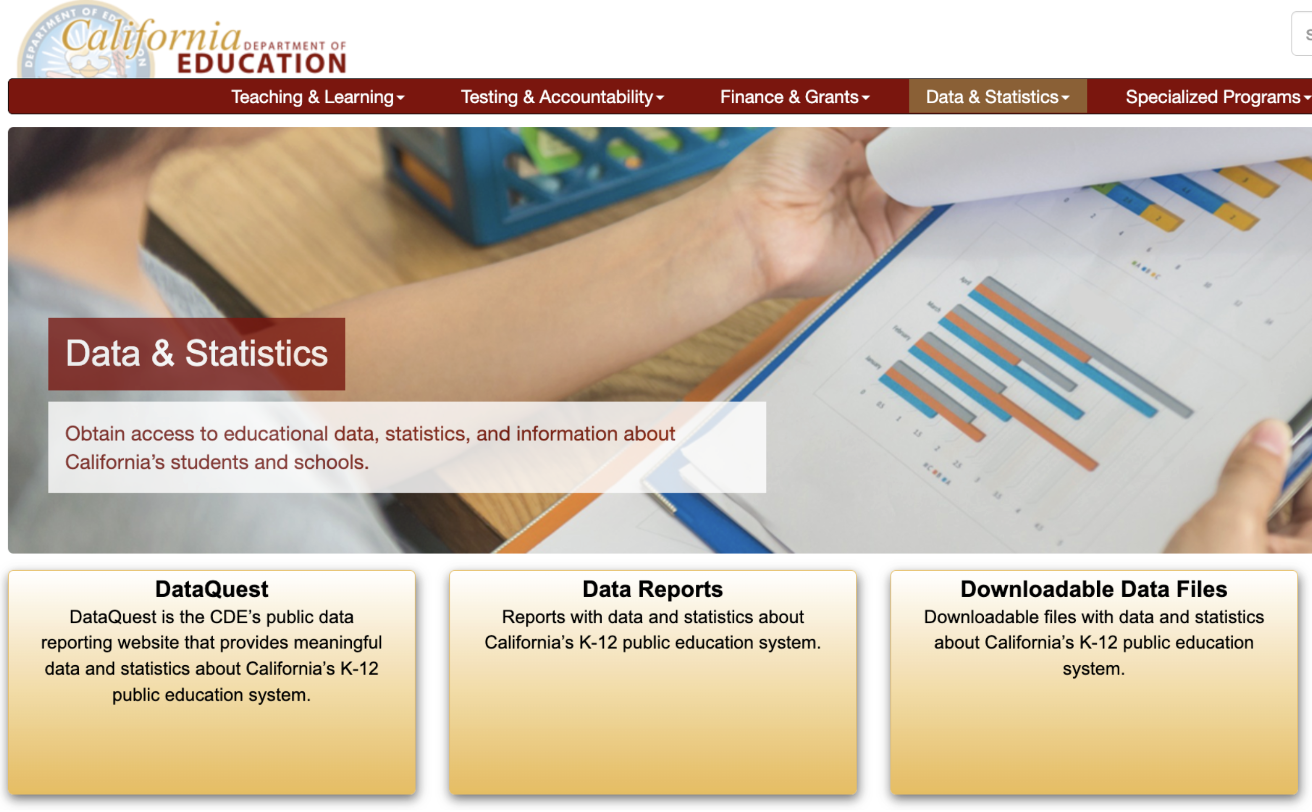
While DataQuest and Data Reports are nice for some general purposes, data scientists need raw donwloadable data files that we can manipulate, join to other datasets, etc. Thus, we will
In order to use this new data containing the number of 12th graders in each school with our original dataset, we need to perform an operation called a join. which is hopefully familiar. We can join datasets containing different information to create a new dataset, particularly when there is some shared information (like the names of different schools). We will discuss joins in greater detail at a later time. But we have this data. We have the schools.
We will join our existing data with census day data for California schools, which contains information on the total number of students enrolled per school in various grades. But in this case, the join is a little tricky, because high school names might be written differently! Maybe different styles of capitalization, different ways of writing different words, shortening, abbreviation, etc. We have done this for you behind the scenes, but it is an important part of the data cleaning process.
Creating New Columns
For every high school, we still have our data from earlier: the city, the county, and the number of applied, admitted, and attending. With our joined data, we also have two new columns: the total number of students enrolled at each school, and the number of 12th graders enrolled at each school.
How do we use this to calculate the application rate? It is the number who applied, divided by the total number of 12th graders.
How do we do this in code? This is where the polar code starts to look a little different from what you might have seen before. First, we will read in the dataset resulting from our join operation.
hs_enroll = pl.read_csv('data/pivoted-ucb-data-w-enrollment.csv')We add our new 'app_rate' column using pl.with_columns. Inside the .with_columns method, we enter our new column’s name (without quotes) and set it equal to the calculation that creates our new column’s data. To perform this calculation, we divide the 'applied' column by the 'grade_12' column, which performs element-wise division between these two features for each row. In polars, we pull out these columns inside of expressions using pl.col('column_name').
hs_enroll = hs_enroll.with_columns(
app_rate=pl.col('applied') / pl.col('grade_12')
)
hs_enrollEnglish:
Create a new column with the application rate for each school.
Polars code:
hs_enroll = hs_enroll.with_columns(
app_rate=pl.col('applied') / pl.col('grade_12')
)
hs_enrollSQL code:
SELECT applied / grade_12 AS app_rate
FROM admissionsWe now have our application rate. We want to ask, “Which schools have the highest application rates?” We will again sort the table by the relevant column, our 'app_rate' column. We will sort in descending order, so that the largest values are at the top. That is our analysis plan in plain English: “Sort the data frame by the app rate column in descending order.”
Source
hs_enroll = hs_enroll.filter(pl.col('app_rate').is_not_null())hs_enroll.sort('app_rate', descending=True)English:
Sort the DataFrame by the ‘app_rate’ column in descending order.
Polars code:
hs_enroll.sort('app_rate', descending=True)SQL code:
SELECT applied / grade_12 AS app_rate
FROM admissions
ORDER BY app_rate DSCInspecting Anomalies
This is our data, sorted in descending order by 'app_rate', but something is strange. One of the schools has an application rate of 2.5, and we can see that there are 16 12th graders even though there are 40 students who applied.
How is it possible to have an application rate over 100%?
Maybe it’s not just 12th graders who are applying. Maybe people graduated, took a gap year, and then applied, or maybe somebody applied from 11th grade. Again, it is important to consider whether our data are an incorrect reflection of reality. Are there assumptions we’re making about our data that might not be quite right?
But it is also important to consider whether you may have simply made a mistake, like pulling information for one of the joined datasets from the wrong year. Anytime you look at a dataset and you see something weird, you should always first check whether the abnormality is the result of a mistake on your end.
It turns out, in this case, that this was the result of a mistake! You’ll explore this mistake in your HW2 assignment.
Filtering Rows
For now, we can see that there are few schools with these anomalous application rates, so we will simply filter them out. We know that there are no more schools with fitting this description in this dataset, because we sorted in descending order and can already see the largest application rates.
We will just remove those four schools for now and continue on with our analysis. Maybe there’s something interesting going on with them, but we know that they’re all small schools, so we’ll leave them out for now.
So, we need to filter our dataset to remove those points. How do we filter? We want to filter out only rows where application rate is greater than one, or only keep rows where application rate is less than or equal to one. Then we want to sort.
hs_enroll = hs_enroll.filter(pl.col('app_rate') <= 1)
hs_enroll.sort('app_rate', descending=True)English:
Filter data to rows where app_rate <= 1. Then, sort by app_rate.
Polars code:
hs_enroll = hs_enroll.filter(pl.col('app_rate') <= 1)
hs_enroll.sort('app_rate', descending=True)SQL code:
SELECT applied/grade_12 AS app_rate
FROM admissions
WHERE app_rate <= 1
ORDER BY app_rate DSCIn order to filter our rows, we use .filter in polars. We pull out the application rate column using pl.col, and say that it is less than or equal to one. Then we use .sort as before.
In SQL, filtering happens with using the WHERE keyword. We redo all of the operations to create the app_rate column, because SQL would require us to create a new table in order to add a column.
Defining Success
Now that we’ve filtered and sorted, do we have our answer to the original task that our manager assigned us? Have we found five schools that defy typical patterns of attendance? We have the five schools with the highest application rates, after all.
However, we don’t know whether or not this is typical, because we haven’t defined what we mean by “typical”.
We have found the five schools with the highest application rates, but there is much that we have not checked out. We haven’t looked at admission or attendance at all! Even within applcation rates, we haven’t looked at low application rates, or at the center and variation of the distribution. We haven’t looked at what is “typical” as a baseline against which to compare schools that “defy typical”.
If we look at these schools, we can see that one of these schools is pretty small, with a total of only 60 12th graders. Another school looks like a a special specialized school math and science academy.
Are these five a good representation of public schools in California? Maybe, maybe not. In order to answer the question of what is a good representation, we need to look at our dataset and understand the overall distribution.
Some Code Specifics
First, we will go over some code that hid earlier in this course note. We start by importing polars as pl and seaborn as sns.
import polars as pl
import seaborn as sns
import numpy as np

sns.set_palette("colorblind")seaborn is the visualization library that we’re going to use to create our visualizations. We also import NumPy as np, and set a color palette for seaborn.
Let’s return to when we pulled out the 'applied' column in our hs dataset using hs['applied']. This may feel familiar to using bracket notation to pull an item out of a dict by the name of its key.
hs['applied']What is this single column object? It is something called a Series. This is kind of like an array, but instead of using NumPy, it uses something called Apache Arrow. Don’t try to use numpy functions on this object, it will break! You can still perform many of the same operations you would with a NumPy array by saying .min(), .max(), .mean(), and so on.
You can also use .describe on one of these Series objects to see many of these summary statistics at a glance. (There is no concise equivalent to this in SQL.)
hs['applied'].describe()You can also apply .describe() to a DataFrame, which simply presents these same summary statistics for every columnn in the DataFrame. This is unhelpful for string-valued columns, where summary statistics like min, mean, and max have no meaning.
If you want a NumPy array instead (which you may want for various reasons), then you would call .to_numpy(), as such:
hs['applied'].to_numpy()array([25, 8, 48, ..., 8, 29, 20], shape=(1268,))This then allows you to use NumPy functions directly:
np.min(hs['applied'].to_numpy())np.int64(5)Pulling a column out of a DataFrame into a 1-dimensional Series object is not the only way to pull out columns that you want. pl.col('column_name'), which we used earlier when we were creating our 'app_rate' column, is how we call on individual columns inside of other polars expressions.
This is also how you select columns out of your DataFrame, as such:
hs_enroll_subset = hs_enroll.select(pl.col('school'), pl.col('attended'))
hs_enroll_subset
When using .select, you can also plug in the names of the columns directly, like this:
hs.select('school', 'attended')However, it is generally more reliable to use pl.col('column_name').
Again, we don’t necessarily want you to know all of the details of these functions and methods, but rather to have a vague idea of how they work. If somebody gives you code and where they did some filtering, you should be able to make sure that they filtered correctly. You can read it and understand what’s going on.
Distributions
In order to talk about “typical”, we have to understand how the data varies from school to school. We used .describe to calculate various summary statistics for the 'app_rate' column, including a mean of 0.16 That is, across all 1,200 schools in my dataset, the average application rate was 16%. Additionally, the standard deviation was 13%, and we also had the 25th percentile, 50th percentile, and so on. The max is 83%.
Is this helpful? It does tell us something about our distribution, but a picture is worth a thousand words. Generally, we want to start with visualizations, and only see specific numbers afterwards. This can be counterintuitive, but humans generally much better at processing images than text.
Boxplots
In particular, we’re going to look at a boxplot. A boxplot is a visualization where has a box with some whiskers on the ends, and potentially some dots outside of the whiskers.
sns.boxplot(hs_enroll, x='app_rate')<Axes: xlabel='app_rate'>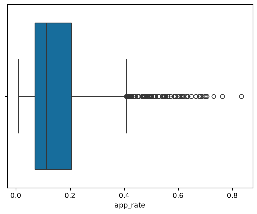
English:
Make a boxplot of the values in app_rate.
Seaborn code:
sns.boxplot(hs_enroll, x='app_rate')The box is bounded by the 25th percentile (or first quartile, or Q1) on the left side, and the 75th percentile (or third quartile, or Q3) on the right side. The line inside of the box is the median (or 50th percentile, or second quartile, or Q2).
The whiskers we get by computing something called the interquartile range, or IQR = Q3 - Q1. The left whisker ends at Q1 - (1.5 * IQR), and the right whisker ends at Q3 + (1.5 * IQR). Every point beyond those whiskers, or everything outside the range [Q1 - 1.5 IQR, Q3 + 1.5 IQR], we consider to be outliers.
This gives you a measure of how spread out your data set is. If you have data that are really spread out, your IQR is going to be really big, and it’ll be really small for data with little overall spread.
Again, helpful to think about how these visualizations work and how they would display datasets with different distributions.
Getting back to our distribution of application rates, the boxplot shows that most of the application rates fall approximately between 0% and 40%, with outliers beyond 40%.
Histograms
We can also look at this data as a histogram, which comes with certain advantages and certain disadvantages.
sns.histplot(hs_enroll, x='app_rate')<Axes: xlabel='app_rate', ylabel='Count'>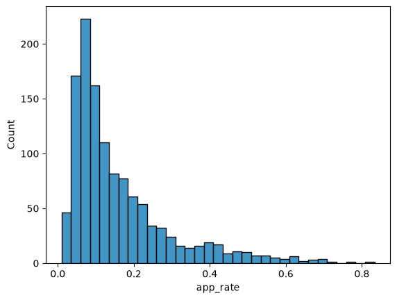
English:
Make a histogram of the values in app_rate.
Seaborn code:
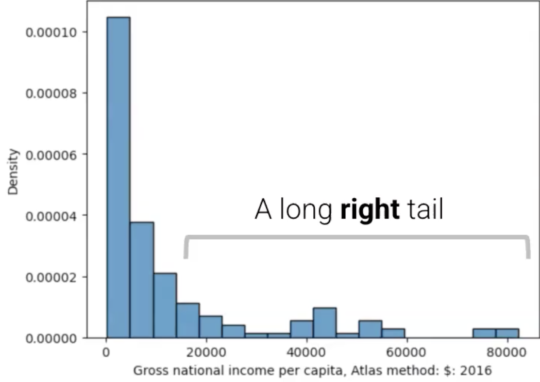
sns.histplot(hs_enroll, x='app_rate')We say that there is a long right tail, with values above 0.4 and there’s a peak around 0.05 (or 5%). In a histogram, we say that there is skew in the direction in which the tail extends. Right skew indicates that the mean is greater than the median, as the mean is more greatly affected than the median by outlying data.
Here is another example of a histogram with right/positive skew, with mean > median:
And here is an example of a histogram with left/negative skew with mean < median:
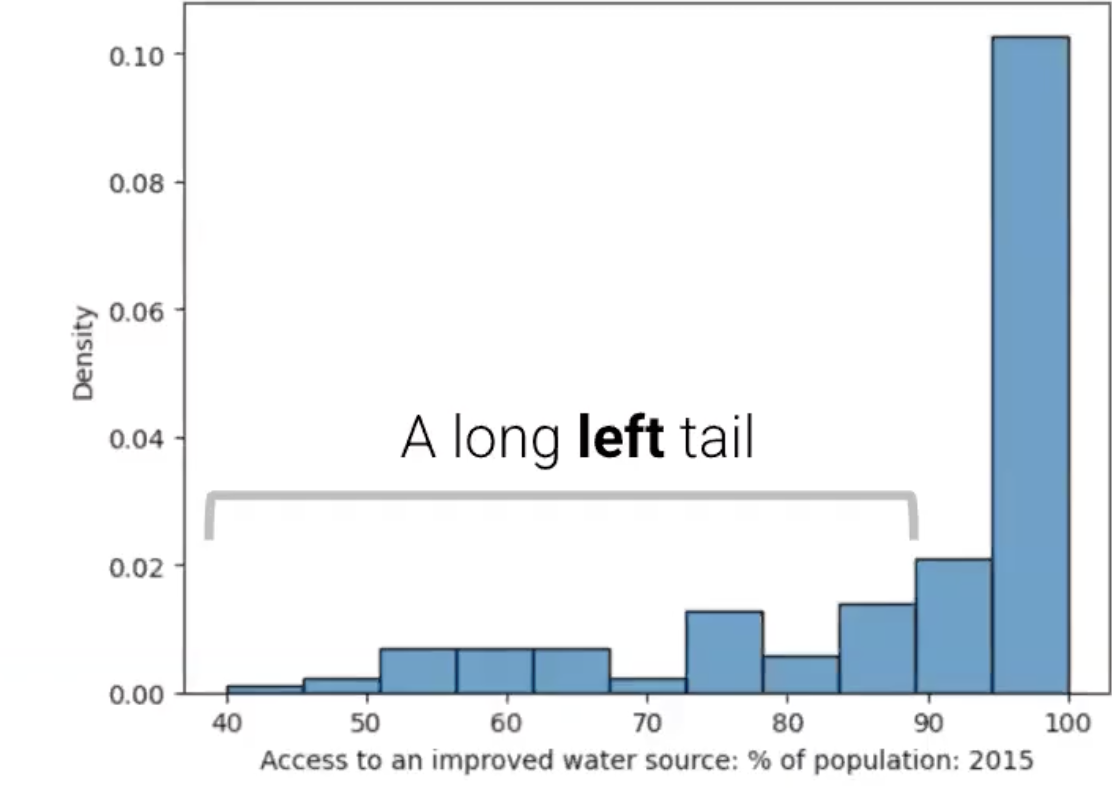
Which one of these is more common in the real world? Right skewed data happens to be much more common than left skewed data. Why might that be? Well, a lot of datasets we work with start at zero and extend positively, such as income.
The mode is the most frequent value of the distribution. If we have a distribution that has one clear peak, it’s called unimodal (as in, a single mode). This includes all three histograms we’ve seen so far, including our histogram of application rates.
A distribution with two peaks is called bimodal, and a distribution with more than two is called multimodal. These labels can be a little fuzzy, because it can be hard to tell whether or not something counts as an additonal peak, which depends on the calculation you use to distinguish peaks and what sort of threshold you use for that distinction. It is up to you to decide how important it is whether the data is unimodal, bimodal, etc.
Notably, it is impossible to recover this information using a boxplot! This is one major advantage of histograms over boxplots. You can get a more detailed idea of the shape of your data’s distribution. However, depending on the bin sizes (how fine-grained your histogram is), this can surface what seem like important patterns or peaks, but are really distractions from the overarching pattern.
Takeaway and Future Direction
We have explored how to find data, how to access and begin using our data, and how to ask important questions about our data. This has led us to inspect missing and anomalous data, check for extremes, examine distributions, and keep context in mind at all steps.
Why is there so much variation in application rate across schools? Well there are many different reasons. We’ll start next time thinking about why those decisions might be complex, but we can bring in a lot of that data from external sources. We will start our next section by thinking about what other information we can bring in about these schools, in order to help us understand why there might be variation here.
There’s a really interesting paper from Latana Sweeney (that she wrote back in 2000) that highlighted this problem for the first time. It was a very embarrassing story about the health records of the governor of Massachusetts getting released. Would recommend checking it out if you have some extra time. It’s been in the news!