We will pick up where EDA II left off: with a plot of four points and the four-row table behind it, which we could describe but not yet build. In this chapter, we will learn to carry out “For each…” analysis plans as grouped operations in Polars and SQL, use them to build that table one step at a time, and then meet our first real decision about missing data.
Where We Left Off
We continue with the UC Berkeley admissions data, joined with the California public schools data. As in EDA I and EDA II, we add each school’s application rate and keep the schools whose rate is at most 1.
admissions = pl.read_csv("data/pivoted-ucb-data-w-everything.csv")
admissions = admissions.with_columns(app_rate=pl.col("applied") / pl.col("grade_12"))
admissions = admissions.filter(pl.col("app_rate") <= 1)
admissionsThis is the same table of 1,229 schools and 12 columns that EDA II worked with. In the SQL blocks throughout this chapter, admissions names this filtered table, app_rate included. When we add a column to the Polars frame, assume the SQL table has it too.
EDA II ended by asking how to generate the four-row table behind its summary plot, and by naming the pattern that most of the answer follows: “For each unique value of COLUMN(S), do SOMETHING.” A grouped operation has two parts, the column (or columns) that define the groups, and what we do to each group. In Polars, .group_by(...) is the way to say “for each unique value of”, and the method that follows it says what to do.
Grouped Operations
Each question in this section starts as an analysis plan in the form “For each…”, written before any code. The plan is the part that takes thought. Once it is clear, the Polars and the SQL follow from it.
Counting Rows per Group
Which counties have the most schools?
English: For each unique value of county, count the number of rows. Sort in descending order of that count.
.group_by("county") splits the table into one group per county. Calling .len() on those groups counts the rows in each one, and returns a new table with one row per county: the group key county and a count column named len. We then sort on len as usual.
admissions.group_by("county").len().sort("len", descending=True)The result has 54 rows, one per county. Los Angeles leads with 321 schools, followed by San Diego (94) and Orange (77). None of the other columns mattered: to count rows, we only needed to know which county each row belongs to. Counties that tie, like the ones with a single school at the bottom of the table, come out in no fixed order.
The same count can be written with .agg(), which is how most grouped computations in this chapter look. .agg(...) takes one or more named expressions and evaluates each one once per group. Inside it, pl.len() means “the number of rows in this group,” and the keyword num_schools= names the output column, just as a keyword argument names a new column in .with_columns().
admissions.group_by("county").agg(num_schools=pl.len()).sort("num_schools", descending=True).head(5)The counts are the same; only the column’s name has changed.
SQL:
SELECT county, COUNT(*) AS num_schools
FROM admissions
GROUP BY county
ORDER BY num_schools DESC
EDA I counted schools per city with .value_counts(sort=True), and admissions["county"].value_counts(sort=True) gives these same county counts. .value_counts() is a shortcut for this one grouped operation. .group_by() is the general tool, and the rest of this chapter needs it.
A related but different question is how many counties there are. That asks for the number of distinct values in one column, and .n_unique() gives it directly for a Series:
admissions["county"].n_unique()54There are 54 counties, which is also the number of rows in the grouped table. The two agree because each county gets exactly one row, but they answer different questions. .n_unique() asks “how many groups are there?”, while .group_by(...).len() asks “how many rows are in each group?”
Aggregating a Column Within Each Group
Counting rows is only one thing we can do to a group. To see the others on a table small enough to check by hand, we use six purchases from a store. pl.DataFrame({...}) builds a DataFrame from a Python dictionary: each key becomes a column name, and each list becomes that column’s values, in order.
transactions = pl.DataFrame(
    {
        "customer_id": ["A", "B", "B", "A", "A", "B"],
        "date": ["6/1", "6/1", "6/1", "6/2", "6/2", "6/2"],
        "cost": [10, 50, 10, 20, 100, 30],
    }
)
transactionsEach row is one purchase: who made it, on which day, and how much it cost.
Which customers spend the most money?
English: For each customer_id, sum up the cost column. Sort in descending order of the summed cost.
EDA I called .min() on a whole Series. The same aggregation methods, including .sum() and .mean(), also work on an expression such as pl.col("cost"). Inside .agg(), the expression is computed separately for each group, so pl.col("cost").sum() gives one total per customer.
transactions.group_by("customer_id").agg(total_cost=pl.col("cost").sum()).sort("total_cost", descending=True)Customer A spent 130 and customer B spent 90. Each column of the result is either a group key (customer_id) or something we named inside .agg() (total_cost). The date column is gone, because we did not say what to do with it.
SQL:
SELECT customer_id, SUM(cost) AS total_cost
FROM transactions
GROUP BY customer_id
ORDER BY total_cost DESCThe First Rows of Each Group
EDA I used .head(n) to preview the first n rows of a table:
admissions.head(3)SQL:
SELECT *
FROM admissions
LIMIT 3
.head(n) has a second use. On a grouped table, it takes the first n rows of each group.
In each county, which two schools admitted the most students?
English: First, sort the entire table in decreasing order of admitted. Then, for each unique value of county, take the first two rows.
top_two = (
    admissions.sort("admitted", descending=True)
    .group_by("county")
    .head(2)
)
top_twoThe result has 101 rows: two for each of the 54 counties, except the seven counties that have only one school. In Alameda County, BERKELEY HIGH SCHOOL (73 admits) and MISSION SAN JOSE HIGH SCHOOL (43) come first. At the bottom of the table, both Yuba County schools admitted 3 students, and the school key decides the order of ties like this one.
Notice that all 12 columns are kept. .agg() returns only the group keys and the columns we name, while .head() returns whole rows, with the group key county moved to the front. .head() takes the rows of each group in the order they had before grouping, which is why the sort comes first.
Grouping on More Than One Column
How much did each customer spend on each day?
English: For each unique combination of customer_id and date, sum up the cost column.
Passing two column names to .group_by() makes each group a unique combination of their values. Customer A on 6/1 is one group, and customer A on 6/2 is another.
daily_totals = transactions.group_by("customer_id", "date").agg(total_cost=pl.col("cost").sum())
daily_totals.sort("date", "customer_id")Four combinations appear in the data, so the result has four rows. Customer A spent 10 on 6/1 and 120 on 6/2, while customer B spent 60 on 6/1 and 30 on 6/2.
SQL:
SELECT customer_id, date, SUM(cost) AS total_cost
FROM transactions
GROUP BY customer_id, date
ORDER BY date, customer_id
Grouping Twice
Which customer spent the most money on each day?
English: For each unique combination of date and customer_id, sum up the cost column. Then, sort the result in decreasing order of summed cost. Finally, for each unique date, take the first row.
The first step is daily_totals, which we just computed. The rest is the recipe from the county question: sort, group, then take the head of each group.
daily_totals.sort("total_cost", descending=True).group_by("date").head(1).sort("date")On 6/1, customer B spent the most (60), and on 6/2, customer A did (120). The second .group_by() does not remember the first. It throws away the groups of customer and date and defines new groups by date alone.
Building the FRL Table
A Three-Step Plan
We now have the tools to answer EDA II’s question. The target is a tidy table with one row per point in the plot and one column per feature: four rows, one for each FRL bucket, and two columns, frl_percentile and avg_app_rate. Our data has one row per school, so we need a plan to get from one to the other:
Compute the FRL percentile of each school.
Put each school into one of four buckets:
0-25,25-50,50-75and75-100.For each unique FRL bucket, compute the application rate.
Only step 3 is a grouped operation. Steps 1 and 2 build the column that step 3 groups by.
A plan at this level of detail is also a good first message to an LLM. You supply the plan, which takes an understanding of the data and of what a percentile is. The LLM can supply syntax you do not need to memorize, such as how to compute a percentile in Polars. Your job is then to check what comes back, and the next step shows why.
Step 1: Calculating Raw Percentiles
A school’s FRL percentile is the fraction of schools whose pct_free_reduced is at or below its own. If we number the schools 1, 2, …, n from the lowest pct_free_reduced to the highest, a school’s percentile is its number divided by n. pl.col(...).rank() does the numbering: the smallest value gets rank 1, and tied values share the average of their ranks. A null is not ranked, and stays null.
admissions = admissions.with_columns(
    frl_percentile_raw=pl.col("pct_free_reduced").rank() / pl.col("pct_free_reduced").count()
)
#admissions.select("frl_percentile_raw").describe()
admissions.head(5)As we are focusing on broader planning and plain English descriptions, we are not addressing the particulars of the code here. You can use an LLM to generate the code once you have this kind of description, though it is useful to understand the definition of a percentile.
Does this column pass the “sniff” test? Inspecting the snippet of the table above, values of frl_percentile_raw appear to be between 0 and 1, as percentiles should be. Comparing the pct_free_reduced values with the frl_percentile_raw values, it appears as though larger values of pct_free_reduced correspond to larger values of frl_percentile_raw, which is expected. LLMs can still make mistakes, so it is important to check that the results are reasonable and line up with your purposes.
Step 2: Assigning Percentile Buckets
To sort the schools into four buckets, we use .qcut(), which cuts a column at its quantiles. .qcut(4, labels=[...]) finds the three values that split the column into four groups of (nearly) equal size, and gives each group the matching label.
Again, we are focusing on braod planning steps and plain English language descriptions, so we will not include a breakdown of the code in this section.
English: Put each school into one of four equal-sized buckets by its FRL percentile. Then, for each bucket, count the schools and find the lowest and highest pct_free_reduced.
admissions = admissions.with_columns(
    frl_percentile=pl.col("frl_percentile_raw")
    .qcut(4, labels=["0-25", "25-50", "50-75", "75-100"])
)
The four buckets hold 294, 293, 293 and 293 schools, a quarter of the ranked schools each. The 56 schools with no pct_free_reduced have no percentile, so they land in a fifth group whose key is null.
OPTIONAL: A Note on Data Types
.qcut() returns a categorical column, a type for labels drawn from a fixed set. We can convert the labels to ordinary strings with .cast(pl.String) in the situation that we want to do some kind of string manipulation with these labels down the road. We choose to ignore that in this section.
Step 3: Group-Wise Rates, Weighted by School Size
Here is what each school’s row now holds:
admissions.select(
    "school", "city", "pct_free_reduced", "frl_percentile_raw", "frl_percentile", "applied", "grade_12", "app_rate"
).head(5)ABRAHAM LINCOLN HIGH SCHOOL in San Francisco, at percentile 0.368, is in the 25-50 bucket, while the school of the same name in Los Angeles, at 0.882, is in 75-100.
How should we compute the application rate within each bucket?
One possible answer is to average the app_rate column, but this does not line up with our purposes here. A school with 10 seniors probably should not carry the same weight as one with 1,000. The definition we want for the application rate of a bucket is the share of all its 12th graders who applied: total applicants divided by total possible applicants.
English: For each FRL bucket, sum up the applied column, sum up the grade_12 column, and divide.
binned = admissions.filter(pl.col("frl_percentile").is_not_null())

app_by_frl = (
    binned.group_by("frl_percentile")
    .agg(
        applied=pl.col("applied").sum(),
        grade_12=pl.col("grade_12").sum(),
        avg_app_rate=pl.col("applied").sum() / pl.col("grade_12").sum()
    )
)

app_by_frlRecreating the Plot
With one row per point, the plot is a single call. sns.pointplot draws one point for each category on the x-axis and connects the points with a line. order= fixes the left-to-right order of the categories, and marker="" hides the point markers so that only the line remains.
sns.pointplot(app_by_frl, x="frl_percentile", y="avg_app_rate", order=["0-25", "25-50", "50-75", "75-100"], marker="");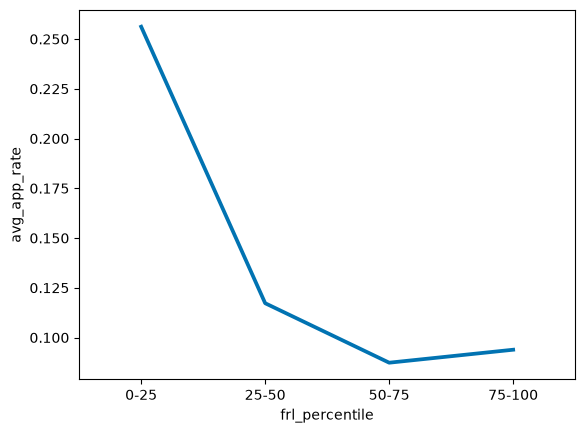
Seaborn draws exactly what the table holds: four points, from 0.256 down to 0.087 and back up to 0.094. The tidy table was the hard part.
Missing Data
Admission Rates and the Nulls in admitted
Applying is only the first step on the road to Berkeley. What is the admission rate in each FRL bucket?
Naively, it is total admits divided by total applicants in each bucket. But the admitted column has many nulls. .null_count(), which we used on a single column earlier, also works on a whole DataFrame, where it returns one row holding the number of nulls in every column.
admissions.null_count()Of the 1,229 schools, 418 have a null admitted and 740 a null attended. Among the 1,173 schools that have a bucket, the number with a null admitted is:
binned["admitted"].null_count()391That is 391 schools. Here are the first few rows of the three count columns:
admissions.select("school", "applied", "admitted", "attended").head(5)ABLE CHARTER had 8 applicants and a null admit count, and A B MILLER HIGH SCHOOL had 3 admits and a null attended.
Why are these values missing? As EDA I explained, the UC leaves a count blank when it is below three, so that no individual student can be identified. The smallest admit count that does appear in the data agrees:
admissions["admitted"].min()3So a null admitted is not a complete unknown. It means 0, 1 or 2.
We will compute the same kind of table several times in this chapter, so we wrap the steps in a function. admission_rates takes a table and returns its admission rate in each bucket: total admits divided by total applicants.
The naive rates are 0.122, 0.121, 0.137 and 0.134.
The code ran without complaint, but it has already made a decision. .sum() skips nulls, so each of the 391 schools with a null admitted added its applicants to the denominator and nothing to the numerator. That is the same as treating every null as 0, and we will see below that replacing the nulls with 0 gives exactly these four numbers. Not choosing is a choice.
Handling missing data is one of the most consequential tasks of a data scientist. Here are several options:
Ignore the schools with a null
admittedwhen computing admission rates.Replace each null with 0, the smallest possible value.
Replace each null with 2, the largest possible value.
Replace each null with 0, 1 or 2, chosen at random.
We should not blindly choose one option and move on. Instead, we compute all four and compare the results. You can find the code for computing these options in the demo Jupyter notebook for the corresponding lecture, and we will compare the results in the following section.
Stability: The PCS Framework
We now have four answers to one question. How should we weigh them? The Predictability, Computability, and Stability (PCS) framework was developed by Bin Yu at UC Berkeley and her collaborators for producing trustworthy data analyses. It asks three questions of an analysis:
Predictability: Are the outputs of the analysis consistent with reality and with domain knowledge? The sniff tests in this chapter are checks of this kind.
Computability: Are the results generated by reproducible code? A notebook that runs from top to bottom, with a seeded random draw, gives us this.
Stability: How sensitive is the analysis to realistic changes in its data, or in the decisions made along the way?
Our four options make a stability check: does the pattern in admission rates change with our missing-data approach?
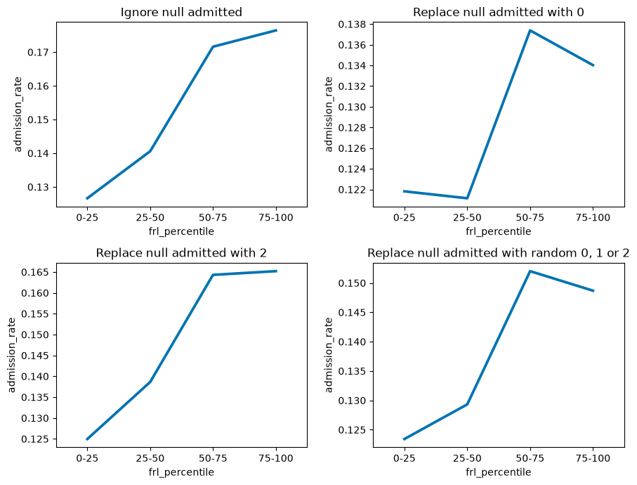
The pattern in admission rates is somewhat sensitive to our choice. In every version, the two highest-FRL buckets, 50-75 and 75-100, admit at a higher rate than 0-25, so that part of the pattern is stable. How large the gap is depends on the choice. The 75-100 rate ranges from 0.134 when the nulls become 0 to 0.176 when we ignore them, while the 0-25 rate only moves between 0.122 and 0.127. Even the first step is not stable: replacing the nulls with 0 puts 25-50 (0.121) just below 0-25 (0.122), and the other three options put it above.
When observing such differences in your results depending on the choice of imputed value, it would be wise to dig deeper into the reason for the missing values being missing or marked as null. This is a good time to consult with the person or people responsible for the original data in order to incorporate domain-specific knowledge. You can then ask them questions such as, “Why are these values missing?” and, “Are there shared traits among the entr/ies with missing values?”
Admission Rates Move the Other Way
We have now collected our entries into buckets based on their FRL percentile, defined the PCS framework, and explored the Stability of our analysis based on different approaches to handling missing data. We will move on to comparing patterns in the three features we are using to select our 5 schools that defy typical patterns: application, admission, and attendance.
Here are the application rates and the admission rates, with random imputation, side by side:
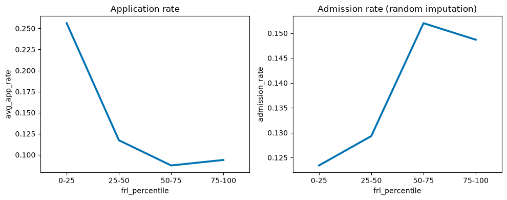
The two panels have different y-axis scales, so this figure compares the direction of each pattern, not its size.
Admission rates have a different pattern than application rates. We will explore this in the following section