23 Logistic Regression II
Today, we will continue studying the Logistic Regression model. We’ll discuss decision boundaries that help inform the classification of a particular prediction. Then, we’ll pick up from last lecture’s discussion of cross-entropy loss, study a few of its pitfalls, and learn potential remedies. We will also provide an implementation of sklearn’s logistic regression model. Lastly, we’ll return to decision rules and discuss metrics that allow us to determine our model’s performance in different scenarios.
This will introduce us to the process of thresholding – a technique used to classify data from our model’s predicted probabilities, or \(P(Y=1|x)\). In doing so, we’ll focus on how these thresholding decisions affect the behavior of our model. We will learn various evaluation metrics useful for binary classification, and apply them to our study of logistic regression.
23.1 Decision Boundaries
In logistic regression, we model the probability that a datapoint belongs to Class 1. Last week, we developed the logistic regression model to predict that probability, but we never actually made any classifications for whether our prediction \(y\) belongs in Class 0 or Class 1.
\[ p = P(Y=1 | x) = \frac{1}{1 + e^{-x^T\theta}}\]
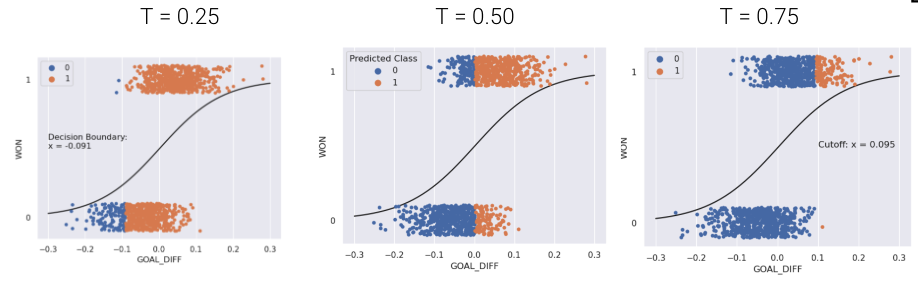
A decision rule tells us how to interpret the output of the model to make a decision on how to classify a datapoint. We commonly make decision rules by specifying a threshold, \(T\). If the predicted probability is greater than or equal to \(T\), predict Class 1. Otherwise, predict Class 0.
\[\hat y = \text{classify}(x) = \begin{cases} 1, & P(Y=1|x) \ge T\\ 0, & \text{otherwise } \end{cases}\]
The threshold is often set to \(T = 0.5\), but not always. We’ll discuss why we might want to use other thresholds \(T \neq 0.5\) later in this lecture.
Using our decision rule, we can define a decision boundary as the “line” that splits the data into classes based on its features. For logistic regression, the decision boundary is a hyperplane – a linear combination of the features in p-dimensions – and we can recover it from the final logistic regression model. For example, if we have a model with 2 features (2D), we have \(\theta = [\theta_0, \theta_1, \theta_2]\) including the intercept term, and we can solve for the decision boundary like so:
\[ \begin{align} T &= \frac{1}{1 + e^{-(\theta_0 + \theta_1 * \text{feature1} + \theta_2 * \text{feature2})}} \\ 1 + e^{-(\theta_0 + \theta_1 \cdot \text{feature1} + \theta_2 \cdot \text{feature2})} &= \frac{1}{T} \\ e^{-(\theta_0 + \theta_1 \cdot \text{feature1} + \theta_2 \cdot \text{feature2})} &= \frac{1}{T} - 1 \\ \theta_0 + \theta_1 \cdot \text{feature1} + \theta_2 \cdot \text{feature2} &= -\log(\frac{1}{T} - 1) \end{align} \]
For a model with 2 features, the decision boundary is a line in terms of its features. To make it easier to visualize, we’ve included an example of a 1-dimensional and a 2-dimensional decision boundary below. Notice how the decision boundary predicted by our logistic regression model perfectly separates the points into two classes.

In real life, however, that is often not the case, and we often see some overlap between points of different classes across the decision boundary. The true classes of the 2D data are shown below:
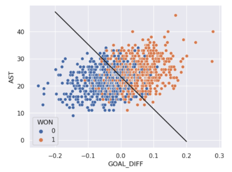
As you can see, the decision boundary predicted by our logistic regression does not perfectly separate the two classes. There’s a “muddled” region near the decision boundary where our classifier predicts the wrong class. What would the data have to look like for the classifier to make perfect predictions?
23.2 Linear Separability and Regularization
A classification dataset is said to be linearly separable if there exists a hyperplane among input features \(x\) that separates the two classes \(y\).
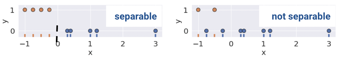
Linear separability in 1D can be found with a rugplot of a single feature. For example, notice how the plot on the bottom left is linearly separable along the vertical line \(x=0\). However, no such line perfectly separates the two classes on the bottom right.
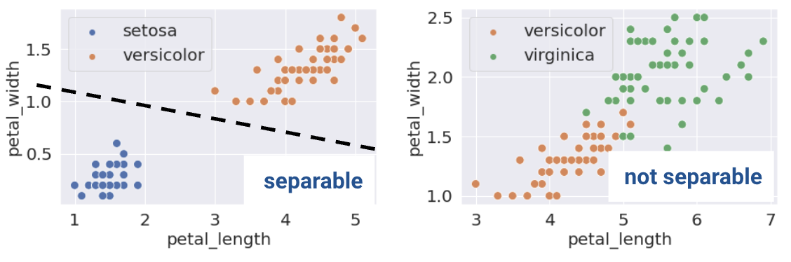
This same definition holds in higher dimensions. If there are two features, the separating hyperplane must exist in two dimensions (any line of the form \(y=mx+b\)). We can visualize this using a scatter plot.
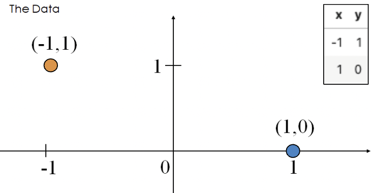
This sounds great! When the dataset is linearly separable, a logistic regression classifier can perfectly assign datapoints into classes. However, (unexpected) complications may arise. Consider the toy dataset with 2 points and only a single feature \(x\):
The optimal \(\theta\) value that minimizes loss pushes the predicted probabilities of the data points to their true class.
- \(P(Y = 1|x = -1) = \frac{1}{1 + e^\theta} \rightarrow 1\)
- \(P(Y = 1|x = 1) = \frac{1}{1 + e^{-\theta}} \rightarrow 0\)
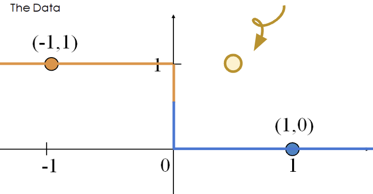
This happens when \(\theta = -\infty\). When \(\theta = -\infty\), we observe the following behavior for any input \(x\).
\[P(Y=1|x) = \sigma(\theta x) \rightarrow \begin{cases} 1, \text{if } x < 0\\ 0, \text{if } x \ge 0 \end{cases}\]
The diverging weights cause the model to be overconfident. For example, consider the new point \((x, y) = (0.5, 1)\). Following the behavior above, our model will incorrectly predict \(p=0\), and thus, \(\hat y = 0\).
The loss incurred by this misclassified point is infinite.
\[-(y\text{ log}(p) + (1-y)\text{ log}(1-p))=1\text{log}(0)\]
Thus, diverging weights (\(|\theta| \rightarrow \infty\)) occur with lineary separable data. “Overconfidence” is a particularly dangerous version of overfitting.
Consider the loss function with respect to the parameter \(\theta\).
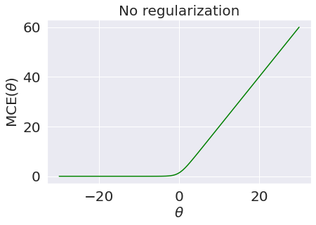
Though it’s very difficult to see, the plateau for negative values of \(\theta\) is slightly tilted downwards, meaning the loss approaches \(0\) as \(\theta\) decreases and approaches \(-\infty\).
23.2.1 Regularized Logistic Regression
To avoid large weights and infinite loss (particularly on linearly separable data), we use regularization. The same principles apply as with linear regression - make sure to standardize your features first.
For example, \(L2\) (Ridge) Logistic Regression takes on the form:
\[\min_{\theta} -\frac{1}{n} \sum_{i=1}^{n} (y_i \text{log}(\sigma(x_i^T\theta)) + (1-y_i)\text{log}(1-\sigma(x_i^T\theta))) + \lambda \sum_{i=1}^{d} \theta_j^2\]
Now, let us compare the loss functions of un-regularized and regularized logistic regression.
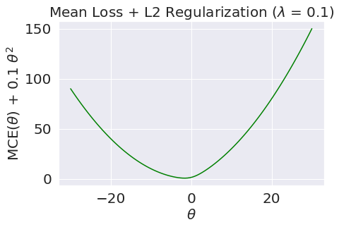
As we can see, \(L2\) regularization helps us prevent diverging weights and deters against “overconfidence.”
sklearn’s logistic regression defaults to L2 regularization and C=1.0; C is the inverse of \(\lambda\): \(C = \frac{1}{\lambda}\). Setting C to a large value, for example, C=300.0, results in minimal regularization.
# sklearn defaults
model = LogisticRegression(penalty='l2', C=1.0, …)
model.fit()
Note that in Data 100, we only use sklearn to fit logistic regression models. There is no closed-form solution to the optimal theta vector, and the gradient is a little messy (see the bonus section below for details).
From here, the .predict function returns the predicted class \(\hat y\) of the point. In the simple binary case,
\[\hat y = \begin{cases} 1, & P(Y=1|x) \ge 0.5\\ 0, & \text{otherwise } \end{cases}\]
23.3 Performance Metrics
You might be thinking, if we’ve already introduced cross-entropy loss, why do we need additional ways of assessing how well our models perform? In linear regression, we made numerical predictions and used a loss function to determine how “good” these predictions were. In logistic regression, our ultimate goal is to classify data – we are much more concerned with whether or not each datapoint was assigned the correct class using the decision rule. As such, we are interested in the quality of classifications, not the predicted probabilities.
The most basic evaluation metric is accuracy, that is, the proportion of correctly classified points.
\[\text{accuracy} = \frac{\# \text{ of points classified correctly}}{\# \text{ of total points}}\]
Translated to code:
def accuracy(X, Y):
    return np.mean(model.predict(X) == Y)

model.score(X, y) # built-in accuracy function
However, accuracy is not always a great metric for classification. To understand why, let’s consider a classification problem with 100 emails where only 5 are truly spam, and the remaining 95 are truly ham. We’ll investigate two models where accuracy is a poor metric.
- Model 1: Our first model classifies every email as non-spam. The model’s accuracy is high (\(\frac{95}{100} = 0.95\)), but it doesn’t detect any spam emails. Despite the high accuracy, this is a bad model.
- Model 2: The second model classifies every email as spam. The accuracy is low (\(\frac{5}{100} = 0.05\)), but the model correctly labels every spam email. Unfortunately, it also misclassifies every non-spam email.
As this example illustrates, accuracy is not always a good metric for classification, particularly when your data could exhibit class imbalance (e.g., very few 1’s compared to 0’s).
23.3.1 Types of Classification
There are 4 different different classifications that our model might make:
- True positive: correctly classify a positive point as being positive (\(y=1\) and \(\hat{y}=1\))
- True negative: correctly classify a negative point as being negative (\(y=0\) and \(\hat{y}=0\))
- False positive: incorrectly classify a negative point as being positive (\(y=0\) and \(\hat{y}=1\))
- False negative: incorrectly classify a positive point as being negative (\(y=1\) and \(\hat{y}=0\))
These classifications can be concisely summarized in a confusion matrix.
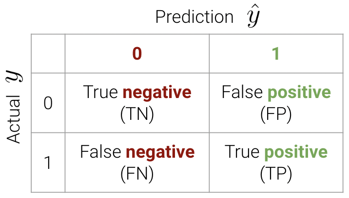
An easy way to remember this terminology is as follows:
- Look at the second word in the phrase. Positive means a prediction of 1. Negative means a prediction of 0.
- Look at the first word in the phrase. True means our prediction was correct. False means it was incorrect.
We can now write the accuracy calculation as \[\text{accuracy} = \frac{TP + TN}{n}\]
In sklearn, we use the following syntax
from sklearn.metrics import confusion_matrix
cm = confusion_matrix(Y_true, Y_pred)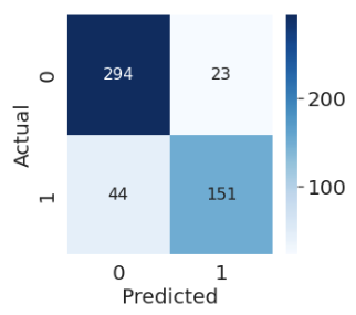
23.3.2 Accuracy, Precision, and Recall
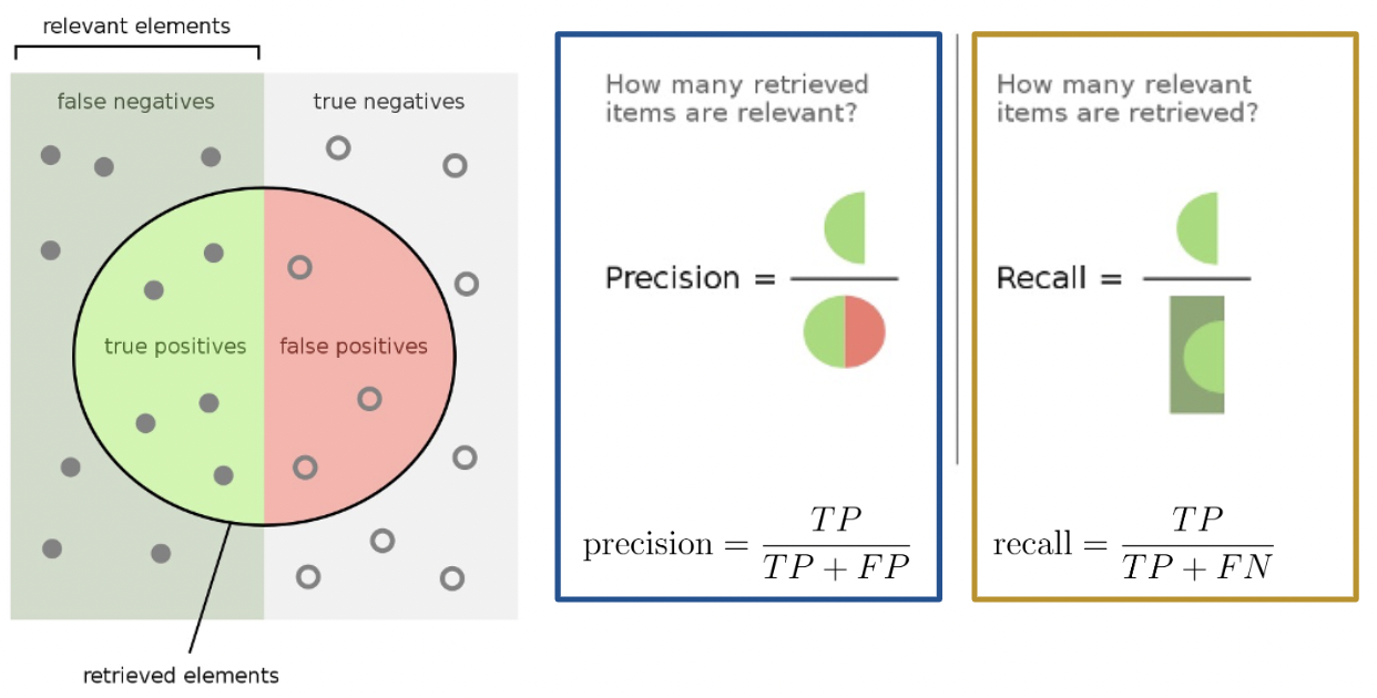
The purpose of our discussion of the confusion matrix was to motivate better performance metrics for classification problems with class imbalance - namely, precision and recall.
Precision is defined as
\[\text{precision} = \frac{\text{TP}}{\text{TP + FP}}\]
Precision answers the question: “Of all observations that were predicted to be \(1\), what proportion was actually \(1\)?” It measures how accurate the classifier is when its predictions are positive.
Recall (or sensitivity) is defined as
\[\text{recall} = \frac{\text{TP}}{\text{TP + FN}}\]
Recall aims to answer: “Of all observations that were actually \(1\), what proportion was predicted to be \(1\)?” It measures how many positive predictions were missed.
Here’s a helpful graphic that summarizes our discussion above.
23.3.3 Example Calculation
In this section, we will calculate the accuracy, precision, and recall performance metrics for our earlier spam classification example. As a reminder, we had 100 emails, 5 of which were spam. We designed two models:
- Model 1: Predict that every email is non-spam
- Model 2: Predict that every email is spam
23.3.3.1 Model 1
First, let’s begin by creating the confusion matrix.
| 0 | 1 | |
|---|---|---|
| 0 | True Negative: 95 | False Positive: 0 |
| 1 | False Negative: 5 | True Positive: 0 |
Convince yourself of why our confusion matrix looks like so.
\[\text{accuracy} = \frac{95}{100} = 0.95\] \[\text{precision} = \frac{0}{0 + 0} = \text{undefined}\] \[\text{recall} = \frac{0}{0 + 5} = 0\]
Notice how our precision is undefined because we never predicted class \(1\). Our recall is 0 for the same reason – the numerator is 0 (we had no positive predictions).
23.3.3.2 Model 2
Our confusion matrix for Model 2 looks like so.
| 0 | 1 | |
|---|---|---|
| 0 | True Negative: 0 | False Positive: 95 |
| 1 | False Negative: 0 | True Positive: 5 |
\[\text{accuracy} = \frac{5}{100} = 0.05\] \[\text{precision} = \frac{5}{5 + 95} = 0.05\] \[\text{recall} = \frac{5}{5 + 0} = 1\]
Our precision is low because we have many false positives, and our recall is perfect - we correctly classified all spam emails (we never predicted class \(0\)).
23.3.4 Precision vs. Recall
Precision (\(\frac{\text{TP}}{\text{TP} + \textbf{ FP}}\)) penalizes false positives, while recall (\(\frac{\text{TP}}{\text{TP} + \textbf{ FN}}\)) penalizes false negatives.
In fact, precision and recall are inversely related. This is evident in our second model – we observed a high recall and low precision. Usually, there is a tradeoff in these two (most models can either minimize the number of FP or FN; and in rare cases, both).
The specific performance metric(s) to prioritize depends on the context. In many medical settings, there might be a much higher cost to missing positive cases. For instance, in our breast cancer example, it is more costly to misclassify malignant tumors (false negatives) than it is to incorrectly classify a benign tumor as malignant (false positives). In the case of the latter, pathologists can conduct further studies to verify malignant tumors. As such, we should minimize the number of false negatives. This is equivalent to maximizing recall.
23.3.5 Two More Metrics
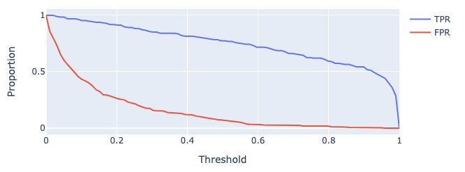
The True Positive Rate (TPR) is defined as
\[\text{true positive rate} = \frac{\text{TP}}{\text{TP + FN}}\]
You’ll notice this is equivalent to recall. In the context of our spam email classifier, it answers the question: “What proportion of spam did I mark correctly?”. We’d like this to be close to \(1\)
The False Positive Rate (FPR) is defined as
\[\text{false positive rate} = \frac{\text{FP}}{\text{FP + TN}}\]
Another word for FPR is specificity. This answers the question: “What proportion of regular email did I mark as spam?”. We’d like this to be close to \(0\)
As we increase threshold \(T\), both TPR and FPR decrease. We’ve plotted this relationship below for some model on a toy dataset.
23.4 Adjusting the Classification Threshold
One way to minimize the number of FP vs. FN (equivalently, maximizing precision vs. recall) is by adjusting the classification threshold \(T\).
\[\hat y = \begin{cases} 1, & P(Y=1|x) \ge T\\ 0, & \text{otherwise } \end{cases}\]
The default threshold in sklearn is \(T = 0.5\). As we increase the threshold \(T\), we “raise the standard” of how confident our classifier needs to be to predict 1 (i.e., “positive”).
As you may notice, the choice of threshold \(T\) impacts our classifier’s performance.
- High \(T\): Most predictions are \(0\).
- Lots of false negatives
- Fewer false positives
- Low \(T\): Most predictions are \(1\).
- Lots of false positives
- Fewer false negatives
In fact, we can choose a threshold \(T\) based on our desired number, or proportion, of false positives and false negatives. We can do so using a few different tools. We’ll touch on two of the most important ones in Data 100.
- Precision-Recall Curve (PR Curve)
- “Receiver Operating Characteristic” Curve (ROC Curve)
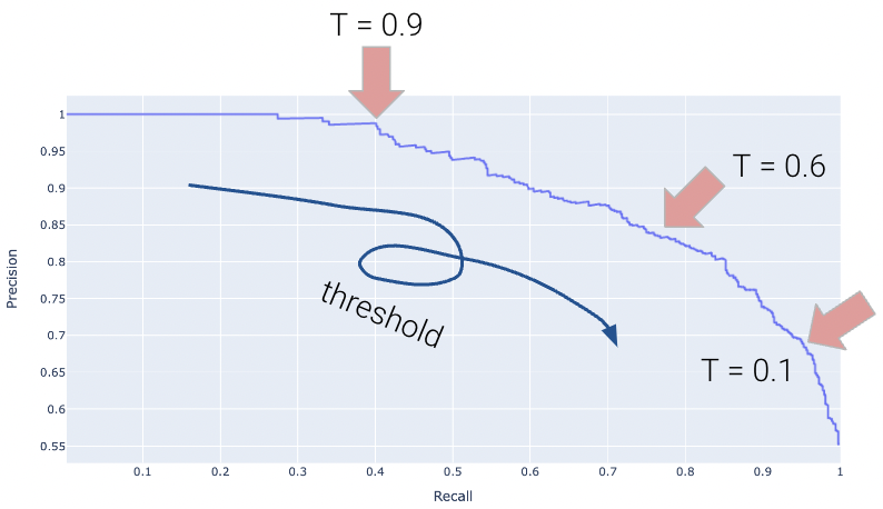
23.4.1 Precision-Recall Curves
A Precision-Recall Curve (PR Curve) is an alternative to the ROC curve that displays the relationship between precision and recall for various threshold values. It is constructed in a similar way as with the ROC curve.
Let’s first consider how precision and recall change as a function of the threshold \(T\). We know this quite well from earlier – precision will generally increase, and recall will decrease.

Displayed below is the PR Curve for the same toy dataset. Notice how threshold values increase as we move to the left.
Once again, the perfect classifier will resemble the orange curve, this time, facing the opposite direction.
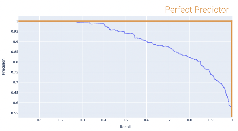
We want our PR curve to be as close to the “top right” of this graph as possible. Again, we use the AUC to determine “closeness”, with the perfect classifier exhibiting an AUC = 1 (and the worst with an AUC = 0.5).
23.4.2 The ROC Curve
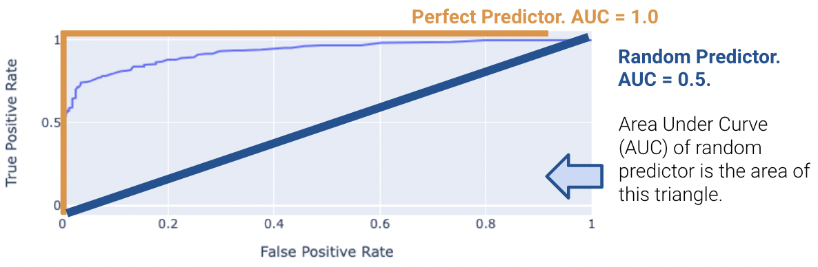
The “Receiver Operating Characteristic” Curve (ROC Curve) plots the tradeoff between FPR and TPR. Notice how the far-left of the curve corresponds to higher threshold \(T\) values.
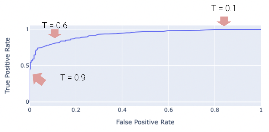
The “perfect” classifier is the one that has a TPR of 1, and FPR of 0. This is achieved at the top-left of the plot below. More generally, it’s ROC curve resembles the curve in orange.
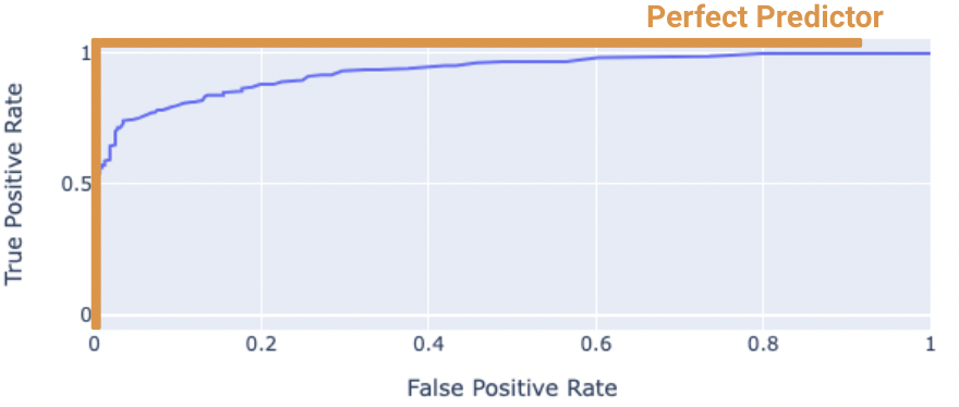
We want our model to be as close to this orange curve as possible. How do we quantify “closeness”?
We can compute the area under curve (AUC) of the ROC curve. Notice how the perfect classifier has an AUC = 1. The closer our model’s AUC is to 1, the better it is.
23.4.2.1 (Bonus) What is the “worst” AUC, and why is it 0.5?
On the other hand, a terrible model will have an AUC closer to 0.5. Random predictors randomly predict \(P(Y = 1 | x)\) to be uniformly between 0 and 1. This indicates the classifier is not able to distinguish between positive and negative classes, and thus, randomly predicts one of the two.
23.5 (Bonus) Gradient Descent for Logistic Regression
Let’s define the following: \[ t_i = \phi(x_i)^T \theta \\ p_i = \sigma(t_i) \\ t_i = \log(\frac{p_i}{1 - p_i}) \\ 1 - \sigma(t_i) = \sigma(-t_i) \\ \frac{d}{dt} \sigma(t) = \sigma(t) \sigma(-t) \]
Now, we can simplify the cross-entropy loss \[ \begin{align} y_i \log(p_i) + (1 - y_i) \log(1 - p_i) &= y_i \log(\frac{p_i}{1 - p_i}) + \log(1 - p_i) \\ &= y_i \phi(x_i)^T + \log(\sigma(-\phi(x_i)^T \theta)) \end{align} \]
Hence, the optimal \(\hat{\theta}\) is \[\text{argmin}_{\theta} - \frac{1}{n} \sum_{i=1}^n (y_i \phi(x_i)^T + \log(\sigma(-\phi(x_i)^T \theta)))\]
We want to minimize \[L(\theta) = - \frac{1}{n} \sum_{i=1}^n (y_i \phi(x_i)^T + \log(\sigma(-\phi(x_i)^T \theta)))\]
So we take the derivative \[ \begin{align} \triangledown_{\theta} L(\theta) &= - \frac{1}{n} \sum_{i=1}^n \triangledown_{\theta} y_i \phi(x_i)^T + \triangledown_{\theta} \log(\sigma(-\phi(x_i)^T \theta)) \\ &= - \frac{1}{n} \sum_{i=1}^n y_i \phi(x_i) + \triangledown_{\theta} \log(\sigma(-\phi(x_i)^T \theta)) \\ &= - \frac{1}{n} \sum_{i=1}^n y_i \phi(x_i) + \frac{1}{\sigma(-\phi(x_i)^T \theta)} \triangledown_{\theta} \sigma(-\phi(x_i)^T \theta) \\ &= - \frac{1}{n} \sum_{i=1}^n y_i \phi(x_i) + \frac{\sigma(-\phi(x_i)^T \theta)}{\sigma(-\phi(x_i)^T \theta)} \sigma(\phi(x_i)^T \theta)\triangledown_{\theta} \sigma(-\phi(x_i)^T \theta) \\ &= - \frac{1}{n} \sum_{i=1}^n (y_i - \sigma(\phi(x_i)^T \theta)\phi(x_i)) \end{align} \]
Setting the derivative equal to 0 and solving for \(\hat{\theta}\), we find that there’s no general analytic solution. Therefore, we must solve using numeric methods.
23.5.1 Gradient Descent Update Rule
\[\theta^{(0)} \leftarrow \text{initial vector (random, zeros, ...)} \]
For \(\tau\) from 0 to convergence: \[ \theta^{(\tau + 1)} \leftarrow \theta^{(\tau)} + \rho(\tau)\left( \frac{1}{n} \sum_{i=1}^n \triangledown_{\theta} L_i(\theta) \mid_{\theta = \theta^{(\tau)}}\right) \]
23.5.2 Stochastic Gradient Descent Update Rule
\[\theta^{(0)} \leftarrow \text{initial vector (random, zeros, ...)} \]
For \(\tau\) from 0 to convergence, let \(B\) ~ \(\text{Random subset of indices}\). \[ \theta^{(\tau + 1)} \leftarrow \theta^{(\tau)} + \rho(\tau)\left( \frac{1}{|B|} \sum_{i \in B} \triangledown_{\theta} L_i(\theta) \mid_{\theta = \theta^{(\tau)}}\right) \]