Visualizations
Visualizations are how data scientists use to communicate their insights to the world. In the process of making a good visualization, be it while adding a legend or setting the x-axis label, we may run into some errors. Let’s take a look at how to resolve them below!
My legend’s labels don’t match up / my legend isn’t displaying properly
If you simply add plt.legend() after your plotting line of code, you should see a legend; seaborn will sometimes automatically populate the legend. However, if you’re plotting multiple lines or sets of points on a single plot, the labels in the legend may not correctly line up with what’s shown.
Make sure to pass in the label argument into the sns plotting function with the label you want associated with that individual plot. For example,
sns.histplot(means_arr, label = 'simulated values') # informative label name
plt.title('Simulated values')
plt.plot(original, 10, 'bo', label = 'original test statistic') # informative label name
plt.legend(loc = 'upper left') # can specify location of legend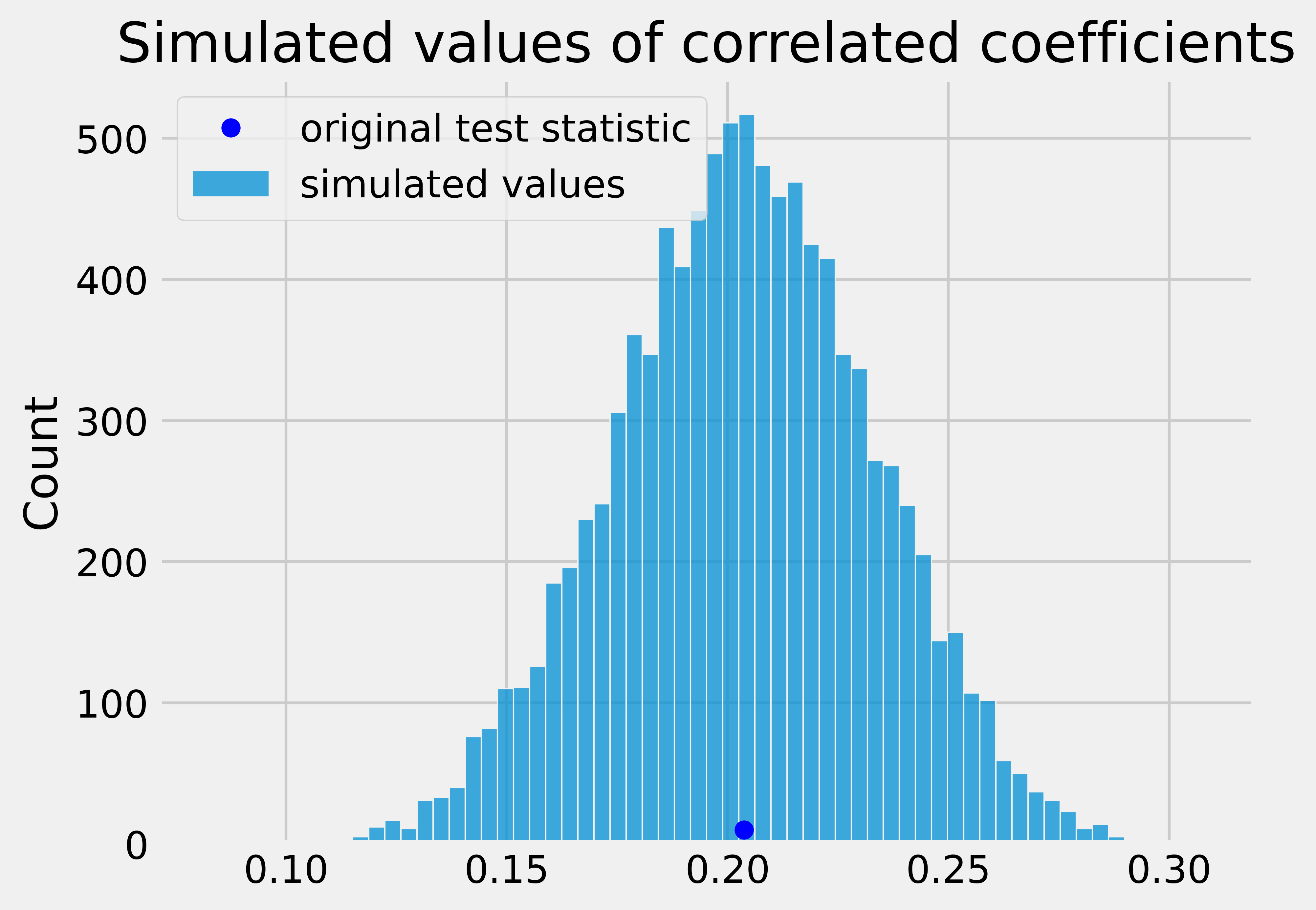
The y-axis of my histplot shows the count, not the density
Look into the sns.histplot documentation and see what arguments the stat parameter takes in. By default, stat=count, and the number of elements in each histogram bin is the y axis. But if you wanted to normalize the distribution such that the total area is 1, consider passing stat=density into the plot function.
I’m having trouble labeling the axes/title of my graph
To label the axes and title of a graph, we use the following syntax:
plt.xlabel(“x axis name”)
plt.ylabel(“y axis name”)
plt.title(“graph title”)
Where plt.xlabel, plt.ylabel, and plt.title are matplotlib functions that we call.
However, we often see students use the following incorrect syntax to try and label their plot:
plt.xlabel = "x name"
plt.ylabel = "y name"
plt.title = "graph title"
Now, instead of plt.xlabel, plt.ylabel, and plt.title being functions, they are strings. Trying to call one of the labelling function using the correct syntax in the next few cells (ie.plt.xlabel(“x name”)) will result in a TypeError: str object is not callable. If this happens to you, comb through your notebook and look for places when you used the incorrect syntax. After fixing it, restart your kernel and rerun your cells.
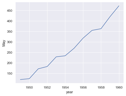
My sns.lineplot has an unwanted shaded region around the solid lines.
Note: the following examples are taken from
sns.lineplot’s documentation.
sns.lineplot gives us a clean line when each x value has one y value. For example, the table
| Year | May |
|---|---|
| 1948 | 120 |
| 1949 | 122 |
| 1950 | 123 |
| \(\vdots\) | \(\vdots\) |
will give us a clean plot because each year corresponds to a single “Number of Flights in May” value.
When each x value has multiple y values, sns.lineplot will automatically plot a shaded region around the solid line, where the solid line is the mean of the y values for that x value (think of a groupby on x aggregated by .mean() on y) and the shaded region is the 95% confidence interval (read more about confidence intervals in the Data 8 textbook). For example, the table
| Year | May |
|---|---|
| 1948 | 115 |
| 1948 | 120 |
| 1948 | 125 |
| 1949 | 118 |
| 1949 | 122 |
| 1949 | 126 |
| \(\vdots\) | \(\vdots\) |
will plot a lineplot with a shaded region.
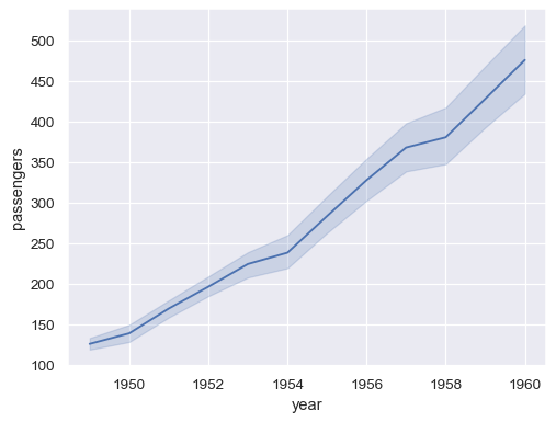
If you do not want the shaded region, aggregate the data such that there is only one y-value for a given x-value; then, make the plot.