This actually matches the EDA performed earlier in the textbook, which shows that PurpleAir measurements are about twice as high as AQS measurements.
The pertinent Q-Q plot (out of scope for this semester):

import numpy as np
import pandas as pd
import matplotlib
import matplotlib.pyplot as plt
import seaborn as sns
import sklearn.linear_model as lm

# big font helper
def adjust_fontsize(size=None):
    SMALL_SIZE = 8
    MEDIUM_SIZE = 10
    BIGGER_SIZE = 12
    if size != None:
        SMALL_SIZE = MEDIUM_SIZE = BIGGER_SIZE = size

    plt.rc('font', size=SMALL_SIZE)          # controls default text sizes
    plt.rc('axes', titlesize=SMALL_SIZE)     # fontsize of the axes title
    plt.rc('axes', labelsize=MEDIUM_SIZE)    # fontsize of the x and y labels
    plt.rc('xtick', labelsize=SMALL_SIZE)    # fontsize of the tick labels
    plt.rc('ytick', labelsize=SMALL_SIZE)    # fontsize of the tick labels
    plt.rc('legend', fontsize=SMALL_SIZE)    # legend fontsize
    plt.rc('figure', titlesize=BIGGER_SIZE)  # fontsize of the figure title

plt.style.use('fivethirtyeight')
sns.set_context("talk")
sns.set_theme()
#plt.style.use('default') # revert style to default mpl
adjust_fontsize(size=20)
%matplotlib inline
csv_file = 'data/Full24hrdataset.csv'
usecols = ['Date', 'ID', 'region', 'PM25FM', 'PM25cf1', 'TempC', 'RH', 'Dewpoint']
full_df = (pd.read_csv(csv_file, usecols=usecols, parse_dates=['Date'])
        .dropna())
full_df.columns = ['date', 'id', 'region', 'pm25aqs', 'pm25pa', 'temp', 'rh', 'dew']
full_df = full_df.loc[(full_df['pm25aqs'] < 50)]


bad_dates = ['2019-08-21', '2019-08-22', '2019-09-24']
GA = full_df.loc[(full_df['id'] == 'GA1') & (~full_df['date'].isin(bad_dates)) , :]
After we build the model that adjusts the PurpleAir measurements using AQS, we then flip the model around and use it to predict the true air quality in the future from PurpleAir measurements when wec don't have a nearby AQS instrument. This is a calibration scenario. Since the AQS measurements are close to the truth, we fit the more variable PurpleAir measurements to them; this is the calibration procedure. Then, we use the calibration curve to correct future PurpleAir measurements. This two-step process is encapsulated in the simple linear model and its flipped form below.
Inverse regression:
First, we fit a line to predict a PA measurement from the ground truth, as recorded by an AQS instrument:
$$ \text{PA} \approx \theta_0 + \theta_1\text{AQS} $$
Next, we flip the line around to use a PA measurement to predict the air quality,
$$ \text{True Air Quality} \approx -\theta_0/\theta_1 + 1/\theta_1 \text{PA} $$
Why perform this “inverse regression”?
from sklearn.linear_model import LinearRegression

AQS, PA = GA[['pm25aqs']], GA['pm25pa']

model = LinearRegression().fit(AQS, PA)
theta_1, theta_0 = model.coef_[0], model.intercept_
print(f"True Air Quality Estimate = {-theta_0/theta_1:.2} + {1/theta_1:.2}PA")
True Air Quality Estimate = 1.6 + 0.46PA
This actually matches the EDA performed earlier in the textbook, which shows that PurpleAir measurements are about twice as high as AQS measurements.
The pertinent Q-Q plot (out of scope for this semester):
What is the mean squared error of the original model?
from sklearn.metrics import mean_squared_error

preds_slr = model.predict(AQS)
mean_squared_error(PA, preds_slr)
4.7083124633807225
Karoline Barkjohn, Brett Gannt, and Andrea Clements from the US Environmental Protection Agency developed a model to improve the PuprleAir measurements from the AQS sensor measurements. arkjohn and group’s work was so successful that, as of this writing, the official US government maps, like the AirNow Fire and Smoke map, includes both AQS and PurpleAir sensors, and applies Barkjohn’s correction to the PurpleAir data. $$ \begin{aligned} \text{PA} \approx \theta_0 + \theta_1 \text{AQS} + \theta_2 \text{RH} \end{aligned} $$
The model that Barkjohn settled on incorporated the relative humidity:
AQS_RH, PA = GA[['pm25aqs', 'rh']], GA['pm25pa']
model_h = LinearRegression().fit(AQS_RH, PA)
[theta_1, theta_2], theta_0 = model_h.coef_, model_h.intercept_

print(f"True Air Quality Estimate = {-theta_0/theta_1:1.2} + {1/theta_1:.2}PA + {-theta_2/theta_1:.2}RH")
True Air Quality Estimate = 7.0 + 0.44PA + -0.092RH
preds_humidity = model_h.predict(AQS_RH)
mean_squared_error(PA, preds_humidity)
3.2977168948380413
Compared to the simple linear model that only incorporated AQS, the Barkjohn et al. model with relative humidity achieves lower error. Good for prediction!
From the Barkjohn et al., model, AQS coefficient $\hat{\theta}_1$:
theta_1
2.2540167939150537
The Relative Humidity coefficient $\hat{\theta}_2$ is pretty close to zero:
theta_2
0.20630108775555353
Is incorporating humidity in the model really needed?
(Note the slight hand-wavy assumption: air quality measurements should resemble the population measurements. But this is a weak assumption because of weather conditions, time of year, location of monitors, etc. Instead we assume that measurements are similar to others taken under the same conditions as those of the original measurement.)
Null hypothesis: The null hypothesis is $\theta_2 = 0$; that is, the null model is the simpler model:
$$ \begin{aligned} \text{PA} \approx \theta_0 + \theta_1 \text{AQS} \end{aligned} $$n = len(GA) # n: size of our sample
def boot_stat(X, y):
r = randint.rvs(low=0, high=(n-1), size=n)
theta2 = LinearRegression().fit(X.iloc[r, :], y.iloc[r]).coef_[1]
return theta2
We set up the design matrix and the outcome variable and check our boot_stat function once to test it.
from scipy.stats import randint


n = len(GA)
y = GA['pm25pa']
X = GA[['pm25aqs', 'rh']]

boot_stat(X, y)
0.1635251292176499
Repeat 10,000 times to get an approximation to the boostrap sampling distirbution of the bootstrap statistic (the fitted humidity coefficient $\hat{\theta_2}$):
rng = np.random.default_rng(42)

boot_theta_hat = [boot_stat(X, y) for _ in range(10000)]
import plotly.express as px
px.histogram(x=boot_theta_hat, nbins=50,
            labels=dict(x='Bootstrapped Humidity Coefficient'),
            width=350, height=250)
(We know that the center will be close to the original coefficient estimated from the sample, 0.21.)
By design, the center of the bootstrap sampling distribution will be near $\hat{\theta}$ because the bootstrap population consists of the observed data. So, rather than compute the chance of a value at least as large as the observed statistic, we find the chance of a value at least as small as 0.
The hypothesized value of 0 is far from the sampling distribution:
len([elem for elem in boot_theta_hat if elem < 0.0])
0
None of the 10,000 simulated regression coefficients are as small as the hypothesized coefficient. Statistical logic leads us to reject the null hypothesis that we do not need to adjust the model for humidity.
The Snowy Plover is a tiny bird that lives on the coast in parts of California and elsewhere. It is so small that it is vulnerable to many predators and to people and dogs that don't look where they are stepping when they go to the beach. It is considered endangered in many parts of the US.
The data are about the eggs and newly-hatched chicks of the Snowy Plover. Here's a parent bird and some eggs.
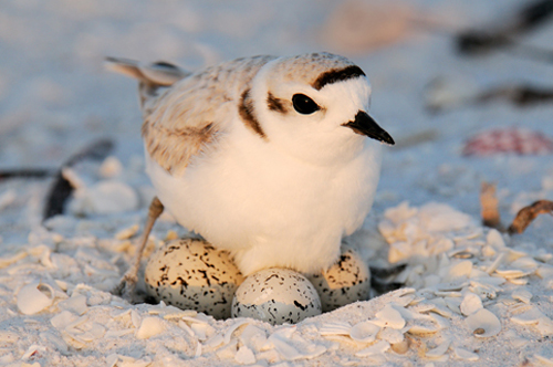
The data were collected at the Point Reyes National Seashore by a former student at Berkeley. The goal was to see how the size of an egg could be used to predict the weight of the resulting chick. The bigger the newly-hatched chick, the more likely it is to survive.

Each row of the data frame below corresponds to one Snowy Plover egg and the resulting chick. Note how tiny the bird is:
eggs = pd.read_csv('data/snowy_plover.csv')
eggs.head()
| egg_weight | egg_length | egg_breadth | bird_weight | |
|---|---|---|---|---|
| 0 | 7.4 | 28.80 | 21.84 | 5.2 |
| 1 | 7.7 | 29.04 | 22.45 | 5.4 |
| 2 | 7.9 | 29.36 | 22.48 | 5.6 |
| 3 | 7.5 | 30.10 | 21.71 | 5.3 |
| 4 | 8.3 | 30.17 | 22.75 | 5.9 |
eggs.shape
(44, 4)
For a particular egg, $x$ is the vector of length, breadth, and weight. The model is
$$ f_\theta(x) ~ = ~ \theta_0 + \theta_1\text{egg_length} + \theta_2\text{egg_breadth} + \theta_3\text{egg_weight} + \epsilon $$y = eggs["bird_weight"]
X = eggs[["egg_weight", "egg_length", "egg_breadth"]]
model = lm.LinearRegression(fit_intercept=True).fit(X, y)
display(pd.DataFrame([model.intercept_] + list(model.coef_),
columns=['theta_hat'],
index=['intercept', 'egg_weight', 'egg_length', 'egg_breadth']))
print("RMSE", np.mean((y - model.predict(X)) ** 2))
| theta_hat | |
|---|---|
| intercept | -4.605670 |
| egg_weight | 0.431229 |
| egg_length | 0.066570 |
| egg_breadth | 0.215914 |
RMSE 0.04547085380275766
Let's try bootstrapping the sample to obtain a 95% confidence interval for the parameter $\theta_1$ corresponding to egg weight.
This code uses df.sample (link) to generate a bootstrap sample of the same size of the original sample.
def get_param1(model):
    # first feature
    return model.coef_[0]

def bootstrap_params(sample_df, get_param_fn=get_param1, n_iters=10000):
    """
    sample: the bootstrap population
    """
    n = len(sample_df)
    estimates = []
    for i in range(n_iters):
        # resample n times with replacement
        # i.e., get a new sample of same size
        # using df.sample(...)
        resample = sample_df.sample(n, replace=True)

        # train model with this bootstrap sample
        resample_y = resample["bird_weight"]
        resample_X = resample[["egg_weight", "egg_length", "egg_breadth"]]
        model = lm.LinearRegression()
        model.fit(resample_X, resample_y)

        # include the estimate
        estimate = get_param_fn(model)
        estimates.append(estimate)
    lower = np.percentile(estimates, 2.5, axis=0)
    upper = np.percentile(estimates, 97.5, axis=0)
    conf_interval = (lower, upper)
    return conf_interval
approx_conf1 = bootstrap_params(eggs, get_param1)
approx_conf1
(-0.27481530994751757, 1.111700720395899)
Let's bootstrap again and compute 95% confidence intervals for all 4 parameters, including the bias term:
def get_all_params(model):
    # all features
    return [model.intercept_] + list(model.coef_)

approx_confs = bootstrap_params(eggs, get_param_fn=get_all_params)
approx_confs
(array([-15.28503477,  -0.24564454,  -0.09843008,  -0.26440006]),
 array([5.31738918, 1.10636652, 0.20917092, 0.75250839]))
Because the 95% confidence interval includes 0, we cannot reject the null hypothesis that the true parameter $\theta_1$ is 0.
def simple_resample(n):
    return np.random.randint(low=0, high=n, size=n)

def bootstrap(boot_pop, statistic, resample=simple_resample, replicates=10000):
    n = len(boot_pop)
    resample_estimates = [statistic(boot_pop[resample(n)])
                          for _ in range(replicates)]
    return np.array(resample_estimates)
But when we make confidence intervals for the model coefficients, we find something strange. All of the confidence intervals contain 0, which prevents us from concluding that any variable is significantly related to the response.
def egg_thetas(data):
    X = data[:, :3]
    y = data[:, 3]

    model = lm.LinearRegression().fit(X, y)
    return model.coef_

egg_thetas = bootstrap(eggs.values, egg_thetas)
egg_ci = np.percentile(egg_thetas, [2.5, 97.5], axis=0)
pd.DataFrame(egg_ci.T,
             columns=['lower', 'upper'],
             index=['theta_egg_weight', 'theta_egg_length', 'theta_egg_breadth'])
| lower | upper | |
|---|---|---|
| theta_egg_weight | -0.255933 | 1.135317 |
| theta_egg_length | -0.104735 | 0.211121 |
| theta_egg_breadth | -0.270184 | 0.758378 |
To see what's going on, we'll make a scatter plot matrix for the data.
px.scatter_matrix(eggs, width=450, height=450)
This shows that bird_weight
is highly correlated with all the other
variables (the bottom row), which means fitting a linear model is a good idea.
But we also see that egg_weight is highly correlated with all the variables
(the top row).
This means we can't increase one covariate while
keeping the others constant. The individual slopes have no meaning.
Here's the correlations showing this more succinctly:
eggs.corr().round(2)
| egg_weight | egg_length | egg_breadth | bird_weight | |
|---|---|---|---|---|
| egg_weight | 1.00 | 0.79 | 0.84 | 0.85 |
| egg_length | 0.79 | 1.00 | 0.40 | 0.68 |
| egg_breadth | 0.84 | 0.40 | 1.00 | 0.73 |
| bird_weight | 0.85 | 0.68 | 0.73 | 1.00 |
One way to fix this is to fit a model that only uses egg_weight.
This model performs almost as well as the model that uses all three variables,
and the confidence interval for $\theta_1$ doesn't
contain zero.
y = eggs["bird_weight"]
X = eggs[["egg_weight"]]

model = lm.LinearRegression(fit_intercept=True).fit(X, y)

display(pd.DataFrame([model.intercept_] + list(model.coef_),
             columns=['theta_hat'],
             index=['intercept', 'egg_weight']))
print("RMSE", np.mean((y - model.predict(X)) ** 2))
| theta_hat | |
|---|---|
| intercept | -0.058272 |
| egg_weight | 0.718515 |
RMSE 0.046493941375556846
def bootstrap_egg_weight_only(sample_df, n_iters=10000):
    """
    copied over for convenience
    """
    n = len(sample_df)
    estimates = []
    for i in range(n_iters):
        resample = sample_df.sample(n, replace=True)

        resample_y = resample["bird_weight"]
        resample_X = resample[["egg_weight"]] # just one feature + intercept
        model = lm.LinearRegression()
        model.fit(resample_X, resample_y)
        estimates.append( model.coef_[0])
    lower = np.percentile(estimates, 2.5, axis=0)
    upper = np.percentile(estimates, 97.5, axis=0)
    conf_interval = (lower, upper)
    return conf_interval

approx_conf_egg_weight_only = bootstrap_egg_weight_only(eggs)
approx_conf_egg_weight_only
(0.6019760255236914, 0.8203344273904387)
It's no surprise that if you want to predict the weight of the newly-hatched chick, using the weight of the egg is your best move.
As this example shows, checking for collinearity is important for inference. When we fit a model on highly correlated variables, we might not be able to use confidence intervals to conclude that variables are related to the prediction.