def better_evaluate_model(name, model, phi, models=dict()):
# Save the model and rmse to the collection of models
models[name] = dict(model=model, phi=phi)
# Generate diagnostic and model comparison plots
fig = make_subplots(rows=1, cols=2)
fig.add_trace(data_scatter, row=1, col=1)
fig.add_trace(test_data_scatter, row=1, col=1)
xgrid = np.expand_dims(np.linspace(-4, 3, 100),1)
for (i,m) in enumerate(models):
model = models[m]["model"]
phi = models[m]["phi"]
# run the prediction function and compute the RMSE
fig.add_trace(go.Scatter(x=xgrid.flatten(),
y=model.predict(phi(xgrid)).flatten(),
marker=dict(color=colors[i+2]),
name=m), row=1, col=1)
if "train_rmse" not in models[m]:
# Evaluate train and test
Yhat_train = model.predict(phi(data[["X"]].to_numpy()) ).flatten()
Y_train = data['Y'].to_numpy()
models[m]['train_rmse'] = np.sqrt(mean_squared_error(Y_train, Yhat_train))
Yhat_test = model.predict(phi(test_data[["X"]].to_numpy()) ).flatten()
Y_test = test_data['Y'].to_numpy()
models[m]['test_rmse'] = np.sqrt(mean_squared_error(Y_test, Yhat_test))
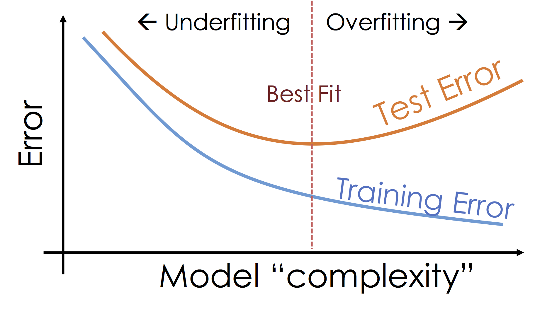
fig.update_xaxes(title = "X", row=1, col=1)
fig.update_yaxes(title = "Y", range=[0,10], row=1, col=1)
fig.add_trace(go.Bar(x=list(models.keys()),
y=[models[k]['train_rmse'] for k in models],
marker=dict(color=colors[0]), name="Training Error"), row=1, col=2)
fig.add_trace(go.Bar(x=list(models.keys()),
y=[models[k]['test_rmse'] for k in models],
marker=dict(color=colors[1]), name="Testing Error"), row=1, col=2)
fig.update_yaxes(title = "RMSE", row=1, col=2)
fig.show()