import numpy as np
import pandas as pd

## Plotly plotting support
import plotly.plotly as py

# import plotly.offline as py
# py.init_notebook_mode()

import plotly.graph_objs as go
import plotly.figure_factory as ff

# Make the notebook deterministic
np.random.seed(42)
Notebook created by Joseph E. Gonzalez for DS100.
Feature Transformations
In addition to transforming categorical and text features to real valued representations, we can often improve model performance through the use of additional feature transformations. Let's start with a simple toy example
Linear Models for Non-Linear Data
To illustrate the potential for feature transformations consider the following synthetic dataset:
train_data = pd.read_csv("toy_training_data.csv")
print(train_data.describe())
train_data.head()
Goal: As usual we would like to learn a model that predicts $Y$ given $X$.
What does this relationship between $X \rightarrow Y$ look like?
train_points = go.Scatter(name = "Training Data",
                          x = train_data['X'], y = train_data['Y'],
                          mode = 'markers')
# layout = go.Layout(autosize=False, width=800, height=600)
py.iplot(go.Figure(data=[train_points]),
         filename="L19_b_p1")
Properties of the Data
How would you describe this data?
- Is there a linear relationship between $X$ and $Y$?
- Are there other patterns?
- How noisy is the data?
- Do we see obvious outliers?
Least Squares Linear Regression (Review)
For the remainder of this lecture we will focus on fitting least squares linear regression models. Recall that linear regression models are functions of the form:
\begin{align}\large f_\theta(x) = x^T \theta = \sum_{j=1}^p \theta_j x_j \end{align}and least squares implies a loss function of the form:
\begin{align} \large L_\mathcal{D}(\theta) = \frac{1}{n} \sum_{i=1}^n \left(y_i - f_\theta(x) \right)^2 \end{align}In the previous lecture, we derived the normal equations which define the loss minimizing $\hat{\theta}$ for:
\begin{align}\large \hat{\theta} & \large = \arg\min L_\mathcal{D}(\theta) \\ & \large = \arg\min \frac{1}{n} \sum_{i=1}^n \left(y_i - X \theta \right)^2 \\ & \large = \left( X^T X \right)^{-1} X^T Y \end{align}Linear Regression with scikit-learn
In this lecture we will use the scikit-learn linear_model package to compute the normal equations. This package supports a wide range of generalized linear models. For those who are interested in studying machine learning, I would encourage you to skim through the descriptions of the various models in the linear_model package. These are the foundation of most practical applications of supervised machine learning.
from sklearn import linear_model
The following block of code creates an instance of the Least Squares Linear Regression model and the fits that model to the training data.
line_reg = linear_model.LinearRegression(fit_intercept=True)
# Fit the model to the data
line_reg.fit(train_data[['X']], train_data['Y'])
Notice: In the above code block we explicitly added a bias (intercept) term by setting fit_intercept=True. Therefore we will not need to add an additional constant feature.
Plotting the Model
To plot the model we will predict the value of $Y$ for a range of $X$ values. I will call these query points X_query.
X_query = np.linspace(-10, 10, 500)
Use the regression model to render predictions at each X_query point.
# Note that np.linspace returns a 1d vector therefore
# we must transform it into a 2d column vector
line_Yhat_query = line_reg.predict(
    np.reshape(X_query, (len(X_query),1)))
To plot the residual we will also predict the $Y$ value for all the training points:
line_Yhat = line_reg.predict(train_data[['X']])
The following visualization code constructs a line as well as the residual plot
# Define the least squares regression line
basic_line = go.Scatter(name = r"$\theta x$", x=X_query.T,
                        y=line_Yhat_query)

# Definethe residual lines segments, a separate line for each
# training point
residual_lines = [
    go.Scatter(x=[x,x], y=[y,yhat],
               mode='lines', showlegend=False,
               line=dict(color='black', width = 0.5))
    for (x, y, yhat) in zip(train_data['X'], train_data['Y'], line_Yhat)
]

# Combine the plot elements
py.iplot([train_points, basic_line] + residual_lines, filename="L19_b_p2")
Assessing the Fit
- Is our simple linear model a good fit?
- What do we see in the above plot?
- Are there clear outliers?
- Are there patterns to the residuals?
Residual Analysis
To help answer these questions it can often be helpful to plot the residuals in a residual plot. Residual plots plot the difference between the predicted value and the observed value in response to a particular covariate ($X$ dimension). The residual plot can help reveal patterns in the residual that might support additional modeling.
residuals = line_Yhat - train_data['Y']
# Plot.ly plotting code
py.iplot(go.Figure(
    data = [dict(x=train_data['X'], y=residuals, mode='markers')],
    layout = dict(title="Residual Plot", xaxis=dict(title="X"),
                  yaxis=dict(title="Residual"))
), filename="L19_b_p3")
resid_vs_fit = go.Scatter(name="y vs yhat", x=line_Yhat, y=residuals, mode='markers')
layout = go.Layout(xaxis=dict(title=r"$\hat{y}$"), yaxis=dict(title="Residuals"))
py.iplot(go.Figure(data=[resid_vs_fit], layout=layout),
         filename="L19_b_p3.2")
Do we see a pattern?
Using a Smoothing Model
To better visualize the pattern we could apply another regression package. In the following plotting code we call a more sophisticated regression package sklearn.kernel_ridge to estimate a smoothed approximation to the residuals.
from sklearn.kernel_ridge import KernelRidge

# Use Kernelized Ridge Regression with Radial Basis Functions to
# compute a smoothed estimator.  Later in this notebook we will
# actually implement part of this  ...
clf = KernelRidge(kernel='rbf', alpha=2)
clf.fit(train_data[['X']], residuals)
residual_smoothed = clf.predict(np.reshape(X_query, (len(X_query),1)))
# Plot the residuals with with a kernel smoothing curve
py.iplot(go.Figure(
    data = [dict(name = "Residuals", x=train_data['X'], y=residuals,
                 mode='markers'),
            dict(name = "Smoothed Approximation",
                 x=X_query, y=residual_smoothed,
                 line=dict(dash="dash"))],
    layout = dict(title="Residual Plot", xaxis=dict(title="X"),
                  yaxis=dict(title="Residual"))
), filename="L19_b_p4")
The above plot suggests a cyclic pattern to the residuals.
Question: Can we fit this non-linear cyclic structure with a linear model?
What does it mean to be a linear model
Let's return to what it means to be a linear model:
$$\large f_\theta(x) = x^T \theta = \sum_{j=1}^p x_j \theta_j $$In what sense is the above model linear?
- Linear in the features $x$?
- Linear in the parameters $\theta$?
- Linear in both at the same time?
Yes, Yes, and No. If we look at just the features or just the parameters the model is linear. However, if we look at both at the same time it is not. Why?
Feature Functions
Consider the following alternative model formulation:
$$\large f_\theta\left( \phi(x) \right) = \phi(x)^T \theta = \sum_{j=1}^{k} \phi(x)_j \theta_j $$where $\phi_j$ is an arbitrary function from $x\in \mathbb{R}^p$ to $\phi(x)_j \in \mathbb{R}$ and we define $k$ of these functions. We often refer to these functions $\phi_j$ as feature functions or basis functions and their design plays a critical role in both how we capture prior knowledge and our ability to fit complicated data.
Capturing Domain Knowledge
Feature functions can be used to capture domain knowledge by:
- Introducing additional information from other sources
- Combining related features
- Encoding non-linear patterns
Suppose I had data about customer purchases and I wanted to estimate their income:
\begin{align} \phi(\text{date}, \text{lat}, \text{lon}, \text{amount})_1 &= \textbf{isWinter}(\text{date}) \\ \phi(\text{date}, \text{lat}, \text{lon}, \text{amount})_2 &= \cos\left( \frac{\textbf{Hour}(\text{date})}{12} \pi \right) \\ \phi(\text{date}, \text{lat}, \text{lon}, \text{amount})_3 &= \frac{\text{amount}}{\textbf{avg_spend}[\textbf{ZipCode}[\text{lat}, \text{lon}]]} \\ \phi(\text{date}, \text{lat}, \text{lon}, \text{amount})_4 &= \exp\left(-\textbf{Distance}\left((\text{lat},\text{lon}), \textbf{StoreA}\right)\right)^2 \\ \phi(\text{date}, \text{lat}, \text{lon}, \text{amount})_5 &= \exp\left(-\textbf{Distance}\left((\text{lat},\text{lon}), \textbf{StoreB}\right)\right)^2 \end{align}Notice: In the above feature functions:
- The transformations are non-linear
- They pull in additional information
- They may encode implicit knowledge
- The functions $\phi$ do not depend on $\theta$
Linear in $\theta$
As a consequence, while the model $f_\theta\left( \phi(x) \right)$ is no longer linear in $x$ it is still a linear model because it is linear in $\theta$. This means we can continue to use the normal equations to compute the optimal parameters.
To apply the normal equations we define the transformed feature matrix:
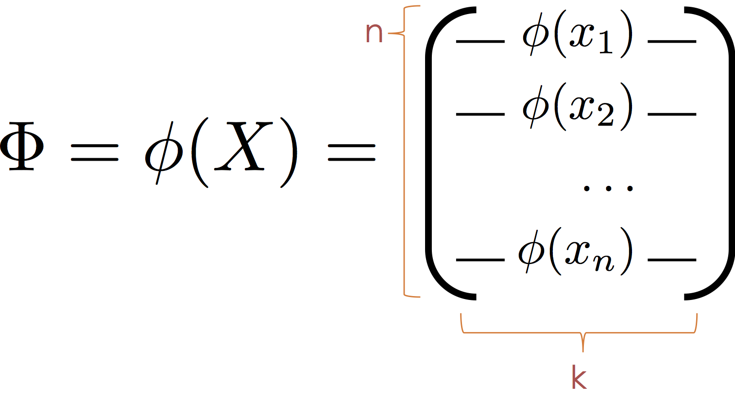
Then substituting $\Phi$ for $X$ we obtain the normal equation:
$$ \large \hat{\theta} = \left( \Phi^T \Phi \right)^{-1} \Phi^T Y $$It is worth noting that the model is also linear in $\phi$ and that the $\phi_j$ form a new basis (hence the term basis functions) in which the data live. As a consequence we can think of $\phi$ as mapping the data into a new (often higher dimensional space) in which the relationship between $y$ and $\phi(x)$ is defined by a hyperplane.
Transforming the data with $\phi$
In our toy data set we observed a cyclic pattern. Here we construct a $\phi$ to capture the cyclic nature of our data and visualize the corresponding hyperplane.
In the following cell we define a function $\phi$ that maps $x\in \mathbb{R}$ to the vector $[x,\sin(x)] \in \mathbb{R}^2$
$$ \large \phi(x) = [x, \sin(x)] $$Why not:
$$ \large \phi(x) = [x, \sin(\theta_3 x + \theta_4)] $$This would no longer be linear $\theta$. However, in practice we might want to consider a range of $\sin$ basis:
$$ \large \phi_{\alpha,\beta}(x) = \sin(\alpha x + \beta) $$for different values of $\alpha$ and $\beta$. The parameters $\alpha$ and $\beta$ are typically called hyperparameters because (at least in this setting) they are not set automatically through learning.
def sin_phi(x):
    return [x, np.sin(x)]
We then compute the matrix $\Phi$ by applying $\phi$ to reach row (record) in the matrix $X$.
Phi = np.array([sin_phi(x) for x in train_data['X']])

# Look at a few examples
Phi[:5,]
It is worth noting that in practice we might prefer a more efficient "vectorized" version of the above code:
Phi = np.vstack((train_data['X'], np.sin(train_data['X']))).T
however in this notebook we will use more explicit for loop notation.
Fit a Linear Model on $\Phi$
We can again use the scikit-learn package to fit a linear model on the transformed space.
sin_reg = linear_model.LinearRegression(fit_intercept=False)
sin_reg.fit(Phi, train_data['Y'])
Plotting the predictions
What will the prediction from this mode look like?
$$ \large f_\theta(x) = \phi(x)^T \theta = \theta_1 x + \theta_2 \sin x $$# Making predictions at the transformed query points
Phi_query = np.array([sin_phi(x) for x in X_query])
sin_Yhat_query = sin_reg.predict(Phi_query)
# plot the regression line
sin_line = go.Scatter(name = r"$\theta_0 x + \theta_1 \sin(x)$ ",
x=X_query, y=sin_Yhat_query)
# Make predictions at the training points
sin_Yhat = sin_reg.predict(Phi)
# Plot the residual segments
residual_lines = [
go.Scatter(x=[x,x], y=[y,yhat],
mode='lines', showlegend=False,
line=dict(color='black', width = 0.5))
for (x, y, yhat) in zip(train_data['X'], train_data['Y'], sin_Yhat)
]
py.iplot([train_points, sin_line, basic_line] + residual_lines,
filename="L19_b_p10")
Examine the residuals again
sin_Yhat = sin_reg.predict(Phi)
residuals = train_data['Y'] - sin_Yhat


# Use Kernelized Ridge Regression with Radial Basis Functions to
# compute a smoothed estimator.
clf = KernelRidge(kernel='rbf')
clf.fit(train_data[['X']], residuals)
residual_smoothed = clf.predict(np.reshape(X_query, (len(X_query),1)))

# Plot the residuals with with a kernel smoothing curve
py.iplot(go.Figure(
    data = [dict(name = "Residuals",
                 x=train_data['X'], y=residuals, mode='markers'),
            dict(name = "Smoothed Approximation",
                 x=X_query, y=residual_smoothed,
                 line=dict(dash="dash"))],
    layout = dict(title="Residual Plot",
                  xaxis=dict(title="X"), yaxis=dict(title="Residual"))
), filename="L19_b_p11")
resid_vs_fit = go.Scatter(name="y vs yhat", x=sin_Yhat, y=residuals, mode='markers')
layout = go.Layout(xaxis=dict(title=r"$\hat{y}$"), yaxis=dict(title="Residuals"))
py.iplot(go.Figure(data=[resid_vs_fit], layout=layout),
         filename="L19_b_p2.2")
yhat_vs_y = go.Scatter(name="y vs yhat", x=train_data['Y'], y=sin_Yhat, mode='markers')
slope_one = go.Scatter(name="Ideal", x=[-25,25], y=[-25,25])
layout = go.Layout(xaxis=dict(title="y"), yaxis=dict(title=r"$\hat{y}$"))
py.iplot(go.Figure(data=[yhat_vs_y, slope_one], layout=layout),
         filename="L19_b_p11.1")
Look at the distribution of residuals
py.iplot(ff.create_distplot([residuals], group_labels=['Residuals']),
         filename="L19_b_p12")
Recall earlier that our residuals were more spread from -10 to 10 and now they have become more concentrated. However, the outliers remain. Is that a problem?
A Linear Model in Transformed Space
As discussed earlier the model we just constructed, while non-linear in $x$ is actually a linear model in $\phi(x)$ and we can visualize that linear model's structure in higher dimensions.
# Plot the data in higher dimensions
phi3d = go.Scatter3d(name = "Raw Data",
    x = Phi[:,0], y = Phi[:,1], z = train_data['Y'],
    mode = 'markers',
    marker = dict(size=3),
    showlegend=False
)

# Compute the predictin plane
(u,v) = np.meshgrid(np.linspace(-10,10,5), np.linspace(-1,1,5))
coords = np.vstack((u.flatten(),v.flatten())).T
ycoords = coords @ sin_reg.coef_
fit_plane = go.Surface(name = "Fitting Hyperplane",
    x = np.reshape(coords[:,0], (5,5)),
    y = np.reshape(coords[:,1], (5,5)),
    z = np.reshape(ycoords, (5,5)),
    opacity = 0.8, cauto = False, showscale = False,
    colorscale = [[0, 'rgb(255,0,0)'], [1, 'rgb(255,0,0)']]
)

# Construct residual lines
Yhat = sin_reg.predict(Phi)
residual_lines = [
    go.Scatter3d(x=[x[0],x[0]], y=[x[1],x[1]], z=[y, yhat],
                 mode='lines', showlegend=False,
                 line=dict(color='black'))
    for (x, y, yhat) in zip(Phi, train_data['Y'], Yhat)
]


# Label the axis and orient the camera
layout = go.Layout(
    scene=go.Scene(
        xaxis=go.XAxis(title='X'),
        yaxis=go.YAxis(title='sin(X)'),
        zaxis=go.ZAxis(title='Y'),
        aspectratio=dict(x=1.,y=1., z=1.),
        camera=dict(eye=dict(x=-1, y=-1, z=0))
    )
)

py.iplot(go.Figure(data=[phi3d, fit_plane] + residual_lines, layout=layout),
         filename="L19_b_p14")
Computing the RMSE of the various methods so far:
def rmse(y, yhat):
    return np.sqrt(np.mean((yhat-y)**2))
const_rmse = rmse(train_data['Y'], train_data['Y'].mean())
line_rmse = rmse(train_data['Y'], line_Yhat)
sin_rmse = rmse(train_data['Y'], sin_Yhat)
py.iplot(go.Figure(data =[go.Bar(
            x=[r'$\theta $', r'$\theta x$',
               r'$\theta_0 x + \theta_1 \sin(x)$'],
            y=[const_rmse, line_rmse, sin_rmse]
            )], layout = go.Layout(title="Loss Comparison",
                           yaxis=dict(title="RMSE"))),
         filename="L19_b_p15")
By adding the sine feature function were were able to reduce the prediction error. How could we improve further?
Generic Feature Functions
We will now explore a range of generic feature transformations. However before we proceed it is worth contrasting two categories of feature functions and their applications.
Interpretable Features: In settings where our goal is to understand the model (e.g., identify important features that predict customer churn) we may want to construct meaningful features based on our understanding of the domain.
Generic Features: However, in other settings where our primary goals is to make accurate predictions we may instead introduce generic feature functions that enable our models to fit and generalize complex relationships.
The Polynomial Basis:
The first set of generic feature functions we will consider is the polynomial basis:
\begin{align} \phi(x) = [x, x^2, x^3, \ldots, x^k] \end{align}We can define a generic python function to implement this basis:
def poly_phi(k):
    return lambda x: [x ** i for i in range(1, k+1)]
To simply the comparison of feature functions we define the following routine:
def evaluate_basis(phi, desc):
    # Apply transformation
    Phi = np.array([phi(x) for x in train_data['X']])

    # Fit a model
    reg_model = linear_model.LinearRegression(fit_intercept=False)
    reg_model.fit(Phi, train_data['Y'])

    # Create plot line
    X_test = np.linspace(-10, 10, 1000) # Fine grained test X
    Phi_test = np.array([phi(x) for x in X_test])
    Yhat_test = reg_model.predict(Phi_test)
    line = go.Scatter(name = desc, x=X_test, y=Yhat_test)

    # Compute RMSE
    Yhat = reg_model.predict(Phi)
    error = rmse(train_data['Y'], Yhat)

    # return results
    return (line, error, reg_model)
Starting with $k=5$ degree polynomials
(poly_line, poly_rmse, poly_reg) = (
    evaluate_basis(poly_phi(5), "Polynomial")
)

py.iplot(go.Figure(data=[train_points, poly_line, sin_line, basic_line],
                   layout = go.Layout(xaxis=dict(range=[-10,10]),
                                      yaxis=dict(range=[-25,25]))),
         filename="L19_b_p16")
Increasing to $k=15$
(poly_line, poly_rmse, poly_reg) = (
    evaluate_basis(poly_phi(15), "Polynomial")
)

py.iplot(go.Figure(data=[train_points, poly_line, sin_line, basic_line],
                   layout = go.Layout(xaxis=dict(range=[-10,10]),
                                      yaxis=dict(range=[-25,25]))),
         filename="L19_b_p17")
Seems like a pretty reasonable fit. Returning to the RMSE on the training data:
py.iplot([go.Bar(
            x=[r'$\theta $', r'$\theta x$',
               r'$\theta_0 x + \theta_1 \sin(x)$',
               'Polynomial'],
            y=[const_rmse, line_rmse, sin_rmse, poly_rmse]
    )], filename="L19_b_p18")
This was a slight improvement. Perhaps we should increase to a higher degree polynomial? Why or why not? We will return to this soon.
Gaussian Radial Basis Functions
One of the more widely used generic feature functions are Gaussian radial basis functions. These feature functions take the form:
$$ \phi_{(\lambda, u_1, \ldots, u_k)}(x) = \left[\exp\left( - \frac{\left|\left|x-u_1\right|\right|_2^2}{\lambda} \right), \ldots, \exp\left( - \frac{\left|\left| x-u_k \right|\right|_2^2}{\lambda} \right) \right] $$The hyper-parameters $u_1$ through $u_k$ and $\lambda$ are not optimized with $\theta$ but instead are set externally. In many cases the $u_i$ may correspond to points in the training data. The term $\lambda$ defines the spread of the basis function and determines the "smoothness" of the function $f_\theta(\phi(x))$.
The following is a plot of three radial basis function centered at 2 with different values of $\lambda$.
def gaussian_rbf(u, lam=1):
    return lambda x: np.exp(-(x - u)**2 / lam**2)
tmpX = np.linspace(-2, 6,100)
py.iplot([
    dict(name=r"$\lambda=0.5$", x=tmpX,
         y=gaussian_rbf(2, lam=0.5)(tmpX)),
    dict(name=r"$\lambda=1$", x=tmpX,
         y=gaussian_rbf(2, lam=1.)(tmpX)),
    dict(name=r"$\lambda=2$", x=tmpX,
         y=gaussian_rbf(2, lam=2.)(tmpX))
], filename="L19_b_p19")
10 RBF Functions $\lambda=1$
Here we plot 10 uniformly spaced RBF functions with $\lambda=1$
def rbf_phi(x):
    return [gaussian_rbf(u, 1.)(x) for u in np.linspace(-9, 9, 10)]

(rbf_line, rbf_rmse, rbf_reg) = evaluate_basis(rbf_phi, r"RBF")

py.iplot([train_points, rbf_line, poly_line, sin_line, basic_line], filename="L19_b_p20")
10 RBF Functions $\lambda=10$
def rbf_phi(x):
    return [gaussian_rbf(u, 2)(x) for u in np.linspace(-9, 9, 15)]


(rbf_line, rbf_rmse, rbf_reg) = (
    evaluate_basis(rbf_phi, r"RBF")
)

py.iplot([train_points, rbf_line, poly_line, sin_line, basic_line],
         filename="L19_b_p21")
Is this a better fit?
py.iplot([go.Bar(
            x=[r'$\theta $', r'$\theta x$',
               r'$\theta_0 x + \theta_1 \sin(x)$',
               r"Polynomial",
               r"RBF"],
            y=[const_rmse, line_rmse, sin_rmse, poly_rmse, rbf_rmse]
    )], filename="L19_b_p23")
Connecting the Dots...
def crazy_rbf_phi(x):
    return (
        [gaussian_rbf(u,0.5)(x) for u in np.linspace(-9, 9, 50)]
    )

(crazy_rbf_line, crazy_rbf_rmse, crazy_rbf_reg) = (
    evaluate_basis(crazy_rbf_phi, "RBF + Crazy")
)

py.iplot(go.Figure(data=[train_points, crazy_rbf_line,
                         poly_line, sin_line, basic_line],
                   layout=go.Layout(yaxis=dict(range=[-25,25]))),
         filename="L19_b_p24")
train_bars = go.Bar(name = "Train",
    x=[r'$\theta $', r'$\theta x$', r'$\theta_0 x + \theta_1 \sin(x)$',
       "Polynomial",
       "RBF",
       "RBF + Crazy"],
    y=[const_rmse, line_rmse, sin_rmse, poly_rmse, rbf_rmse, crazy_rbf_rmse])

py.iplot([train_bars], filename="L19_b_p25")
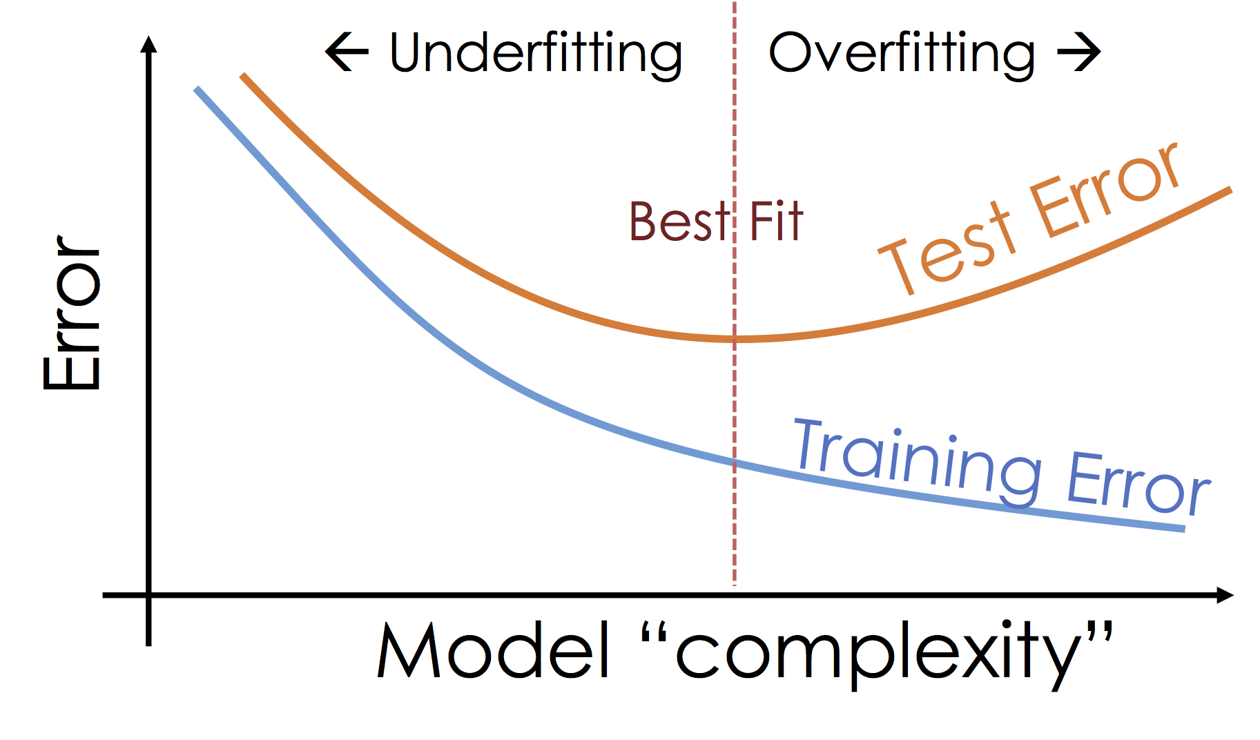
Which is the best model?
We started with the objective of minimizing the training loss (error). As we increased the model sophistication by adding features we were able to fit increasingly complex functions to the data and reduce the loss. However, is our ultimate goal to minimize training error?
Ideally we would like to minimize the error we make when making new predictions at unseen values of $X$. One way to evaluate that error is use a test dataset which is distinct from the dataset used to train the model. Fortunately, we have such a test dataset.
test_data = pd.read_csv("toy_test_data.csv")

test_points = go.Scatter(name = "Test Data", x = test_data['X'], y = test_data['Y'],
                       mode = 'markers', marker=dict(symbol="cross", color="red"))
py.iplot([train_points, test_points], filename="L19_b_p26")
def test_rmse(phi, reg):
    yhat = reg.predict(np.array([phi(x) for x in test_data['X']]))
    return rmse(test_data['Y'], yhat)
test_bars = go.Bar(name = "Test",
    x=[r'$\theta $', r'$\theta x$', r'$\theta_0 x + \theta_1 \sin(x)$',
       "Polynomial",
       "RBF",
       "RBF + Crazy"],
    y=[np.sqrt(np.mean((test_data['Y']-train_data['Y'].mean())**2)),
       test_rmse(lambda x: [x], line_reg),
       test_rmse(sin_phi, sin_reg),
       test_rmse(poly_phi(15), poly_reg),
       test_rmse(rbf_phi, rbf_reg),
       test_rmse(crazy_rbf_phi, crazy_rbf_reg)]
    )

py.iplot([train_bars, test_bars], filename="L19_b_p27")
What happened here?
This is a very common occurrence in machine learning. As we increased the model complexity
What's happening: Over-fitting
As we increase the expressiveness of our model we begin to over-fit to the variability in our training data. That is we are learning patterns that do not generalize beyond our training dataset
Over-fitting is a key challenge in machine learning and statistical inference. At it's core is a fundamental trade-off between bias and variance: the desire to explain the training data and yet be robust to variation in the training data.
We will study the bias-variance trade-off more in the next lecture but for now we will focus on the trade-off between under fitting and over fitting:
Train, Test, and Validation Splitting
To manage over-fitting it is essential to split your initial training data into a training and testing dataset.
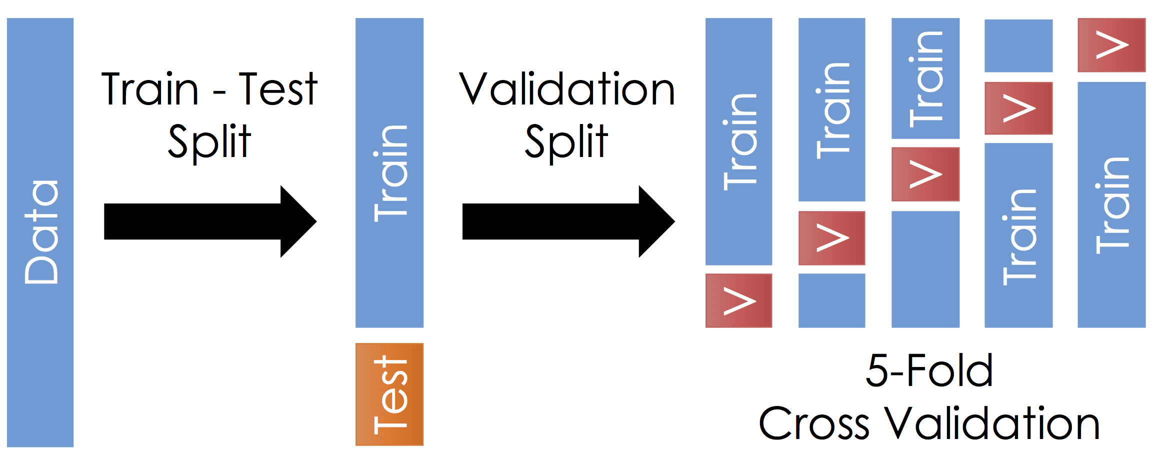
Train - Test Split
Before running cross validation split the data into train and test subsets (typically a 90-10 split). How should you do this? You want the test data to reflect the prediction goal:
- Random sample of the training data
- Future examples
- Different stratifications
Ask yourself, where will I be using this model and how does that relate to my test data.
Do not look at the test data until after selecting your final model. Also, it is very important to not look at the test data until after selecting your final model. Finally, you should not look at the test data until after selecting your final model.
Cross Validation
With the remaining training data:
- Split the remaining training dataset k-ways as in the Figure above. The figure uses 5-Fold which is standard. You should split the data in the same way you constructed the test set (this is typically randomly)
- For each split train the model on the training fraction and then compute the error (RMSE) on the validation fraction.
- Average the error across each validation fraction to estimate the test error.
Questions:
- What is this accomplishing?
- What are the implication on the choice of $k$?
Answers:
- This is repeatedly simulating the train-test split we did earlier. We repeat this process because it is noisy.
- Larger $k$ means we average our validation error over more instances which makes our estimate of the test error more stable. This typically also means that the validation set is smaller so we have more training data. However, larger $k$ also means we have to train the model more often which gets computational expensive
When do we use Cross Validation
We use cross validation to estimate our test performance without looking at our test data. Remember, do not look at the test data until after selecting your final model.
Cross validation is commonly used to tune the model complexity. In the following we will use cross validation to find the optimal number of basis functions.
Cross Validation in sklearn
from sklearn.model_selection import KFold
nsplits = 5

X = train_data['X']
Y = train_data['Y']


nbasis_values = range(3, 20)
sigma_values = np.linspace(1, 20, 50)

scores = []
for nbasis in nbasis_values:
    for sigma in sigma_values:
        # Define my basis for this "experiment"
        def phi(x):
            return (
                [gaussian_rbf(u, sigma)(x) for u in np.linspace(-9, 9, nbasis)]
            )
        Phi = np.array([phi(x) for x in X])

        # One step in k-fold cross validation
        def score_model(train_index, test_index):
            model = linear_model.LinearRegression(fit_intercept=False)
            model.fit(Phi[train_index,], Y[train_index])
            return rmse(Y[test_index], model.predict(Phi[test_index,]))


        # Do the actual K-Fold cross validation
        kfold = KFold(nsplits, shuffle=True,random_state=42)
        score = np.mean([score_model(tr_ind, te_ind)
                         for (tr_ind, te_ind) in kfold.split(Phi)])

        # Save the results in the dictionary
        scores.append(dict(nbasis=nbasis,sigma=sigma,score=score))
scores_df = pd.DataFrame(scores)
(b,s) = (len(nbasis_values), len(sigma_values))

z = np.reshape(scores_df['score'].values,(b,s))
loss_surface = go.Surface(
    x = np.reshape(scores_df['nbasis'].values,(b,s)),
    y = np.reshape(scores_df['sigma'].values,(b,s)),
    z = z
)

optimal_value = scores_df.loc[scores_df['score'].argmin(),]
print(optimal_value)
optimal_point = go.Scatter3d(
    x=optimal_value['nbasis'],
    y=optimal_value['sigma'],
    z=optimal_value['score'],
    marker=dict(size=10, color="red")
)

# Axis labels
layout = go.Layout(
    scene=go.Scene(
        xaxis=go.XAxis(title='nbasis'),
        yaxis=go.YAxis(title='sigma'),
        zaxis=go.ZAxis(title='log CV rmse'),
        aspectratio=dict(x=1.,y=1., z=1.)
    )
)


fig = go.Figure(data = [loss_surface,optimal_point], layout = layout)
py.iplot(fig, filename="L19-p2-cv-loss")
Take a look at the final fit:
def optimal_rbf_phi(x):
    return (
        [gaussian_rbf(u,optimal_value['sigma'])(x) for u in np.linspace(-9, 9, optimal_value['nbasis'])]
    )

(optimal_rbf_line, optimal_rbf_rmse, optimal_rbf_reg) = (
    evaluate_basis(optimal_rbf_phi, "Optimal RBF")
)

py.iplot(go.Figure(data=[train_points, optimal_rbf_line],
                   layout=go.Layout(yaxis=dict(range=[-25,25]))),
         filename="L19_final")
Next time:
We will dig more into the bias variance trade-off and introduce the concept of regularization to parametrically explore the space of model complexity.