import numpy as np
import pandas as pd
import plotly.express as px
import sklearn.linear_model as lm
import seaborn as sns
from tqdm.notebook import tqdm
Simple Bootstrap Example
Here we work through a simple example of the bootstap when estimating the relationship between miles per gallon and the weight of a vehicle.
Suppose we collected a sample of 20 cars from a population. For the purposes of this demo we will assume that the seaborn dataset is the population. The following is a visualization of our sample:
np.random.seed(42)
sample_size = 100
mpg = sns.load_dataset('mpg')
print("Full Data Size:", len(mpg))
mpg_sample = mpg.sample(sample_size)
print("Sample Size:", len(mpg_sample))
px.scatter(mpg_sample, x='weight', y='mpg', trendline='ols', width=800)
Full Data Size: 398 Sample Size: 100
Fitting a linear model we get an estimate of the slope:
model = lm.LinearRegression().fit(mpg_sample[['weight']], mpg_sample['mpg'])
model.coef_
array([-0.00730597])
Bootstrap Implementation
Now let's use bootstrap to estimate the distribution of that coefficient. Here will will construct a bootstrap function that takes an estimator function and uses that function to construct many bootstrap estimates.
def estimator(sample):
model = lm.LinearRegression().fit(sample[['weight']], sample['mpg'])
return model.coef_[0]
This code uses df.sample (link) to generate a bootstrap sample of the same size of the original sample.
def bootstrap(sample, statistic, num_repetitions):
"""
Returns the statistic computed on a num_repetitions
bootstrap samples from sample.
"""
stats = []
for i in tqdm(np.arange(num_repetitions), "Bootstrapping"):
# Step 1: Sample the Sample
bootstrap_sample = sample.sample(frac=1, replace=True)
# Step 2: compute statistics on the sample of the sample
bootstrap_stat = statistic(bootstrap_sample)
# Accumulate the statistics
stats.append(bootstrap_stat)
return stats
Constructing MANY bootstrap slope estimates.
bs_thetas = bootstrap(mpg_sample, estimator, 10000)
Bootstrapping: 0%| | 0/10000 [00:00<?, ?it/s]
We can visualize the bootstrap distribution of the slope estimates.
fig = px.histogram(pd.Series(bs_thetas, name="Bootstrap Distribution"),
title='Bootstrap Distribution of the Slope',
width=800, histnorm='probability',
barmode="overlay", opacity=0.8)
fig.add_vline(0)
Computing a Bootstrap CI
We can compute the CI using the percentiles of the empirical distribution:
def bootstrap_ci(bootstrap_samples, confidence_level=95):
"""
Returns the confidence interval for the bootstrap samples.
"""
lower_percentile = (100 - confidence_level) / 2
upper_percentile = 100 - lower_percentile
# using numpy percentile function to compute ci
return np.percentile(bootstrap_samples, [lower_percentile, upper_percentile])
bootstrap_ci(bs_thetas)
array([-0.00814752, -0.00653232])
ci_line_style = dict(color="orange", width=2, dash="dash")
fig.add_vline(x=bootstrap_ci(bs_thetas)[0], line=ci_line_style)
fig.add_vline(x=bootstrap_ci(bs_thetas)[1], line=ci_line_style)
Comparing to the Population CIs
In practice you don't have access to the population but in this specific example we had taken a sample from a larger dataset that we can pretend is the population. Let's compare to resampling from the larger dataset:
mpg_pop = sns.load_dataset('mpg')
theta_est = [estimator(mpg_pop.sample(sample_size)) for i in tqdm(range(10000))]
0%| | 0/10000 [00:00<?, ?it/s]
print("Actual CI", bootstrap_ci(theta_est))
fig.add_histogram(x=theta_est, name='Population Distribution', histnorm='probability', opacity=0.7)
fig.add_vline(x=bootstrap_ci(theta_est)[0], line=dict(color="red", width=2, dash="dash"))
fig.add_vline(x=bootstrap_ci(theta_est)[1], line=dict(color="red", width=2, dash="dash"))
Actual CI [-0.00852071 -0.00691023]
Visualizing the two distributions:
thetas = pd.DataFrame({"bs_thetas": bs_thetas, "thetas": theta_est})
px.histogram(thetas.melt(), x='value', facet_row='variable',
title='Distribution of the Slope', width=800)
Return to Lecture.
csv_file = 'data/Full24hrdataset.csv.gz'
usecols = ['Date', 'ID', 'region', 'PM25FM', 'PM25cf1', 'TempC', 'RH', 'Dewpoint']
full_df = pd.read_csv(csv_file, usecols=usecols, parse_dates=['Date']).dropna()
full_df.columns = ['date', 'id', 'region', 'pm25aqs', 'pm25pa', 'temp', 'rh', 'dew']
full_df = full_df[(full_df['pm25aqs'] < 50)]
# drop dates with issues in the data
bad_dates = pd.to_datetime(['2019-08-21', '2019-08-22', '2019-09-24'])
GA = full_df[(full_df['id'] == 'GA1') & (~full_df['date'].isin(bad_dates))]
GA = GA.sort_values("pm25aqs")
display(full_df["region"].value_counts())
display(GA.head())
print("Number of Rows:", GA.shape[0])
region North 5592 West 3750 Central Southwest 1502 Southeast 1032 Alaska 365 Name: count, dtype: int64
| date | id | region | pm25aqs | pm25pa | temp | rh | dew | |
|---|---|---|---|---|---|---|---|---|
| 5416 | 2019-10-31 | GA1 | Southeast | 3.100000 | 7.638554 | 19.214186 | 70.443672 | 13.674061 |
| 5401 | 2019-10-09 | GA1 | Southeast | 4.200000 | 10.059924 | 24.621388 | 57.696801 | 15.708347 |
| 5407 | 2019-10-17 | GA1 | Southeast | 4.200000 | 6.389826 | 16.641975 | 49.377778 | 5.921212 |
| 5411 | 2019-10-23 | GA1 | Southeast | 4.300000 | 4.544160 | 16.963735 | 50.861111 | 6.650425 |
| 5325 | 2019-10-23 | GA1 | Southeast | 4.304167 | 4.544160 | 16.963735 | 50.861111 | 6.650425 |
Number of Rows: 176
Inverse Regression
After we build the model that adjusts the PurpleAir measurements using AQS, we then flip the model around and use it to predict the true air quality in the future from PurpleAir measurements when we don't have a nearby AQS instrument. This is a calibration scenario. Since the AQS measurements are close to the truth, we fit the more variable PurpleAir measurements to them; this is the calibration procedure. Then, we use the calibration curve to correct future PurpleAir measurements. This two-step process is encapsulated in the simple linear model and its flipped form below.
Inverse regression:
First, we fit a line to predict a PA measurement from the ground truth, as recorded by an AQS instrument:
$$ \text{PA} \approx \theta_0 + \theta_1\text{AQS} $$
Next, we flip the line around to use a PA measurement to predict the air quality,
$$ \text{True Air Quality} \approx -\theta_0/\theta_1 + 1/\theta_1 \text{PA} $$
Why perform this “inverse regression”?
- Intuitively, AQS measurements are “true” and have no error.
- A linear model takes a “true” x value input and minimizes the error in the y direction.
- Algebraically identical, but statistically different.
model = lm.LinearRegression().fit(GA[['pm25aqs']], GA['pm25pa'])
theta_0, theta_1 = model.intercept_, model.coef_[0],
fig = px.scatter(GA, x='pm25aqs', y='pm25pa', width=800)
xtest = pd.DataFrame({"pm25aqs": np.array([GA['pm25aqs'].min(), GA['pm25aqs'].max()])})
fig.add_scatter(x=xtest["pm25aqs"], y=model.predict(xtest[["pm25aqs"]]), mode='lines',
name="Least Squares Fit")
Constructing the inverse predictions
print(f"True Air Quality Estimate = {-theta_0/theta_1:.2} + {1/theta_1:.2}PA")
True Air Quality Estimate = 1.6 + 0.46PA
model2 = lm.LinearRegression().fit(GA[['pm25pa']], GA['pm25aqs'])
fig = px.scatter(GA, y='pm25aqs', x='pm25pa', width=800)
xtest["pm25pa"] = np.array([GA['pm25pa'].min(), GA['pm25pa'].max()])
fig.add_scatter(x=xtest["pm25pa"], y=xtest["pm25pa"] *1/theta_1 - theta_0/theta_1 , mode='lines',
name="Inverse Fit")
fig.add_scatter(x=xtest["pm25pa"], y=model2.predict(xtest[['pm25pa']]), mode='lines',
name="Least Squares Fit")
The Barkjohn et al. model with Relative Humidity
Karoline Barkjohn, Brett Gannt, and Andrea Clements from the US Environmental Protection Agency developed a model to improve the PuprleAir measurements from the AQS sensor measurements. Arkjohn and group’s work was so successful that, as of this writing, the official US government maps, like the AirNow Fire and Smoke map, includes both AQS and PurpleAir sensors, and applies Barkjohn’s correction to the PurpleAir data. $$ \begin{aligned} \text{PA} \approx \theta_0 + \theta_1 \text{AQS} + \theta_2 \text{RH} \end{aligned} $$
The model that Barkjohn settled on incorporated the relative humidity:
model_h = lm.LinearRegression().fit(GA[['pm25aqs', 'rh']], GA['pm25pa'])
[theta_1, theta_2], theta_0 = model_h.coef_, model_h.intercept_
print(f"True Air Quality Estimate = {-theta_0/theta_1:1.2} + {1/theta_1:.2}PA + {-theta_2/theta_1:.2}RH")
True Air Quality Estimate = 7.0 + 0.44PA + -0.092RH
fig = px.scatter(GA, x='pm25aqs', y='pm25pa', width=800)
fig.add_scatter(x=xtest['pm25aqs'], y=model.predict(xtest[['pm25aqs']]), mode='lines',
name="Least Squares Fit")
fig.add_scatter(x=GA["pm25aqs"], y=model_h.predict(GA[['pm25aqs', 'rh']]), mode='lines+markers',
marker_size=5, name="Least Squares Fit with RH")
Bonus Visualizing the surface:
fig = px.scatter_3d(GA, x='pm25aqs', y='rh', z='pm25pa', width=800, height=600)
grid_resolution = 2
(u,v) = np.meshgrid(
np.linspace(GA["pm25aqs"].min(), GA["pm25aqs"].max(), grid_resolution),
np.linspace(GA["rh"].min(), GA["rh"].max(), grid_resolution))
zs = model_h.predict(pd.DataFrame({"pm25aqs": u.flatten(), "rh": v.flatten()}))
zs_old = model.predict(pd.DataFrame({"pm25aqs": u.flatten()}))
# create the Surface
color1 = px.colors.qualitative.Plotly[3]
color2 = px.colors.qualitative.Plotly[4]
fig.add_surface(x=u, y=v, z= zs.reshape(u.shape), opacity=1,
colorscale=[[0, color1], [1,color1]],
showscale=False, name="AQS + RH")
fig.add_surface(x=u, y=v, z= zs_old.reshape(u.shape), opacity=1,
colorscale=[[0, color2], [1,color2]],
showscale=False, name="AQS")
# set the aspect ratio of the 3d plot
fig.update_scenes(aspectmode='cube')
Compared to the simple linear model that only incorporated AQS, the Barkjohn et al. model with relative humidity achieves lower error. Good for prediction!
From the Barkjohn et al., model, AQS coefficient $\hat{\theta}_1$:
theta_1
2.2540167939150546
The Relative Humidity coefficient $\hat{\theta}_2$ is pretty close to zero:
theta_2
0.20630108775555359
Is incorporating humidity in the model really needed?
Null hypothesis: The null hypothesis is $\theta_2 = 0$; that is, the null model is the simpler model:
$$ \begin{aligned} \text{PA} \approx \theta_0 + \theta_1 \text{AQS} \end{aligned} $$
Repeat 10,000 times to get an approximation to the boostrap sampling distirbution of the bootstrap statistic (the fitted humidity coefficient $\hat{\theta_2}$):
def theta2_estimate(sample):
model = lm.LinearRegression().fit(sample[['pm25aqs', 'rh']], sample['pm25pa'])
return model.coef_[1]
bs_theta2 = bootstrap(GA, theta2_estimate, 10000)
Bootstrapping: 0%| | 0/10000 [00:00<?, ?it/s]
import plotly.express as px
fig = px.histogram(x=bs_theta2,
labels=dict(x='Bootstrapped Humidity Coefficient'),
histnorm='probability',
width=800)
fig.add_vline(0)
fig.add_vline(x=bootstrap_ci(bs_theta2)[0], line=ci_line_style)
fig.add_vline(x=bootstrap_ci(bs_theta2)[1], line=ci_line_style)
(We know that the center will be close to the original coefficient estimated from the sample, 0.21.)
By design, the center of the bootstrap sampling distribution will be near $\hat{\theta}$ because the bootstrap population consists of the observed data. So, rather than compute the chance of a value at least as large as the observed statistic, we find the chance of a value at least as small as 0.
The hypothesized value of 0 is far from the sampling distribution:
len([elem for elem in bs_theta2 if elem < 0.0])
0
None of the 10,000 simulated regression coefficients are as small as the hypothesized coefficient. Statistical logic leads us to reject the null hypothesis that we do not need to adjust the model for humidity.
The Data
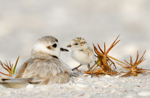
The Snowy Plover is a tiny bird that lives on the coast in parts of California and elsewhere. It is so small that it is vulnerable to many predators and to people and dogs that don't look where they are stepping when they go to the beach. It is considered endangered in many parts of the US.
The data are about the eggs and newly-hatched chicks of the Snowy Plover. Here's a parent bird and some eggs.
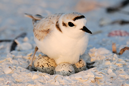
The data were collected at the Point Reyes National Seashore by a former student at Berkeley. The goal was to see how the size of an egg could be used to predict the weight of the resulting chick. The bigger the newly-hatched chick, the more likely it is to survive.
Each row of the data frame below corresponds to one Snowy Plover egg and the resulting chick. Note how tiny the bird is:
- Egg Length and Egg Breadth (widest diameter) are measured in millimeters
- Egg Weight and Bird Weight are measured in grams; for comparison, a standard paper clip weighs about one gram
eggs = pd.read_csv('data/snowy_plover.csv.gz')
eggs.head()
| egg_weight | egg_length | egg_breadth | bird_weight | |
|---|---|---|---|---|
| 0 | 7.4 | 28.80 | 21.84 | 5.2 |
| 1 | 7.7 | 29.04 | 22.45 | 5.4 |
| 2 | 7.9 | 29.36 | 22.48 | 5.6 |
| 3 | 7.5 | 30.10 | 21.71 | 5.3 |
| 4 | 8.3 | 30.17 | 22.75 | 5.9 |
eggs.shape
(44, 4)
For a particular egg, $x$ is the vector of length, breadth, and weight. The model is
$$ f_\theta(x) ~ = ~ \theta_0 + \theta_1\text{egg\_length} + \theta_2\text{egg\_breadth} + \theta_3\text{egg\_weight} + \epsilon $$
- For each $i$, the parameter $\theta_i$ is a fixed number but it is unobservable. We can only estimate it.
- The random error $\epsilon$ is also unobservable, but it is assumed to have expectation 0 and be independent and identically distributed across eggs.
y = eggs["bird_weight"]
X = eggs[["egg_weight", "egg_length", "egg_breadth"]]
model = lm.LinearRegression(fit_intercept=True).fit(X, y)
display(pd.DataFrame(
[model.intercept_] + list(model.coef_),
columns=['theta_hat'],
index=['intercept', 'egg_weight', 'egg_length', 'egg_breadth']))
all_features_rmse = np.mean((y - model.predict(X)) ** 2)
print("RMSE", all_features_rmse)
| theta_hat | |
|---|---|
| intercept | -4.605670 |
| egg_weight | 0.431229 |
| egg_length | 0.066570 |
| egg_breadth | 0.215914 |
RMSE 0.045470853802757616
Let's try bootstrapping the sample to obtain a 95% confidence intervals for all the parameters.
def all_thetas(sample):
# first feature
model = lm.LinearRegression().fit(
sample[["egg_weight", "egg_length", "egg_breadth"]],
sample["bird_weight"])
return [model.intercept_] + model.coef_.tolist()
bs_thetas = pd.DataFrame(
bootstrap(eggs, all_thetas, 10_000),
columns=['intercept', 'egg_weight', 'egg_length', 'egg_breadth'])
bs_thetas
Bootstrapping: 0%| | 0/10000 [00:00<?, ?it/s]
Computing the confidence intervals for all the coefficients we get:
cis = (bs_thetas
.apply(bootstrap_ci).T
.rename(columns={0: 'lower', 1: 'upper'}))
cis
def visualize_coeffs(bs_thetas, rows, cols):
cis = (bs_thetas
.apply(bootstrap_ci).T
.rename(columns={0: 'lower', 1: 'upper'}))
display(cis)
from plotly.subplots import make_subplots
fig = make_subplots(rows=rows, cols=cols, subplot_titles=cis.index)
for i, coeff_name in enumerate(cis.index):
c = (i % cols) + 1
r = (i // cols) + 1
fig.add_histogram(x=bs_thetas[coeff_name], name=coeff_name,
row=r, col=c, histnorm='probability')
fig.add_vline(x=0, row=r, col=c)
fig.add_vline(x=cis.loc[coeff_name, 'lower'], line=ci_line_style,
row=r, col=c)
fig.add_vline(x=cis.loc[coeff_name, 'upper'], line=ci_line_style,
row=r, col=c)
return fig
visualize_coeffs(bs_thetas, 2, 2)
Because all the confidence intervals contain 0 we cannot reject the null hypothesis for any of them. Does this mean that all the parameters could be zero?
Inspecting the Relationship between Features
To see what's going on, we'll make a scatter plot matrix for the data.
px.scatter_matrix(eggs, width=600, height=600)
This shows that bird_weight
is highly correlated with all the other
variables (the bottom row), which means fitting a linear model is a good idea.
But we also see that egg_weight is highly correlated with all the variables
(the top row).
This means we can't increase one covariate while
keeping the others constant. The individual slopes have no meaning.
Here's the correlations showing this more succinctly:
px.imshow(eggs.corr().round(2), text_auto=True, width=600)
Bonus: We can also look at the singular values of our $X$ matrix. Notice that there is one dominant singular values and the remaining singular values are very small. This suggests that our feature matrix is roughly rank 1.
U, s, Vt = np.linalg.svd(eggs[['egg_weight', 'egg_length', 'egg_breadth']])
px.line(s)
Changing Our Modeling Features
One way to fix this is to fit a model that only uses egg_weight.
This model performs almost as well as the model that uses all three variables,
and the confidence interval for $\theta_1$ doesn't
contain zero.
px.scatter(eggs, x='egg_weight', y='bird_weight', trendline='ols', width=800)
y = eggs["bird_weight"]
X = eggs[["egg_weight"]]
model = lm.LinearRegression(fit_intercept=True).fit(X, y)
display(pd.DataFrame([model.intercept_] + list(model.coef_),
columns=['theta_hat'],
index=['intercept', 'egg_weight']))
print("All Features RMSE", all_features_rmse)
print("RMSE", np.mean((y - model.predict(X)) ** 2))
def egg_weight_coeff(sample):
# first feature
model = lm.LinearRegression().fit(
sample[["egg_weight"]],
sample["bird_weight"])
return [model.intercept_] + model.coef_.tolist()
bs_thetas_egg_weight = pd.DataFrame(
bootstrap(eggs, egg_weight_coeff, 10_000),
columns=['intercept', 'egg_weight'])
bs_thetas_egg_weight
visualize_coeffs(bs_thetas_egg_weight, 1, 2)
It's no surprise that if you want to predict the weight of the newly-hatched chick, using the weight of the egg is your best move.
As this example shows, checking for collinearity is important for inference. When we fit a model on highly correlated variables, we might not be able to use confidence intervals to conclude that variables are related to the prediction.