%matplotlib inline
import matplotlib.pyplot as plt
import seaborn as sns
import numpy as np
sns.set_context("talk")
Numpy Array
import numpy as np
As you learned in homework one the np.array is the key data structure in numpy for dense arrays of data.
- From a list
np.array([[1.,2.], [3.,4.]])
np.array([["A", "matrix"], ["of", "words."]])
- All zeros (what shape?)
np.zeros(5)
- All ones
np.ones([3,2])
np.eye(4)
- From a range:
np.arange(0, 10, 2)
np.linspace(0, 5, 10)
np.arange(np.datetime64('2016-12-31'), np.datetime64('2017-02-01'))
Learn more about working with datetime objects.
- A random array (more on randomness later)
np.random.randn(3,2)
np.random.permutation(10)
Shape
A = np.array([[1.,2., 3.], [4.,5., 6.]])
print(A)
A.shape
Type
A.dtype
np.arange(1,5).dtype
(np.arange(1,5) > 3).dtype
np.array(["Hello", "World!"]).dtype
and we can change the type of an array:
np.array([1,2,3]).astype(float)
np.array(["1","2","3"]).astype(int)
Learn more about numpy array types
Is the following valid?
A = np.array([[1, 2, 3], [4, 5], [6]])
A
What happened?
A.shape
print(A.dtype)
print(A[0])
print(A[1])
print(A[2])

Jagged arrays can be problematic:
- Difficult to index
A[0,1]
> Error
A[0][1]
> 2
- Difficult to extract columns.
Some solutions
pd.Series(A).apply(lambda x: pd.Series(x))
np.vectorize(lambda x: x[0])(A)
Often you will need to reshape matrices. Suppose you have the following array:
np.arange(1,13)
What will the following produce:
np.arange(1,13).reshape(4,3)
Option A:
array([[ 1,  2,  3],
       [ 4,  5,  6],
       [ 7,  8,  9],
       [10, 11, 12]])
Option B:
array([[ 1,  5,  9],
       [ 2,  6, 10],
       [ 3,  7, 11],
       [ 4,  8, 12]])
Solution
A = np.arange(1,13).reshape(4,3)
A
- You can also flatten a matrix
A.flatten()
Advanced: Array representation
Numpy stores data contiguously in memory
A.data.tobytes()
Numpy stores matrices in row-major order (by rows)
print(np.arange(1,13).reshape(4,3, order='C'))
print()
print(np.arange(1,13).reshape(4,3, order='F'))
What does the `'F'` mean?
**F**ortran ordering. In BLAS libraries are specified for Fortran and C programming languages which differ both in the column (Fortran) or row (C) indexing.
Slicing
From homework 1 you should already be pretty good at Slicing so let's test your slicing knowledge.
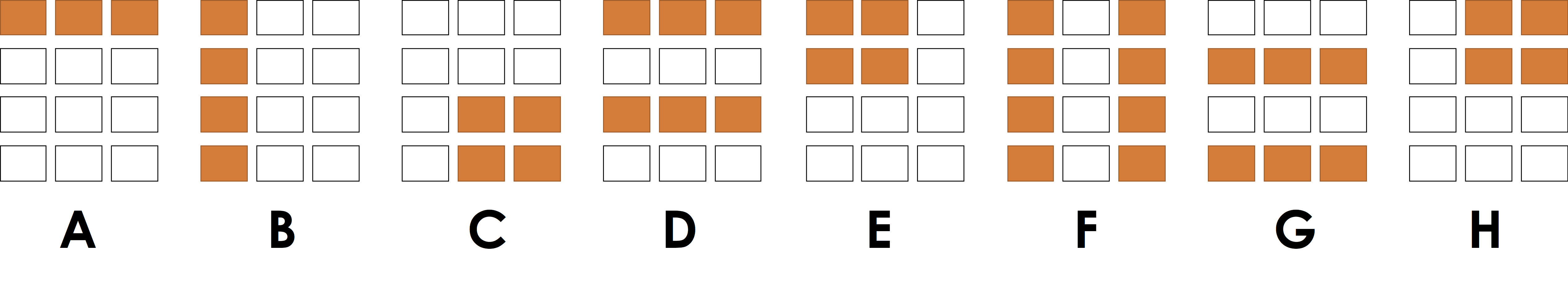
- Program 1:
x[:, 0]
**Answer**
B
- Program 2:
x[0, :]
**Answer**
A
- Program 3:
x[:2, 1:]
**Answer**
H
- Program 4:
x[0::2, :]
**Answer**
D
The last program was a bit tricky:
begin:end:stride
Modifying a Slice
Suppose I wanted to make all entries in my matrix 0 in the top right corner as in (H) above.
A = np.arange(1,13).reshape(4,3)
print("Before:\n", A)
A[:2, 1:] = 0
print("After:\n", A)
We can apply boolean operations to arrays. This is essential when trying to select and modify individual elements.
Question: Given the following definition of A:
[[   1.    2.    3.]
 [   4.    5. -999.]
 [   7.    8.    9.]
 [  10. -999. -999.]]
what will the following output:
A > 3
- Option A:
False
- Option B:
array([[False, False, False],
       [ True,  True, False],
       [ True,  True,  True],
       [ True, False, False]], dtype=bool)
A = np.array([[  1.,   2.,   3.],
       [  4.,   5.,   -999.0],
       [  7.,   8.,   9.],
       [ 10.,  -999.0,  -999.0]])

A > 3.
Question: What will the following output
A = np.array([[   1.,    2.,    3.],
       [   4.,    5., -999.],
       [   7.,    8.,    9.],
       [  10., -999., -999.]])

A[A > 3]
- Option A:
array([ 4, 7, 10, 5, 8, 11, 6, 9, 12])
- Option B:
array([ 4., 5., 7., 8., 9., 10.])
- Option C:
array([[  nan,   nan,  nan],
       [  4.,    5.,   nan],
       [  7.,    8.,   9.],
       [ 10.,    nan,  nan]])
A = np.array([[  1.,   2.,   3.],
       [  4.,   5.,   -999.0],
       [  7.,   8.,   9.],
       [ 10.,  -999.0,  -999.0]])

A[A > 3]
Question: Why is the answer not two dimensional?
The -999.0 numbers seem like a place holder. Replace them with np.nan.
array([[   1.,    2.,    3.],
       [   4.,    5., -999.],
       [   7.,    8.,    9.],
       [  10., -999., -999.]])
Solution
A = np.array([[  1.,   2.,   3.],
       [  4.,   5.,   -999.0],
       [  7.,   8.,   9.],
       [ 10.,  -999.0,  -999.0]])
Construct a boolean array that indicates where the value is 999.0:
ind = (A == -999.0)
print(ind)
Assign 0.0 to all the True entires:
A[ind] = np.nan
A
np.mean(A)
Perhaps instead we want:
np.nanmean(A)
Some random made-up data
names = np.array(["Joey", "Henry", "Joseph",
                  "Jim", "Sam", "Deb", "Mike",
                  "Bin", "Joe", "Andrew", "Bob"])

favorite_number = np.arange(len(names))

staff = ["Joey", "Bin", "Deb", "Joe", "Sam", "Henry", "Andrew", "Joseph"]
What is sum of the staff's favorite numbers:
Solution
Determine which people are staff using the np.in1d function
is_staff = np.in1d(names, staff)
is_staff
Boolean indexing
favorite_number[is_staff].sum()
What does the following expression compute:
starts_with_j = np.char.startswith(names, "J")
starts_with_j[is_staff].mean()
**Solution**
The fraction of the staff have names that begin with `J`?
starts_with_j = np.char.startswith(names, "J")
starts_with_j[is_staff].mean()
What does it mean to take the mean of an array of booleans?
The values `True` and `False` correspond to the integers `1` and `0` and are treated as such in mathematical expressions (e.g., `mean()`, `sum()`, as well as linear algebraic operations).
What does the following expression compute:
favorite_number[starts_with_j & is_staff].sum()
**Solution**
What is the sum of the favorite numbers of staff starting with `J`
favorite_number[starts_with_j & is_staff].sum()
data = np.random.rand(1000000)
Consider the following two programs.
- What do they do?
- Which one is faster?
%%timeit
s = 0
for x in data:
    if x > 0.5:
        s += x
result = s/len(data)
%%timeit
result = data[data > 0.5].mean()
Important Points
Using the array abstractions instead of looping can often be:
- Clearer
- Faster
These are fundamental goals of abstraction.
Numpy arrays support standard mathematical operations
A = np.arange(1., 13.).reshape(4,3)
print(A)
A * 0.5 + 3
notice that operations are element wise.
A.T
A.sum()
Be Careful with Floating Point Numbers
What is the value of the following: $$ A - \exp \left( \log \left( A \right) \right) $$
Solution:
A = np.arange(1., 13.).reshape(4,3)
print(A)

(A - np.exp(np.log(A)))
**What happened?!**
Floating point precision is not perfect and we are applying transcendental functions.0.1 + 0.2 == 0.3
print(0.1 + 0.2)
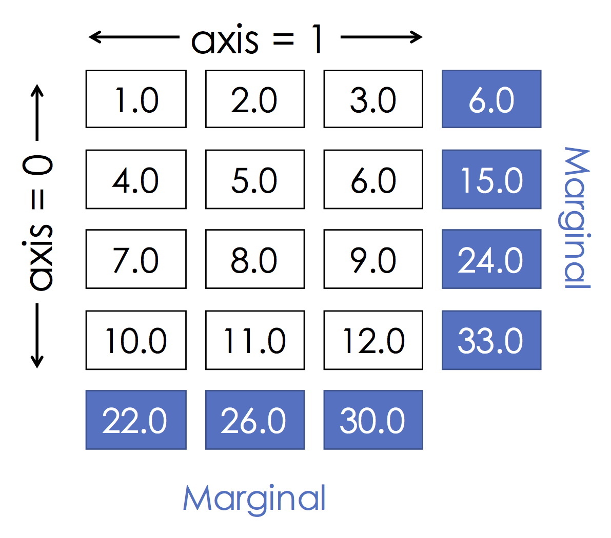
Grouping by row:
A.sum(axis=0)
This is the same as:
[r,c] = A.shape

s = np.zeros(c)
for i in range(r):
    s += A[i,:]

print(s)
Grouping by col:
A.sum(axis=1)
This is the same as:
[r,c] = A.shape

s = np.zeros(r)
for i in range(c):
    s += A[:,i]

print(s)
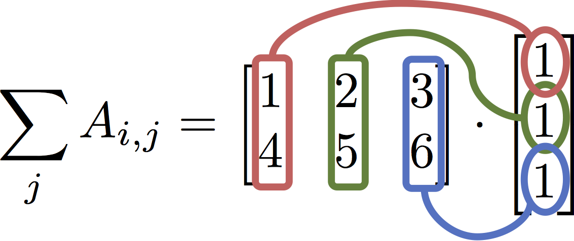
$$ \texttt{A.sum(axis=1)} = \sum_j A_{i,j} = \begin{bmatrix} 1 & 2 & 3 \\ 4 & 5 & 6\end{bmatrix} \cdot \begin{bmatrix} 1 \\ 1 \\ 1\end{bmatrix} $$
b = np.ones(3)
A * b
Explanation:
We ended up computing an element-wise product. The vector of ones was replicated once for each row and then used to scale the entire row.
The correct expression for matrix multiplication
A.dot(b)
Python 3.5 feature:
A @ b
Using the binary infix operator @ is clearer to read.
Suppose you are asked to solve the following system of linear equations:
$$ 5x - 3y = 2 \\ -9x + 2y = -7 $$this means that we want to solve the following linear systems:
$$ \begin{bmatrix} 5 & -3 \\ -9 & 2 \end{bmatrix} \begin{bmatrix} x \\ y \end{bmatrix} = \begin{bmatrix} 2 \\ -7 \end{bmatrix} $$Solving for $x$ and $y$ we get:
$$ \begin{bmatrix} x \\ y \end{bmatrix} = \begin{bmatrix} 5 & -3 \\ -9 & 2 \end{bmatrix}^{-1} \begin{bmatrix} 2 \\ -7 \end{bmatrix} $$This can be solved numerically using NumPy:
A = np.array([[5, -3], [-9, 2]])
b = np.array([2,-7])
from numpy.linalg import inv
inv(A) @ b
Preferred way to solve (more numerically stable)
from numpy.linalg import solve
solve(A, b)
Two points:
- Issue with performance
- Issue with numerical stability
When the matrix is not full rank it may be necessary to use lstsq.
[Skip In Class] Numpy in Higher Dimensions and why blue is a bad color
In homework 1 you had a chance to work with a tensor. Images are tensors:

import scipy.ndimage
image = scipy.ndimage.imread("numpy_project_page.jpg")
image.shape
with sns.axes_style("white"):
    plt.imshow(image)

imageC = image.copy()
imageC[:,:,np.arange(3) != 1] = 0

with sns.axes_style("white"):
    plt.imshow(imageC)

Comparing green and blue information
Extracting the Green and Blue information
green_data = np.floor(image[:,:,1]).astype(image.dtype)

blue_data = np.floor(image[:,:,2]).astype(image.dtype)
plt.figure(figsize=(20,10))
with sns.axes_style("white"):
    plt.subplot(1,2,1)
    plt.title("Green")
    plt.imshow(green_data)
    plt.subplot(1,2,2)
    plt.title("Blue")
    plt.imshow(blue_data)

**Question:** *Why does Blue look so bad?*
The human eye is not very sensitive to the color blue. As a consequence jpeg compression algorithms tend to more aggressively compress the blue dimension.
import pandas as pd
Series
The numpy arrays we have been using contain data of a single type and the location of the data item matters. Often when working with data the location of the data only matters in a relative sense.
Consider the following city population data:
pop = np.array([10.01, 0.84, 8.41, 13.62, np.nan, 0.84, 0.01, 0.01])
city = ["Seoul", "SF", "NYC", "Tokyo", "Typo", "SF", "Mechville", "Zootopia"]
As long as the population and city stay aligned the exact ordering doesn't matter. Furthermore, the data is really a mapping from city name to population. We would like a data structure that couples these two relates pieces of data.
To address this need Pandas introduces the Series object as a fundamental representation of column of data of the same type.
pop_series = pd.Series(pop, index=city, name="Population")
pop_series
We can lookup elements by their value
pop_series["Seoul"]
Notice that since SF occurs twice we get a series back:
pop_series["SF"]
Lookup by location (should be avoided, why?)
pop_series.iloc[1:3]
Slicing with predicates
pop_series[pop_series > 10.]
Important Point!
Notice that slicing a series preserves the index and the name.
- This is a big improvement over numpy where the meaning of the data is lost when the location changes.
However if you insist you can still access the underlying numpy arrays
pop_series.values
pop_series.index
We can apply mathematical operations to the series:
np.log(pop_series + 1.0)
pop_series.notnull()
pop_series.dropna()
pop_series.drop_duplicates()
Note that drop duplicates is by value not by key
pop_series[~pop_series.index.duplicated(keep="first")]
Perhaps a more clear way to removed duplicates using groupby() which we will return to soon
pop_series.groupby(pop_series.index).first()
Cleaning data in one shot:
pop_series_clean = (pop_series
    .groupby(pop_series.index).first()
    .dropna()
)
pop_series_clean.sort_values(ascending=False)
pop_series_clean.sort_index()
Examining a few elements
pop_series_clean.head(n=3)
Computing statistics
pop_series_clean.describe()
Notice that even the summary is also a Series
pop_series_clean.sort_values(ascending=False).plot.bar()
plt.ylabel('Population in Millions')

pop_series_clean.plot.hist(bins=4)

text_series = pd.Series(["1,one", "2,two", "3,three", "4,four"],
                        name="Numbers")
text_series
Questions?
- What is the index of this series?
- How could I split the numbers into separate series?
There is a collection of routines associated with each series:
1. series.str.split()
2. series.str.len()
3. series.str.strip()
You will use these often so learn about them.
text_series.str.split(pat=",", expand=True)
Consider the following string data for the three lectures Prof. Gonzalez taught (so far...)
date_strings = pd.Series(["01/17/2017", "01/19/2017", "02/07/2017"],
                         index=["lec1", "lec2", "lec7"], name="Dates")
date_strings
We can use the Pandas built-in date-time parsing facilities pd.to_datetime to convert the strings into date objects:
dates = pd.to_datetime(date_strings)
dates
Then use one of the many date time series operations defined here.
dates.dt.dayofweek
Many of the visualizations are pretty basic but can be useful as you are quickly exploring data.
DataFrames are a programming abstraction for Tables that provide a lot of the syntactic functionality we found useful when working with matrices.
Conceptually a DataFrame is a collection of series (columns) with a common index. Let's work through some basic examples.
Making a DataFrame
import pandas as pd
We can make a DataFrame from a dictionary:
baby_names_dictionary = {
    "Name": ["Emma", "Liam", "Noah", "Olivia",  "Sophia"],
    "Sex": ["F", "M", "M", "F", "F"],
    "Count": [20355, 18281, 19511, 19553, 17327]
}
baby_names_dictionary
baby_names = pd.DataFrame(baby_names_dictionary)
baby_names
Does the order of columns matter?
Conceptually no. However we have to be a little careful since Pandas allows us to index columns by their location (avoid doing this).Does the order of row matter?
Conceptually no. However we have to be a little careful since Pandas allows us to index rows by their location (avoid doing this).Accessing each column (Series)
baby_names['Name']
baby_names[['Name', 'Sex']]
Default Index?
What is the default index?
baby_names.index
Since we never specified the index, a default index was created which numbers each of the rows. We can access each row using this default index:
baby_names.loc[[1,3]]
Setting an Index
baby_names = baby_names.set_index(['Name', 'Sex'])
baby_names
baby_names.loc[[("Liam", "M"), ("Noah", "M")]]
We can download baby names collected by the social security office.
%%bash
wget https://www.ssa.gov/oact/babynames/state/namesbystate.zip
unzip namesbystate.zip
!ls *.TXT
!head CA.TXT
**Data cleaning question:** _What is the format of this file?_
Comma separated values (CSV)baby_names = pd.read_csv("CA.TXT")
baby_names.head()
What went wrong?
No header provided in the file so first record was treated as a header.column_names = ["State", "Sex", "Year", "Name", "Count"]
baby_names = pd.read_csv("CA.TXT", names = column_names)
baby_names.head()
Looks Good!
For fun let's load the rest of the states (why might we not want to do this?):
import os

file_names = (f for f in os.listdir() if f.endswith(".TXT"))

baby_names = pd.concat(
    (pd.read_csv(f, names = column_names) for f in file_names)
).reset_index(drop=True)
baby_names.head()
How much data do we have?
len(baby_names)
How many total people are counted?
baby_names['Count'].sum()
**Question:** *Is this number reasonable?*
It seems low. However this is what the social security website states:All names are from Social Security card applications for births that occurred in the United States after 1879. Note that many people born before 1937 never applied for a Social Security card, so their names are not included in our data. For others who did apply, our records may not show the place of birth, and again their names are not included in our data. All data are from a 100% sample of our records on Social Security card applications as of the end of February 2016.
There are additional qualifications [here](https://www.ssa.gov/oact/babynames/background.html)
To get a better understanding of how people enrolled in social security you can plot the number of applicants per year.
baby_names.groupby("Year")['Count'].sum().plot()
We will explain the following query in a few minutes but let's quickly take a look at the date distribution of the data.
baby_names.groupby("Year")['Count'].sum().plot()
plt.ylabel('Count')

You can add derived columns by simply assigning to the DataFrame
baby_names['Len'] = baby_names['Name'].str.len()
baby_names.head()
Notice the .str.len() above? There is a large collection of string operations you can apply to series containing strings.
Computing the last letter
baby_names['Last Letter'] = baby_names['Name'].str[-1].str.lower()
baby_names.head()
Zoom in on the data for California in 2015.
ca2015 = baby_names[
    (baby_names['Year'] == 2015) &
    (baby_names['State'] == "CA")
]

len(ca2015)
ca2015.head()
- Notice that we retained the index from the original table.
How popular is the name Joey this year?
ca2015[ca2015["Name"] == "Joey"]
We will often want to compute data at a more coarse granularity by aggregating over all records that share a common set of attributes. This process is called grouping. In the following we will explore a few grouping operations. To get an intuition behind grouping consider the following figure:

gender_counts = baby_names.groupby("Sex")[["Count"]].sum()
gender_counts.head()
Notice that the groupby operations produces a table that is indexed (keyed) by the group attribute (in this case Sex).
name_counts = baby_names.groupby('Name')[['Count']].sum()
name_counts.head()
Visualizing the most popular names
(
name_counts['Count']
    .sort_values(ascending=False)
    .head(20)
    .sort_values()
    .plot.barh()
)

name_counts = baby_names.groupby(['Sex','Name'])['Count'].sum()

plt.subplot(2,1,1)
(name_counts
     .loc['F']
     .sort_values(ascending=False)
     .head(15)
     .sort_values()
     .plot.barh()
)
plt.ylabel('Female Names')
plt.xlim(0, name_counts.max())
plt.subplot(2,1,2)
(name_counts
     .loc['M']
     .sort_values(ascending=False)
     .head(15)
     .sort_values()
     .plot.barh()
)
plt.ylabel('Male Names')
plt.xlim(0, name_counts.max())

**Question:** What is going on here?
Males seem to be concentrated around Judeo-Christian names while females appear to be more diverse.
unique_names = baby_names.groupby('Sex')['Name'].nunique()
unique_names.plot.bar()

What names are most gender neutral?
- What does it mean to be commonly associated with both sexes?
- What computation would I run to compute this value?
Proposals:
- For each name compute $|C_M - C_F|$
- For each name compute $(C_M + C_F)/2$
- For each name compute $\sqrt{C_M * C_F}$
I will focus on more recent dates:
(baby_names[baby_names['Year'] > 2000]
     .groupby(['Name', 'Sex'])['Count'].sum()
     .groupby(level ='Name').prod()
     .sort_values(ascending=False)
     .head(20)
     .sort_values()
     .plot.barh()
)

Notice in the above example it was necessary to use the level argument for the second groupby call. This is because the Name column became an index after the first groupby. If we wanted to avoid this we could do the following:
(baby_names[baby_names['Year'] > 2000]
     .groupby(['Name', 'Sex'], as_index=False)['Count'].sum()
     .groupby('Name').prod()
     .sort_values('Count', ascending=False)
     .head(20)
     .sort_values('Count')
     .plot.barh()
)
Which instructor has the most popular name?
(baby_names.groupby("Name")['Count'].sum()
     .loc[["Joey", "Joseph", "Bin", "Deborah"]]
     .plot.bar()
)

Pivoting
Supposed we wanted to study the breakdown with respect to the last letter in the names. We might like a table that looks like:
| "M" | "F" | |
|---|---|---|
| "a" | 48576568 | 1560980 |
| "b" | 9286 | 1343336 |
| "c" | 17077 | 1545079 |
We can build such a table by Pivoting. Pivoting will take the unique values in a column (e.g., Sex: {M, F}) and make those into separate columns. Then we can choose a column (or set of columns) to groupby (e.g., Last Letter : {a, b, ...}) and finally a column for which we want to compute the total (e.g., Count). In essence pivoting is just like groupby except we can choose two dimension along which to group.
last_letter_pivot = baby_names.pivot_table(
    index=['Last Letter'], # the row index
    columns=['Sex'], # the column values
    values='Count', # the field(s) to processed in each group
    aggfunc='sum', # group operation
    margins=True # show margins `All`
)
last_letter_pivot
We can use the built-in plotting functionality in Pandas to visualize this data quickly:
(
    last_letter_pivot
    .plot.bar()
)
plt.ylabel("Count")

# normalize the counts
normalized_ll_pivot = (
    last_letter_pivot.div(last_letter_pivot.sum(axis=1), axis=0)
)


pink_blue = ["#E188DB", "#334FFF"]
with sns.color_palette(sns.color_palette(pink_blue)):
    (normalized_ll_pivot
         .sort_values("F",ascending=False) # Sort the plot
         .plot.bar()
    )
    plt.ylabel('Proportion')

**Question:** *How might you use this information to predict `Sex` from name?*
There are certain letters that appear to be disproportionately associated with the `Sex` of the baby.Suppose I wanted to compute a pivot table which looked like:
Name  Andrew     Sam
Year
1910   845.0   847.0
1911  1066.0   895.0
1912  1922.0  1295.0
1913  2204.0  1518.0
1914  2957.0  1856.0
...
containing the total number of babies each year with a given name.
Let's fill in the following query
(
baby_names
     .pivot_table(
         index = ???,
         columns = ???,
         values = ???,
         aggfunc = ???)
     .loc[:, ['Andrew', 'Sam']].head()
)
Answer
Suppose we want to track the popularity of the Staff names over time?
staff = ["Andrew", "Sam", "Bin", "Deborah", "Joseph", "Joey"]
(baby_names
     .pivot_table(index=['Year'], columns=['Name'], values='Count', aggfunc='sum')
     .loc[:, staff].head()
)
Some names don't occur on some years. What should I do about the NaN values?
staff_pivot = (
    baby_names
    .pivot_table(
        index=['Year'], columns=['Name'], values='Count', aggfunc='sum')
    .loc[:,staff]
    ## Replace the NaN Values with 0.0
    .fillna(0.0)
)
staff_pivot.head()
staff_pivot.plot(marker='.')
plt.ylabel("Count")

What if we wanted to compute the proportion relative to the total names reported that year?
yearly_total = baby_names.groupby('Year')['Count'].sum()

# use the apply function to divide each year by the yearly total
staff_pivot.div(yearly_total, axis=0).plot(marker='.')
plt.ylabel("Proportion of Names")

Joining
Comparing popularity across two time periods
Suppose I want to compare the popularity of names from the 80s with names after 2K. Let's look at one way to accomplish this comparison using joins.
- Compute the total counts of each name during the 80s and >2K
- Join these names back together to get a table that looks like:
      Count80s  Count2ks
Name
Aakash        5.0     179.0
Aaliyah      36.0   64972.0
Aarika       44.0      14.0
Aarin         5.0      41.0
Aaron    139165.0  121726.0
Build groups
name80s = (
    baby_names[(baby_names['Year'] >= 1980) & (baby_names['Year'] < 1990)]
        .groupby("Name", as_index=False)[['Count']].sum()
)

name80s.head()
name2ks = (
    baby_names[baby_names['Year'] > 2000]
        .groupby("Name", as_index=False)[['Count']].sum()
)

name2ks.head()
Join tables (columns) together
joined_names = name80s.merge(name2ks,
                             on="Name", # What column to use when matching rows
                             suffixes=("_80s", "_2ks"))
joined_names.head()
How many rows did I get?
How many rows are in my input
print("80s Names:", len(name80s))
print("2Ks Names:", len(name2ks))
Answer:
print("Joined Names:", len(joined_names))
What happened?
We only obtained rows that had a name in both tables. This is because the default join behavior is what is called an inner join. We will study different kinds of joins in much more detail next week. However for our purposes here we will want an outer join:
joined_names = name80s.merge(name2ks,
how="outer", # Include rows from both tables with missing values as NaN
on="Name",
suffixes=("_80s", "_2ks"))
joined_names = joined_names.set_index("Name")
joined_names.head(10)
Notice now that we have more rows than before:
80s Names: 11365
2Ks Names: 19167
Inner Join: 7634len(joined_names)
Fun Visualization [Skip code in class]
Read the code at home.
# compute the relative popularity of the name in that period
normalized = joined_names.div(joined_names.sum(axis=0), axis=1)

# Compute the change in popularity
deltaprop = normalized['Count_2ks'] - normalized['Count_80s']

pd.concat([
    deltaprop.sort_values(ascending=False).head(15),
    deltaprop.sort_values().head(10).sort_values(ascending=False)]
    ).plot.bar()

plt.ylabel("Change in Proportion")

Visualization with Seaborn and Matplotlib
So far we already made some plots using:
- the Pandas built-in plotting tools that call
- the Matplotlib python plotting library
Some important things to note from MatplotLib:
import matplotlib.pyplot as plt

plt.xlabel("The x-axis (horizontal) label value")
plt.xlabel("The y-axis (vertical) label value")
plt.title("The title of the plot")
plt.axvline(x=1.42, ymin=0, ymax=3.14, linewidth=2, color='r')
plt.legend(["Line1", "Line2"])
plt.savefig("amazing_plot.pdf")
Mastering all of matplotlib is difficult. I routinely have to lookup basic operations. Fortunately, there are plenty of forums and tutorial on using matplotlib.
Seaborn
Seaborn can the thought of as a wrapper over Matplotlib which:
- Makes standard plots more visually appealing using color and design
- Automates certain complex statistical visualizations
import seaborn as sns
# There is a bug in stats model ...
import warnings
warnings.filterwarnings('ignore',module="statsmodels")
Make some fake data
x = pd.Series(
    np.hstack([np.random.normal(size=100), 2.5 + 0.5 * np.random.normal(size=100)]),
    name="Random Data"
)
x.head()
sns.distplot(x, bins=50, rug=True)

Observe
- Subtle background histogram
- Rug plot at bottom
- Kernel density estimator (smoothed approximation to histogram)
- x-label automatically pulled from Series Name
Plotting Joint distributions with Joint plot
Often we will want to plot two related variables to understand their joint density. Seaborn provides utilities to
- simultaneously visualize the margin and joint distributions
- compute various joint density estimators
Here we generate some synthetic data
mean, cov = np.ones(2), np.array([(1, .5), (.5, 1)])
data = np.vstack([
    np.random.multivariate_normal(mean, cov, 700),
    np.random.multivariate_normal(-2.0 * mean, 0.5 * np.eye(2), 500)])
df = pd.DataFrame(data, columns=["x", "y"])
sns.jointplot(x="x", # x dimension column name
              y="y", # y dimension column name
              data=df, # dataframe
              marker='.', # type of marker to use
              joint_kws={'alpha':0.3} # additional plotting characteristics
             )

We can apply various density estimators:
sns.jointplot(x="x", y="y", data=df, kind='hex')

sns.jointplot(x="x", y="y", data=df, kind='kde')

Plotting Linear Relationships
The lmplot and related regplot provide visualizations for linear relationships. In addition to constructing scatter plots lmplot also automatically:
- estimates linear models for the data
- computes Bootstrap confidence intervals for the linear model
- simplifies plotting additional dimensions by color and subplots
- computes per dimension density estimates
Loading a data collected by a waiter reporting tips and characteristics of the customer who paid.
tips = sns.load_dataset("tips")
tips.head()
We can lmplot to plot linear relationships
sns.lmplot(data=tips, x="total_bill", y="tip", size=6, aspect=1.3)

Linear Model + CI
Notice that the plotting library automatically computes a linear estimator and even runs the Bootstrap algorithm to estimate the confidence interval of the linear model.
We can add additional dimensions
In the following we segment (i.e., Groupby) the smoker dimension to create a sequence of lines, one for each value, in the grouping dimension (in this case Smoker = Yes/No). This is done by associating the Smoker column with the hue graphic property.
sns.lmplot(data=tips, x="total_bill", y="tip", # Data configuration
           hue='smoker', # Associate color with Smoker column
           markers=["o", "x"], # Define the Marker type
           size=6, aspect=1.3) # extra plot size information

This suggests that non-smokers are better tipper
Adding another dimension (Day)
Plotting too many plots in the same figure can be difficult to read.
sns.lmplot(data=tips, x="total_bill", y="tip",
           hue='day',
           size=6)

Alternatively we can segment the plot by setting the col equal to "day".
sns.lmplot(data=tips, x="total_bill", y="tip",
           col='day',
           col_wrap=2,
           size=6)

We can also ask the joint plot to compute a regression model.
sns.jointplot(x="total_bill", y="tip", data=tips,
              kind="reg", # Set the figure size
              size=6)

boxplot
Seaborn renders boxplots using the same hue arguments as before.
Here we examine the relative tip proportion broken down by day of the week and sex.
# compute an addition column corresponding to the trip proportion
tips['tipprop'] = tips["tip"]/tips["total_bill"]
tips.head()
sns.boxplot(x="day", y="tipprop", data=tips,
            hue="sex")

violinplot
The violin plot is lot like the box plot but with a continuous density estimator
sns.violinplot(x="day", y="tipprop", data=tips,
    hue="sex")

Additional options for Violin Plot
The Violin plot takes several additional options that can further improve our ability to relate the two datasets and visualize the raw data.
sns.violinplot(x="day", y="tipprop", data=tips,
    hue="sex",
    split=True, # Place the two variables side by side
    inner="stick", # show a "rug" plot along each side (also try quartile)
    palette="Set2" # a Lighter color palette
  )

The Bar Plot is like the standard matplotlib bar plot except that if there are multiple observations with the same X value than the average is plotted along with a bootstrap confidence interval.
titanic = sns.load_dataset("titanic")
titanic.head()
Plotting the titanic data by gender and class to visualize the mean survival.
sns.barplot(x="sex", y="survived", hue="class", data=titanic)
