import numpy as np
import pandas as pd
import matplotlib.pyplot as plt
import seaborn as sns
sns.set_context("talk")
%matplotlib inline
import plotly.offline as py
py.init_notebook_mode(connected=False)

from IPython.core.display import display, HTML
# The polling here is to ensure that plotly.js has already been loaded before
# setting display alignment in order to avoid a race condition.
display(HTML(
    '<script>'
        'var waitForPlotly = setInterval( function() {'
            'if( typeof(window.Plotly) !== "undefined" ){'
                'MathJax.Hub.Config({ SVG: { font: "STIX-Web" }, displayAlign: "center" });'
                'MathJax.Hub.Queue(["setRenderer", MathJax.Hub, "SVG"]);'
                'clearInterval(waitForPlotly);'
            '}}, 5000 );'
    '</script>'
))
import plotly.graph_objs as go
import plotly.figure_factory as ff
import cufflinks as cf

cf.set_config_file(offline=False, world_readable=True, theme='ggplot')
Non-linear Relationships
For this exercise we are going to use synthetic data to illustrate the basic ideas of model design. Notice here that we are generating data from a linear model with Gaussian noise.
train_data = pd.read_csv("data/toy_training_data.csv")
train_data.head()
# Visualize the data ---------------------
train_points = go.Scatter(name = "Training Data",
                          x = train_data['X'], y = train_data['Y'],
                          mode = 'markers')
# layout = go.Layout(autosize=False, width=800, height=600)
py.iplot(go.Figure(data=[train_points]),
         filename="L19_b_p1")
Is this data linear?
How would you describe this data?
- Is there a linear relationship between $X$ and $Y$?
- Are there other patterns?
- How noisy is the data?
- Do we see obvious outliers?
The relationship between X and Y does appear to have some linear trend but there also appears to be other patterns in the relationship?
However, in this lecture we will show that linear models can still be used to model this data very effectively.
Yes! Let's see how.
What does it mean to be a linear model
Let's return to what it means to be a linear model:
$$\large f_\theta(x) = x^T \theta = \sum_{j=1}^p x_j \theta_j $$In what sense is the above model linear?
- Linear in the features $x$?
- Linear in the parameters $\theta$?
- Linear in both at the same time?
Yes, Yes, and No. If we look at just the features or just the parameters the model is linear. However, if we look at both at the same time it is not. Why?
Feature Functions
Consider the following alternative model formulation:
$$\large f_\theta\left( \phi(x) \right) = \phi(x)^T \theta = \sum_{j=1}^{k} \phi(x)_j \theta_j $$where $\phi_j$ is an arbitrary function from $x\in \mathbb{R}^p$ to $\phi(x)_j \in \mathbb{R}$ and we define $k$ of these functions. We often refer to these functions $\phi_j$ as feature functions or basis functions and their design plays a critical role in both how we capture prior knowledge and our ability to fit complicated data.
The Transformed Covariate Matrix
As a consequence, while the model $f_\theta\left( \phi(x) \right)$ is no longer linear in $x$ it is still a linear model because it is linear in $\theta$. This means we can continue to use the normal equations to compute the optimal parameters.
To apply the normal equations we define the transformed feature matrix:
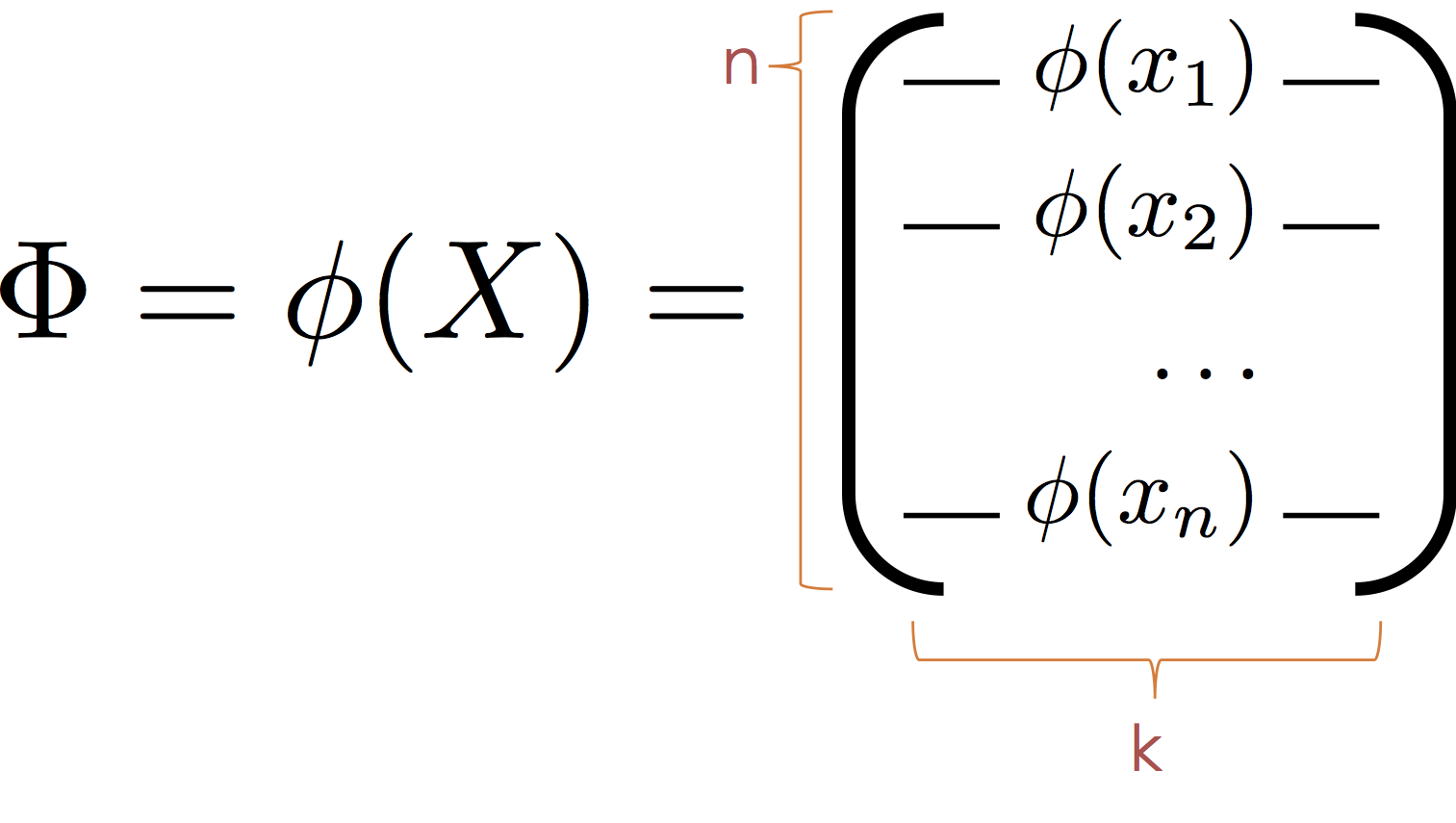
Then substituting $\Phi$ for $X$ we obtain the normal equation:
$$ \large \hat{\theta} = \left( \Phi^T \Phi \right)^{-1} \Phi^T Y $$It is worth noting that the model is also linear in $\phi$ and that the $\phi_j$ form a new basis (hence the term basis functions) in which the data live. As a consequence we can think of $\phi$ as mapping the data into a new (often higher dimensional space) in which the relationship between $y$ and $\phi(x)$ is defined by a hyperplane.
Transforming the Toy Data
In our toy data set we observed a cyclic pattern. Here we construct a $\phi$ to capture the cyclic nature of our data and visualize the corresponding hyperplane.
In the following cell we define a function $\phi$ that maps $x\in \mathbb{R}$ to the vector $[x,\sin(x)] \in \mathbb{R}^2$
$$ \large \phi(x) = [x, \sin(x)] $$Why not:
$$ \large \phi(x) = [x, \sin(\theta_3 x + \theta_4)] $$This would no longer be linear $\theta$. However, in practice we might want to consider a range of $\sin$ basis:
$$ \large \phi_{\alpha,\beta}(x) = \sin(\alpha x + \beta) $$for different values of $\alpha$ and $\beta$. The parameters $\alpha$ and $\beta$ are typically called hyperparameters because (at least in this setting) they are not set automatically through learning.
def sin_phi(x):
    return np.hstack([x, np.sin(x)])
Phi = sin_phi(train_data[["X"]])
Phi[:5]
Fit a Linear Model on $\Phi$
We can again use the scikit-learn package to fit a linear model on the transformed space.
Fitting the Basic Linear Model
from sklearn import linear_model
basic_reg = linear_model.LinearRegression(fit_intercept=True)
basic_reg.fit(train_data[['X']], train_data['Y'])
Fitting the Transformed Linear Model on $\Phi$
from sklearn import linear_model
sin_reg = linear_model.LinearRegression(fit_intercept=True)
sin_reg.fit(sin_phi(train_data[["X"]]), train_data['Y'])
Making Predictions at Query Locations
X_query = np.linspace(train_data['X'].min()-1, train_data['X'].max() +1, 100)
Y_basic_query = basic_reg.predict(X_query[:, np.newaxis])
Y_sin_query = sin_reg.predict(sin_phi(X_query[:, np.newaxis]))
Visualizing the Fit
# Define the least squares regression line
basic_line = go.Scatter(name = r"Basic Model", x=X_query, y = Y_basic_query)
sin_line = go.Scatter(name = r"Transformed Model", x=X_query, y = Y_sin_query)

# Definethe residual lines segments, a separate line for each
# training point
residual_lines = [
    go.Scatter(x=[x,x], y=[y,yhat],
               mode='lines', showlegend=False,
               line=dict(color='black', width = 0.5))
    for (x, y, yhat) in zip(train_data['X'], train_data['Y'],
                            sin_reg.predict(sin_phi(train_data[["X"]])))
]

# Combine the plot elements
py.iplot([train_points, basic_line, sin_line] + residual_lines)
Linear Model in a Transformed Space
As discussed earlier the model we just constructed, while non-linear in $x$ is actually a linear model in $\phi(x)$ and we can visualize that linear model's structure in higher dimensions.
# Plot the data in higher dimensions
phi3d = go.Scatter3d(name = "Raw Data",
    x = Phi[:,0], y = Phi[:,1], z = train_data['Y'],
    mode = 'markers',
    marker = dict(size=3),
    showlegend=False
)

# Compute the predictin plane
(u,v) = np.meshgrid(np.linspace(-10,10,5), np.linspace(-1,1,5))
coords = np.vstack((u.flatten(),v.flatten())).T
ycoords = sin_reg.predict(coords)
fit_plane = go.Surface(name = "Fitting Hyperplane",
    x = np.reshape(coords[:,0], (5,5)),
    y = np.reshape(coords[:,1], (5,5)),
    z = np.reshape(ycoords, (5,5)),
    opacity = 0.8, cauto = False, showscale = False,
    colorscale = [[0, 'rgb(255,0,0)'], [1, 'rgb(255,0,0)']]
)

# Construct residual lines
Yhat = sin_reg.predict(Phi)
residual_lines = [
    go.Scatter3d(x=[x[0],x[0]], y=[x[1],x[1]], z=[y, yhat],
                 mode='lines', showlegend=False,
                 line=dict(color='black'))
    for (x, y, yhat) in zip(Phi, train_data['Y'], Yhat)
]


# Label the axis and orient the camera
layout = go.Layout(
    height=800,
    scene=go.Scene(
        xaxis=go.XAxis(title='X'),
        yaxis=go.YAxis(title='sin(X)'),
        zaxis=go.ZAxis(title='Y'),
        aspectratio=dict(x=1.,y=1., z=.5),
        camera=dict(eye=dict(x=-1, y=-1, z=0))
    )
)

py.iplot(go.Figure(data=[phi3d, fit_plane] + residual_lines, layout=layout))
Error Estimates
How well are we fitting the data? We can compute the root mean squared error.
def rmse(y, yhat):
    return np.sqrt(np.mean((yhat-y)**2))
basic_rmse = rmse(train_data['Y'], basic_reg.predict(train_data[['X']]))
sin_rmse = rmse(train_data['Y'], sin_reg.predict(sin_phi(train_data[['X']])))
py.iplot(go.Figure(data =[go.Bar(
            x=[r'Basic Regression',
               r'Sine Transformation'],
            y=[basic_rmse, sin_rmse]
            )], layout = go.Layout(title="Loss Comparison",
                           yaxis=dict(title="RMSE"))))
Generic Feature Functions
We will now explore a range of generic feature transformations. However, before we proceed it is worth contrasting two categories of feature functions and their applications.
Interpretable Features: In settings where our goal is to understand the model (e.g., identify important features that predict customer churn) we may want to construct meaningful features based on our understanding of the domain.
Generic Features: However, in other settings where our primary goals is to make accurate predictions we may instead introduce generic feature functions that enable our models to fit and generalize complex relationships.
Gaussian Radial Basis Functions
One of the more widely used generic feature functions are Gaussian radial basis functions. These feature functions take the form:
$$ \phi_{(\lambda, u_1, \ldots, u_k)}(x) = \left[\exp\left( - \frac{\left|\left|x-u_1\right|\right|_2^2}{\lambda} \right), \ldots, \exp\left( - \frac{\left|\left| x-u_k \right|\right|_2^2}{\lambda} \right) \right] $$The hyper-parameters $u_1$ through $u_k$ and $\lambda$ are not optimized with $\theta$ but instead are set externally. In many cases the $u_i$ may correspond to points in the training data. The term $\lambda$ defines the spread of the basis function and determines the "smoothness" of the function $f_\theta(\phi(x))$.
The following is a plot of three radial basis function centered at 2 with different values of $\lambda$.
def gaussian_rbf(u, lam=1):
    return lambda x: np.exp(-(x - u)**2 / lam**2)
tmpX = np.linspace(-2, 6,1000)
py.iplot([
    dict(name=r"$\lambda=0.5$", x=tmpX,
         y=gaussian_rbf(2, lam=0.5)(tmpX)),
    dict(name=r"$\lambda=1$", x=tmpX,
         y=gaussian_rbf(2, lam=1.)(tmpX)),
    dict(name=r"$\lambda=2$", x=tmpX,
         y=gaussian_rbf(2, lam=2.)(tmpX))
])
Develop some helper code
To simplify the following analysis we create two helper functions.
uniform_rbf_phiwhich constructs uniformly spaced RBF functions and each function is a feature that has a large value when the input $x$ is nearby.evaluate_basiswhich takes a feature function configuration and fits a model
def uniform_rbf_phi(x, lam=1, num_basis = 10, minvalue=-9, maxvalue=9):
    return np.hstack([gaussian_rbf(u, lam)(x) for u in np.linspace(minvalue, maxvalue, num_basis)])
tmpXTall = np.linspace(-11, 11,1000)[:,np.newaxis]
py.iplot([
    dict(x=tmpXTall[:,0],
         y=y)
    for y in uniform_rbf_phi(tmpXTall, lam=0.5).T
])
def evaluate_basis(phi, desc):
    # Apply transformation
    Phi = phi(train_data[["X"]])

    # Fit a model
    reg_model = linear_model.LinearRegression(fit_intercept=True)
    reg_model.fit(Phi, train_data['Y'])

    # Create plot line
    X_test = np.linspace(-11, 11, 1000) # Fine grained test X
    Phi_test = phi(X_test[:,np.newaxis])
    Yhat_test = reg_model.predict(Phi_test)
    line = go.Scatter(name = desc, x=X_test, y=Yhat_test)

    # Compute RMSE
    Yhat = reg_model.predict(Phi)
    error = rmse(train_data['Y'], Yhat)

    # return results
    return (line, error, reg_model)
Visualizing 10 RBF features
(rbf_line10, rbf_rmse10, rbf_reg10) = \
    evaluate_basis(lambda x: uniform_rbf_phi(x, lam=1, num_basis=10), r"RBF10")

py.iplot([train_points, rbf_line10, basic_line, sin_line])
Visualizing 50 RBF features (Really Connecting the Dots!)
We are now getting a really good fit to this dataset!!!!
(rbf_line50, rbf_rmse50, rbf_reg50) = \
    evaluate_basis(lambda x: uniform_rbf_phi(x, lam=0.3, num_basis=50), r"RBF50")

fig = go.Figure(data=[train_points, rbf_line50, rbf_line10, sin_line, basic_line ],
                   layout = go.Layout(xaxis=dict(range=[-10,10]),
                                      yaxis=dict(range=[-10,50])))
py.iplot(fig)
Examining the Error
train_bars = go.Bar(
            x=[r'Basic Regression',
               r'Sine Transformation',
               r'RBF 10',
               r'RBF 50'],
            y=[basic_rmse, sin_rmse, rbf_rmse10, rbf_rmse50],
            name="Training Erorr")
py.iplot(go.Figure(data = [train_bars], layout = go.Layout(title="Loss Comparison",
                           yaxis=dict(title="RMSE"))))
Which is the best model?
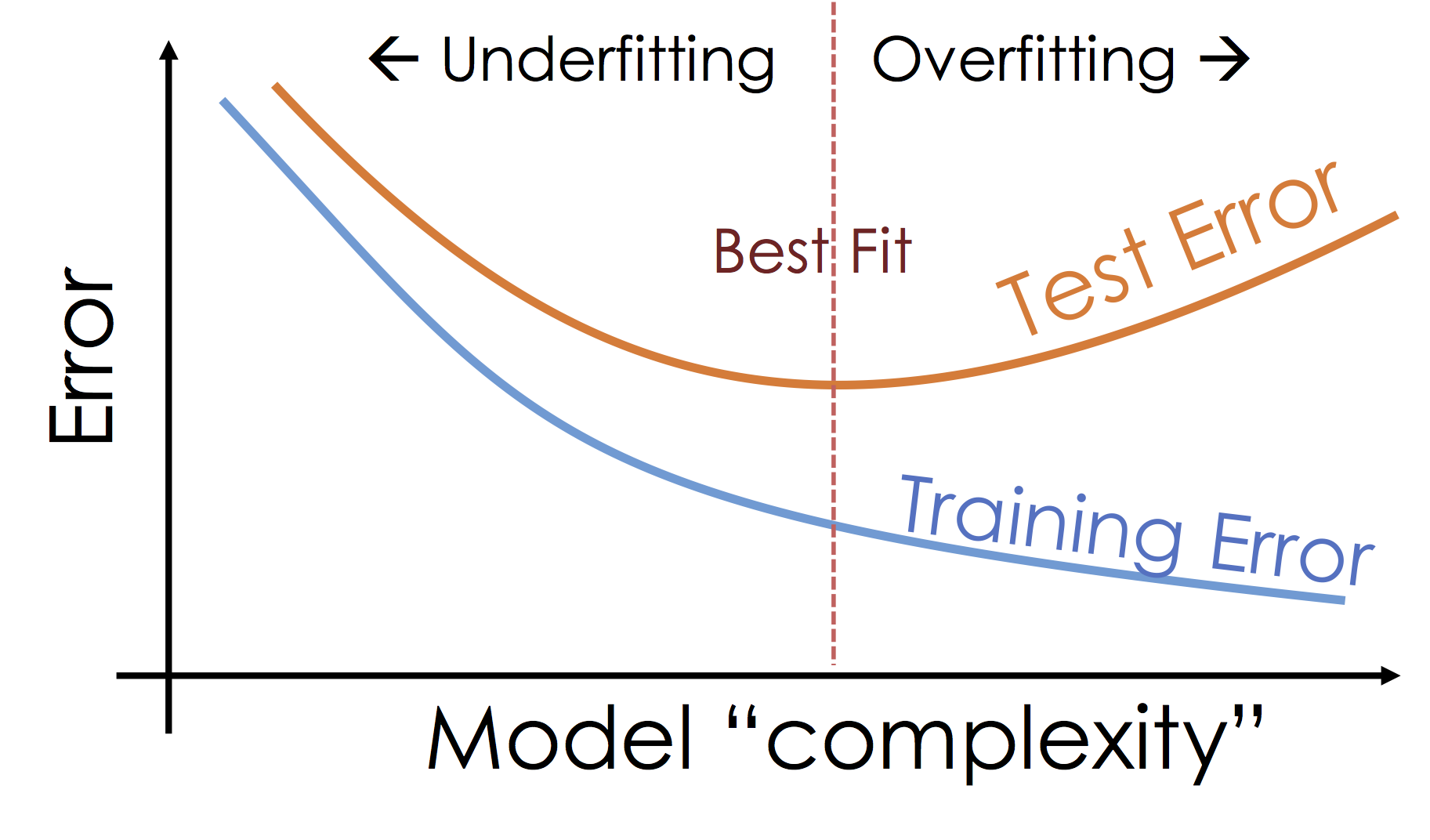
We started with the objective of minimizing the training loss (error). As we increased the model sophistication by adding features we were able to fit increasingly complex functions to the data and reduce the loss. However, is our ultimate goal to minimize training error?
Ideally we would like to minimize the error we make when making new predictions at unseen values of $X$. One way to evaluate that error is use a test dataset which is distinct from the dataset used to train the model. Fortunately, we have such a test dataset.
test_data = pd.read_csv("data/toy_test_data.csv")

test_points = go.Scatter(name = "Test Data", x = test_data['X'], y = test_data['Y'],
                       mode = 'markers', marker=dict(symbol="cross", color="red"))
py.iplot([train_points, test_points])
def test_rmse(phi, reg):
    return rmse(test_data['Y'], reg.predict(phi(test_data[['X']])))
test_bars = go.Bar(
            x=[r'Basic Regression',
               r'Sine Transformation',
               r'RBF 10',
               r'RBF 50'],
            y=[test_rmse(lambda x: x, basic_reg),
               test_rmse(sin_phi, sin_reg),
               test_rmse(lambda x: uniform_rbf_phi(x, lam=1, num_basis=10), rbf_reg10),
               test_rmse(lambda x: uniform_rbf_phi(x, lam=0.3, num_basis=50), rbf_reg50)
              ],
            name="Test Error"
            )
py.iplot(go.Figure(data =[train_bars, test_bars], layout = go.Layout(title="Loss Comparison",
                           yaxis=dict(title="RMSE"))))
What's happening: Over-fitting
As we increase the expressiveness of our model we begin to over-fit to the variability in our training data. That is we are learning patterns that do not generalize beyond our training dataset
Over-fitting is a key challenge in machine learning and statistical inference. At it's core is a fundamental trade-off between bias and variance: the desire to explain the training data and yet be robust to variation in the training data.
We will study the bias-variance trade-off more in the next lecture but for now we will focus on the trade-off between under fitting and over fitting:
Train, Test, and Validation Split
To manage over-fitting it is essential to split your initial training data into a training and testing dataset.
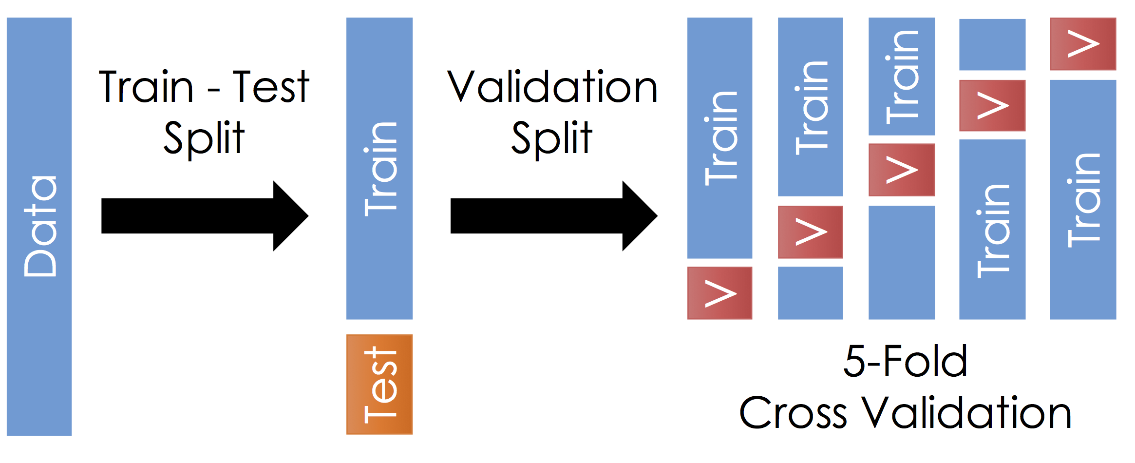
The Train - Test Split
Before running cross validation split the data into train and test subsets (typically a 90-10 split). How should you do this? You want the test data to reflect the prediction goal:
- Random sample of the training data
- Future examples
- Different stratifications
Ask yourself, where will I be using this model and how does that relate to my test data.
Do not look at the test data until after selecting your final model. Also, it is very important to not look at the test data until after selecting your final model. Finally, you should not look at the test data until after selecting your final model.
Cross Validation
With the remaining training data:
- Split the remaining training dataset k-ways as in the Figure above. The figure uses 5-Fold which is standard. You should split the data in the same way you constructed the test set (this is typically randomly)
- For each split train the model on the training fraction and then compute the error (RMSE) on the validation fraction.
- Average the error across each validation fraction to estimate the test error.
Questions:
- What is this accomplishing?
- What are the implication on the choice of $k$?
Answers:
- This is repeatedly simulating the train-test split we did earlier. We repeat this process because it is noisy.
- Larger $k$ means we average our validation error over more instances which makes our estimate of the test error more stable. This typically also means that the validation set is smaller so we have more training data. However, larger $k$ also means we have to train the model more often which gets computational expensive