import numpy as np
import matplotlib.pyplot as plt
import pandas as pd
import seaborn as sns
%matplotlib inline

## Plotly plotting support
# import plotly.plotly as py

import plotly.offline as py
py.init_notebook_mode(connected=True)
import plotly.graph_objs as go
import plotly.figure_factory as ff
import cufflinks as cf

cf.set_config_file(offline=True, world_readable=True, theme='ggplot')
Overview
In this lecture we provide a sample of the various topics covered in DS100. In particular we will discuss key aspects of the data science lifecycle:
- Question/Problem Formulation:
- What do we want to know or what problems are we trying to solve?
- What are our hypotheses?
- What are our metrics of success?
- Data Acquisition and Cleaning:
- What data do we have and what data do we need?
- How will we collect more data?
- How do we organize the data for analysis?
- Exploratory Data Analysis:
- Do we already have relevant data?
- What are the biases, anomalies, or other issues with the data?
- How do we transform the data to enable effective analysis?
- Prediction and Inference:
- What does the data say about the world?
- Does it answer our questions or accurately solve the problem?
- How robust are our conclusions?
Question: Who are you (the students of DS100)?
This is a pretty vague question but let's start with the goal of learning something about the students in the class.
Data Acquisition and Cleaning
In DS100 we will study various methods to collect data.
To answer this question, I downloaded the course roster and extracted everyones names.
students = pd.read_csv("roster.csv")
students.head()
What are some of the issues that we will need to address in this data?
Answer:
- What is the meaning of Role
- Some names appear capitalized.
In the above sample we notice that some of the names are capitalized and some are not. This will be an issue in our later analysis so let's convert all names to lower case.
students['Name'] = students['Name'].str.lower()
students.head()
Exploratory Data Analysis
In DS100 we will study exploratory data analysis and practice analyzing new datasets.
Solution
print("There are", len(students), "students on the roster.")
Is this big data? (or at least "big class")
Answer:
This would not normally constitute big data ... however this is a common data size for a lot of data analysis tasks.
Should we be worried about the sample size? Is this even a sample?
Answer:
This is (or at least was) a complete census of the class containing all the official students. We will learn more about data collection and sampling.
What is the meaning of the Role field?
Solution
Understanding the meaning of field can often be achieved by looking at the types of data it contains (in particular the counts of its unique values).
pd.DataFrame(students['Role'].value_counts())
What about the names? How can we summarize this field?
In DS100 we will deal with many different kinds of data (not just numbers) and we will study techniques to diverse types of data.
A good starting point might be to examine the lengths of the strings.
sns.distplot(students['Name'].str.len(), rug=True, axlabel="Number of Characters")

The above density plot combines histograms with kernel density estimators and a rug plot to convey information about the distribution of name lengths.
In DS100 we will learn a lot about how to visualize data.
Does the above plot seem reasonable? Why might we want to check the lengths of strings.
Answer
Yes the above plot seems reasonable for name lengths. We might be concerned if there were 0 or even 1 letter names as these might represent abbreviations or missing entries.
What is in a name?
We normally don't get to pick our names but they can say a lot about us. What information might a name reveal about a person?
Here are some examples we will explore in this lecture:
- Age
- Gender
Obtaining More Data
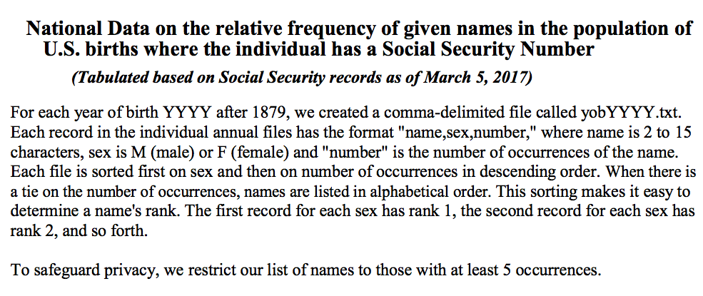
To study what a name tells about a person we will download data from the United States Social Security office containing the number of registered names broken down by year, sex, and name. This is often called the baby names data as social security numbers are typically given at birth.
Note: In the following we download the data programmatically to ensure that the process is reproducible.
import urllib.request
import os.path

data_url = "https://www.ssa.gov/oact/babynames/names.zip"
local_filename = "babynames.zip"
if not os.path.exists(local_filename): # if the data exists don't download again
    with urllib.request.urlopen(data_url) as resp, open(local_filename, 'wb') as f:
        f.write(resp.read())
The data is organized into separate files in the format yobYYYY.txt with each file containing the name, sex, and count of babies registered in that year.
Loading the Data
Note: In the following we load the data directly into python without decompressing the zipfile.
In DS100 we will think a bit more about how we can be efficient in our data analysis to support processing large datasets.
import zipfile
babynames = []
with zipfile.ZipFile(local_filename, "r") as zf:
    data_files = [f for f in zf.filelist if f.filename[-3:] == "txt"]
    def extract_year_from_filename(fn):
        return int(fn[3:7])
    for f in data_files:
        year = extract_year_from_filename(f.filename)
        with zf.open(f) as fp:
            df = pd.read_csv(fp, names=["Name", "Sex", "Count"])
            df["Year"] = year
            babynames.append(df)
babynames = pd.concat(babynames)
Understanding the Setting
In DS100 you will have to learn about different data sources on your own.
Reading from SSN Office description:
All names are from Social Security card applications for births that occurred in the United States after 1879. Note  that many people born before 1937 never applied for a Social Security card, so their names are not included in our data. For others who did apply, our records may not show the place of birth, and again their names are not included in our data.

All data are from a 100% sample of our records on Social Security card applications as of March 2017.Examining the data:
babynames.head()
In our earlier analysis we converted names to lower case. We will do the same again here:
babynames['Name'] = babynames['Name'].str.lower()
babynames.head()
How many people does this data represent?
format(babynames['Count'].sum(), ',d')
Is this number low or high?
Answer
It seems low. However this is what the social security website states: All names are from Social Security card applications for births that occurred in the United States after 1879. Note that many people born before 1937 never applied for a Social Security card, so their names are not included in our data. For others who did apply, our records may not show the place of birth, and again their names are not included in our data. All data are from a 100% sample of our records on Social Security card applications as of the end of February 2016.
Temporal Patterns Conditioned on Gender
In DS100 we still study how to visualize and analyze relationships in data.
pivot_year_name_count = pd.pivot_table(babynames,
        index=['Year'], # the row index
        columns=['Sex'], # the column values
        values='Count', # the field(s) to processed in each group
        aggfunc=np.sum,
    )

pink_blue = ["#E188DB", "#334FFF"]
with sns.color_palette(sns.color_palette(pink_blue)):
    pivot_year_name_count.plot(marker=".")
    plt.title("Registered Names vs Year Stratified by Sex")
    plt.ylabel('Names Registered that Year')

In DS100 we will learn to use many different plotting technologies.
pivot_year_name_count.iplot(
    mode="lines+markers", size=8, colors=pink_blue,
    xTitle="Year", yTitle='Names Registered that Year',
    filename="Registered SSN Names")
How has the number of unique names each changed?
pivot_year_name_nunique = pd.pivot_table(babynames,
        index=['Year'],
        columns=['Sex'],
        values='Name',
        aggfunc=lambda x: len(np.unique(x)),
    )

pivot_year_name_nunique.iplot(
    mode="lines+markers", size=8, colors=pink_blue,
    xTitle="Year", yTitle='Number of Unique Names',
    filename="Unique SSN Names")
This could in part be due to increasing number of names.
(pivot_year_name_nunique/pivot_year_name_count).iplot(
    mode="lines+markers", size=8, colors=pink_blue,
    xTitle="Year", yTitle='Fraction of Unique Names',
    filename="Unique SSN Names")
What patterns do we see?
Some observations
- Registration data seems limited in the early 1900s. Because many people did not register before 1937.
- You can see the baby boomers.
- Females have greater diversity of names.
Question: Does you name reveal your age?
In the following cell we define a variable for your name. Feel free to download the notebook and follow along.
my_name = "joey" # all lowercase
Compute the proportion of the name each year
name_year_pivot = babynames.pivot_table(
        index=['Year'], columns=['Name'], values='Count', aggfunc=np.sum)
prob_year_given_name = name_year_pivot.div(name_year_pivot.sum()).fillna(0)
prob_year_given_name[[my_name, "joseph", "deborah"]].iplot(
    mode="lines+markers", size=8, xTitle="Year", yTitle='Poportion',
    filename="Name Popularity")
prob_year_given_name[[my_name, "keisha", "kanye"]].iplot(
    mode="lines+markers", size=8, xTitle="Year", yTitle='Poportion',
    filename="Name Popularity2")
Ideally, we would run a census collecting the age of each student. What are limitations of this approach?
- It is time consuming/costly to collect this data.
- Students may refuse to answer.
- Students may not answer truthfully.
What fraction of the student names are in the baby names database:
names = pd.Index(students["Name"]).intersection(prob_year_given_name.columns)
print("Fraction of names in the babynames data:" , len(names) / len(students))
Simulation
In Data8 we relied on simulation:
def simulate_name(name):
    years = prob_year_given_name.index.values
    return np.random.choice(years, size=1, p = prob_year_given_name.loc[:, name])[0]
simulate_name("joey")
def simulate_class_avg(num_classes, names):
    return np.array([np.mean([simulate_name(n) for n in names]) for c in range(num_classes)])
simulate_class_avg(1, names)
Simulating the Average Age of Students in the Class
class_ages = simulate_class_avg(200, names)
f = ff.create_distplot([class_ages], ["Class Ages"],bin_size=0.25)
py.iplot(f)
Directly Marginalizing the Empirical Distribution
We could build the probability distribution for the age of an average student directly:
$$ \tilde{P}(\text{year} \, |\, \text{this class}) = \sum_{\text{name}} \tilde{P}(\text{year} \, | \, \text{name}) \tilde{P}(\text{name} \, | \, \text{this class}) $$In DS100 we will explore the use of probability calculations to derive new estimators
However, we have more direct estimates of a distributions and so instead we can marginalize over student names:
age_dist = prob_year_given_name[names].mean(axis=1)
age_dist.iplot(xTitle="Year", yTitle="P(Age of Student)")
What is the expected age of students?
np.sum(age_dist * age_dist.index.values)
Is this a reasonable estimate? Can we quantify our uncertainty?
class_ages = []
for i in range(10000):
    class_ages.append(
        np.mean(np.random.choice(age_dist.index.values, size=len(names), p=age_dist)))
print(np.percentile(class_ages, [2.5, 50, 97.5]))
f = ff.create_distplot([class_ages], ["Class Ages"],bin_size=0.25)
py.iplot(f)
Is this a good estimator?
- How many of you were born around 1983?
- How many of you were born before 1988?
- Our age distribution looked at the popularity of a name through all time. Who was born before 1890?
- Students are likely to have been born much more recently.
How can we incorporate this knowledge.
lthresh = 1985
uthresh = 2005
prior = pd.Series(0.000001, index = name_year_pivot.index, name="prior")
prior[(prior.index > lthresh) & (prior.index < uthresh)] = 1.0
prior = prior/np.sum(prior)
prior.plot()

Incorporating the Prior Believe into our Model
Take advantages of Bayesian reasoning.
$$\large P(y \,|\, n) = \frac{P(n\, | \, y) P(y)}{P(n)} $$Time permitting we will cover some basics of Bayesian modeling in DS100.
year_name_pivot = babynames.pivot_table(
        index=['Name'], columns=['Year'], values='Count', aggfunc=np.sum)
prob_name_given_year = year_name_pivot.div(year_name_pivot.sum()).fillna(0)
u = (prob_name_given_year * prior)
posterior = (u.div(u.sum(axis=1), axis=0)).fillna(0.0).transpose()
posterior_age_dist = np.mean(posterior[names],axis=1)
posterior_age_dist.iplot(xTitle="Year", yTitle="P(Age of Student)")
post_class_ages = []
for i in range(10000):
    post_class_ages.append(
        np.mean(np.random.choice(posterior_age_dist.index.values, size=len(names),
                                 p=posterior_age_dist)))
print(np.percentile(post_class_ages, [2.5, 50, 97.5]))
f = ff.create_distplot([post_class_ages], ["Posterior Class Ages"],bin_size=0.25)
py.iplot(f)
What is the gender of the class?
We can construct a similar analysis with gender looking at recent names only.
gender_pivot = babynames[(babynames['Year'] > lthresh) & (babynames['Year'] < uthresh)].pivot_table(
        index=['Sex'], columns=['Name'], values='Count', aggfunc=np.sum).fillna(0.0)
prob_gender_given_name = gender_pivot / gender_pivot.sum()
prob_gender_given_name[names.intersection(prob_gender_given_name.columns)].mean(axis=1)
Would we expect this to be a good estimator?